
The Search Interface is a graphical user interface used by the search users to pose their queries. SearchAssist allows you to customize this user interface.
Highlights
You can customize the interface in three different aspects:
- Experience – You can choose the position of the search bar, this would also dictate the result types presented to the user.
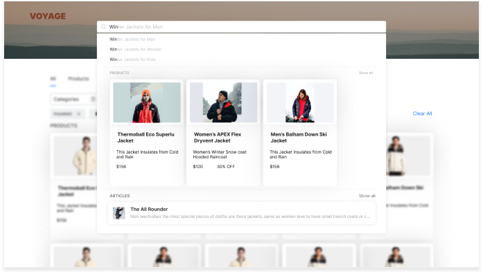
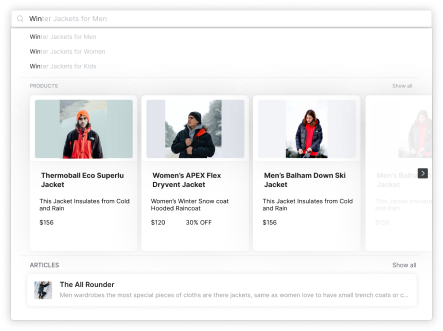
- Top-down experience will position the Search Bar at the top of the chat window. This approach is used in e-commerce websites where search results are displayed from top to bottom in the search bar.
As the user types a query, the live search results are displayed as a drop-down list and the full page results are given on the page itself. The user can either select an option from the live search drop-down list or browse through the full results page.
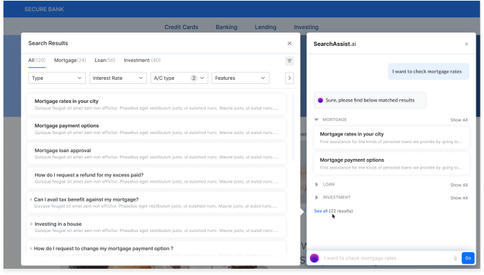
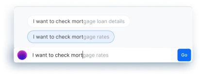
- Bottom-up experience will position the Search Bar at the bottom of the chat window. This approach is generally used in banking and insurance websites where you want a bot’s help to perform actions like pay bills, etc. at the top or bottom of the chat window.
In this case, the live search results are displayed as the user types the query and the conversational search results are displayed in the chat window. Users can select an option from the live search list or browse the options given in the conversational search results. Apart from this, the user will be presented with an option to view the full page results, to see the entire search results on a slide-out page.
- Top-down experience will position the Search Bar at the top of the chat window. This approach is used in e-commerce websites where search results are displayed from top to bottom in the search bar.
- Search Widget includes customization of the search bar. These include:
- Placeholder Text inside the search bar, text color
- Search bar border color, search Icon
- Search Button customization
- Interactions – The user experience with the search interface can be improved by configuring various interactions.
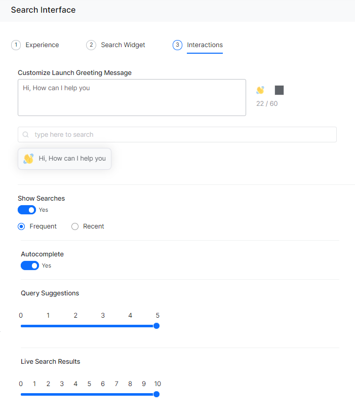
- Greeting message is displayed on the launch of the search bar, a total of 60 characters allowed and you can set the color of the text.
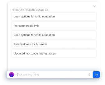
- Show Searches option can be enabled for the user to see their previous queries. These queries appear as cards in the search window as soon as the user selects the search bar. Options are to display either frequent searches or recent search displays.
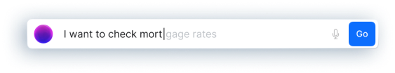
- Auto-complete option can be enabled to save the user time and effort by predicting the rest of the word as they are typing a query.
- Query Suggestion reduces user’s time to search a query by providing suggestions. These suggestions would help users to enter long queries or select a query as they type. You can set the number of suggestions to be displayed from 0-3 for bottom-up experience, from 0-5 for a top-down experience. When used along with Live Search Results, the live search results appear at the background of the query suggestions and the user can scroll to browse the results.
- Live Search Results enhance the user’s search experience by showing the results while entering the query and allow the user to see search results without redirecting to the results page. You can set the number of results to be displayed from 0-5 for bottom-up experience, from 0-10 for a top-down experience. When used along with Query Suggestion, the live search results appear at the background of the query suggestions and the user can scroll to browse the results.
Configuration
To access the Search Interface and customize it, follow the below steps:
- Click the Indices tab on the top.
- On the left pane, under the Search Experience section, click Search Interface.
- On the Search Interface page, by default, the Experience section is displayed.
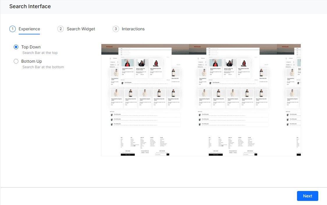
- Select an option:
- Top-Down – Search bar at the top
- Bottom-Up – Search bar at the bottom
- Click Next.
- On the Search Widget section:
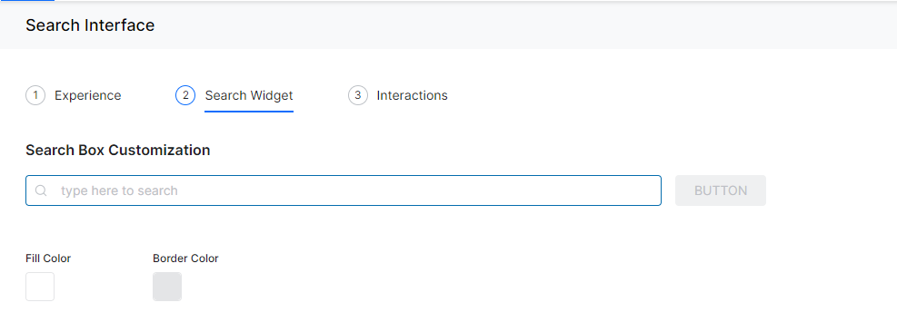
- In the Search Box Customization section, you can make changes to the search box.
- Click in the search text box to update the placeholder text and the text color.
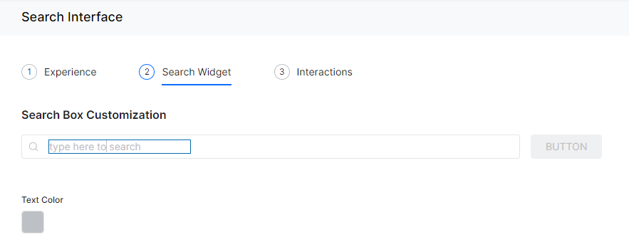
- Click in the search box to update the border color and the fill color
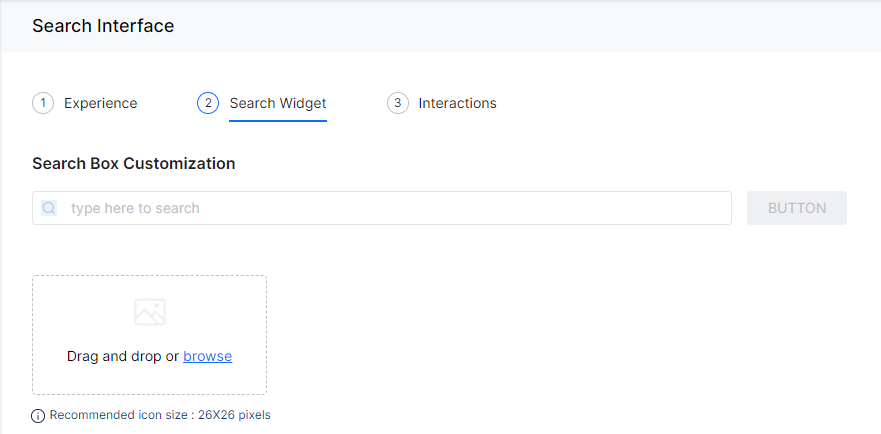
- Click on the search icon to Upload Icon of your choice to replace the default icon. You can upload an image measuring 26×26 pixels.
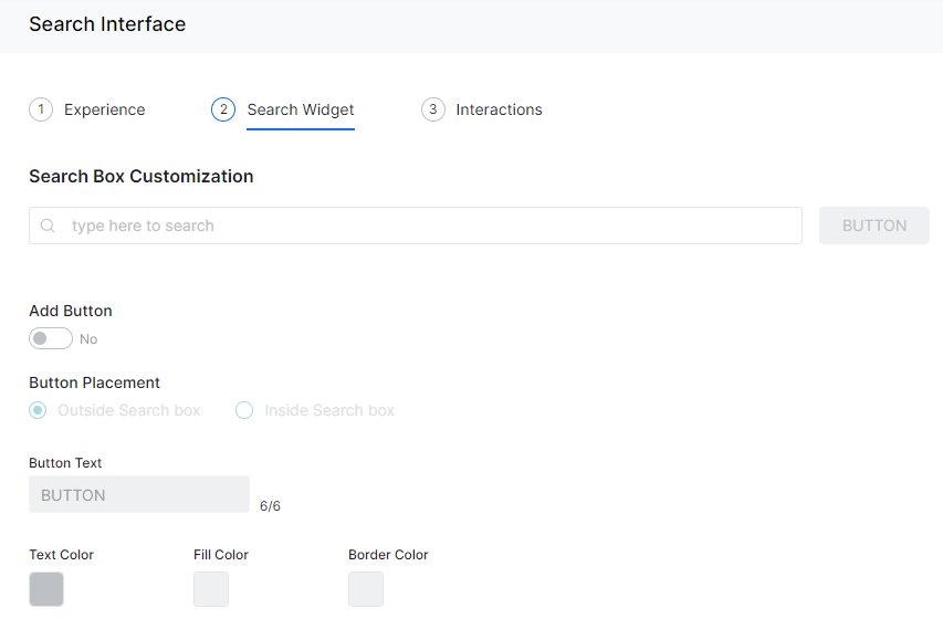
- Click on the Button to Add button. You can change
- Show or hide button
- Placement of the button – outside or inside the search bar
- Text displayed on the button (total of 5 characters)
- Text color, button fill color, and button border color.
- Click in the search text box to update the placeholder text and the text color.
- In the Search Box Customization section, you can make changes to the search box.
- Click Next.
- On the Interactions section:
- Enter a message to be displayed as the greeting message, in the Customize Greeting Message box.
- Enable to Show Searches and select an option:
- Frequent – Frequent searches done by users,
- Recent – Recent searches done by the user.
- Turn on or off the Auto-complete toggle. This option auto-completes the search text as the user is typing.
- Under Query Suggestions, set the slider between to decide the number of query suggestions be displayed.
- Under Live Search Results, set the slider to decide the number of live search results be displayed.
- Click Done.