Using the Dialog Builder
The Dialog Builder is where you can create your Dialog Tasks, from end-to-end. This is an in-depth article on how to use this tool.
Create a Dialog Task
To create a dialog task, you must have already created an assistant to add a dialog task to. See Create Your First Assistant for more information.
Note
For optimal performance, limit the number of dialog tasks to 50 or fewer. Exceeding this number may lead to sluggish UI response and increased latency.
Steps to add a dialog task:
- Open the app for which you want to create the dialog task.
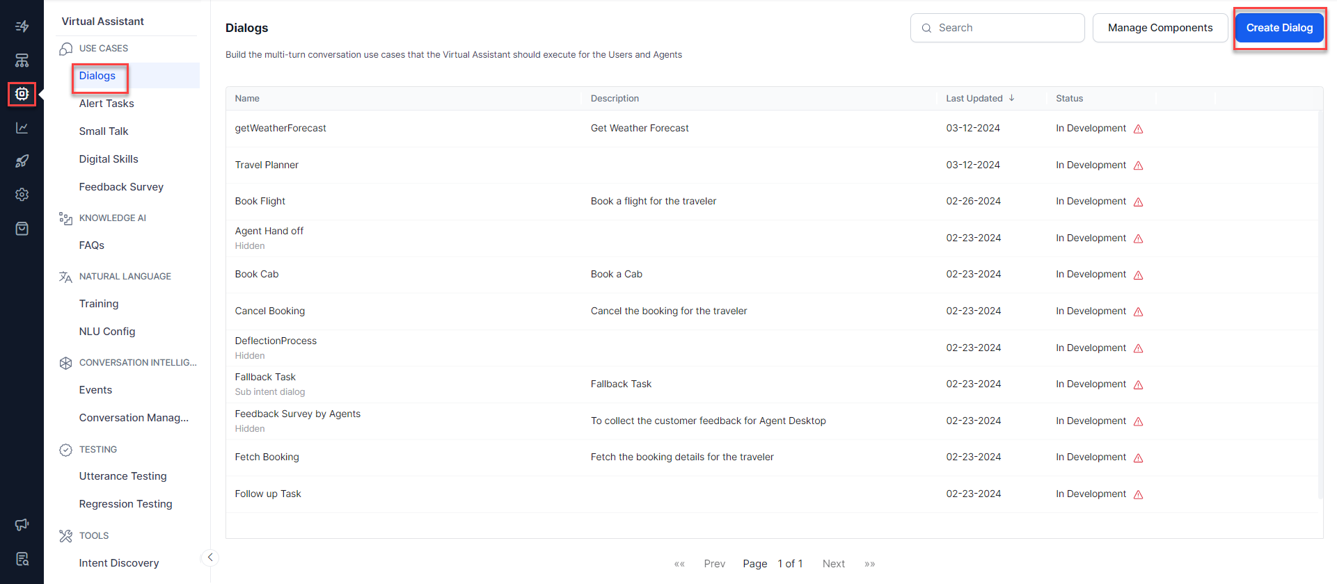
- Navigate to Automation AI > Virtual Assistant icon on the left menu.
- The Virtual Assistant menu opens, and the Dialogs page is open by default.
-
On the Dialogs page, click the Create Dialog button.
-
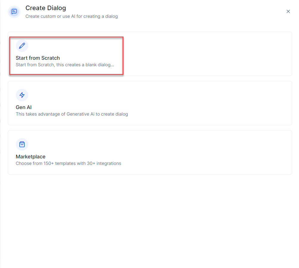
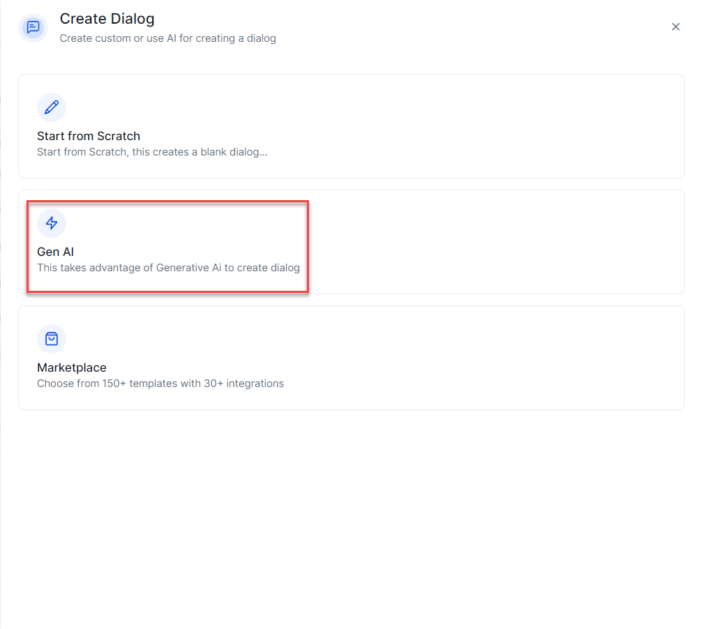
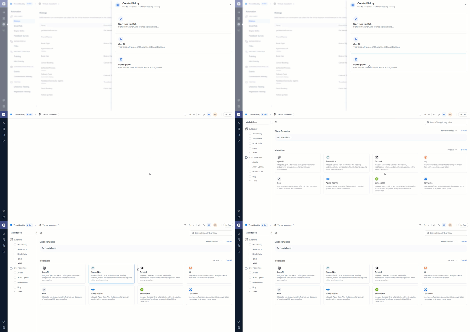
The Create Dialog window appears; from here, you can Create a dialog from scratch, Generate with AI to create a dialog, or Marketplace with integrations to create a dialog.
-
Click on Start From Scratch.
-
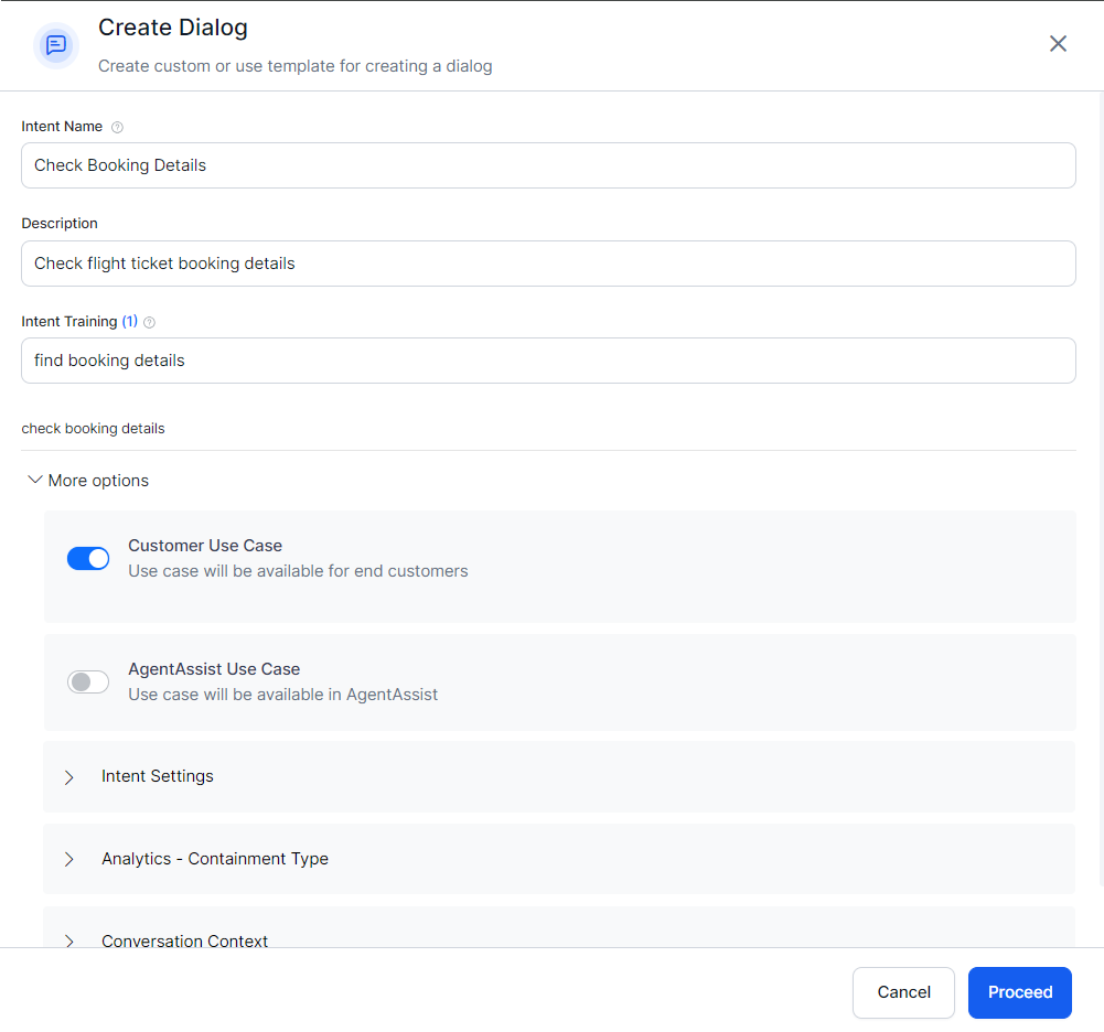
Provide an Intent Name (mandatory) and Description (Optional but recommended).
Note
Non utf 8 characters are not supported for intent display name.
-
You can choose whether the new dialog will be available to the end users (Customer Use Case), agents (Agent AI Use Case), or both.
- Under Intent Settings, set options for the task to be independent, such as a Sub-intent dialog or Hide it from Help.
- Under Analytics - Containment type, you can choose between Abandonment as Self-Service and Abandonment as Drop Off.
- Optionally, you can adjust Conversation Context, set Intent Preconditions, or define Context Output.
-
Click Proceed.
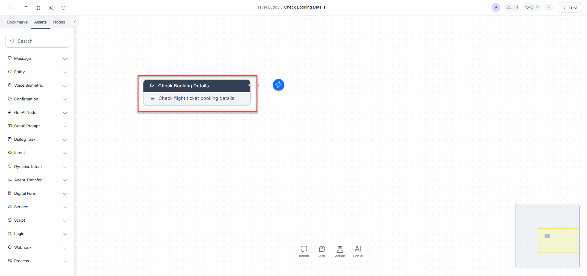
The Dialog Builder is displayed with the canvas containing the root intent, which shows the Dialog Name and Description. Now, you can add nodes and establish transitions between these nodes for your workflow.
Click here to know about Nodes & Connections.
Auto-Generated Dialog Tasks
Introduction
This feature auto-generates dialog flows using the app’s purpose and intent description provided during task creation. The Platform uses Generative AI or Pre Built Templates to create suitable Dialog Tasks for Conversation Design, Logic Building, and Training by including the required nodes in the flow. This helps simplify and shorten the development process and suggests possible pathways that developers might not think otherwise.
The nodes and the flow for the Business Logic are automatically built for your conversation, and you only need to configure the flow transition.
The Platform auto-defines the Entities, Prompts, Error Prompts, Bot Action nodes, Service Tasks, Request Definition, and other parameters.
Auto-Generate Dialog Tasks using AI
Right after creating your dialog task, you will see a Conversation Preview window. In this window, you can view mock conversations and convert them into dialog flows for every intent.
-
Click the Generate with AI option.
-
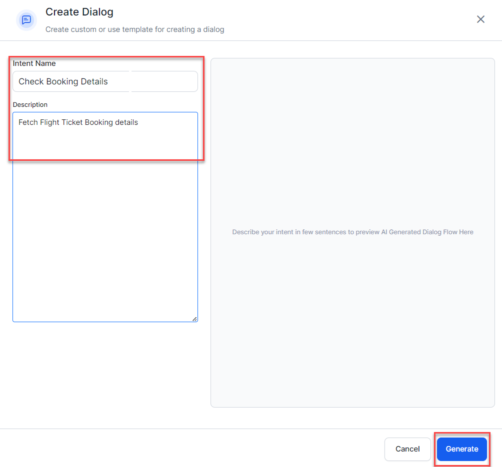
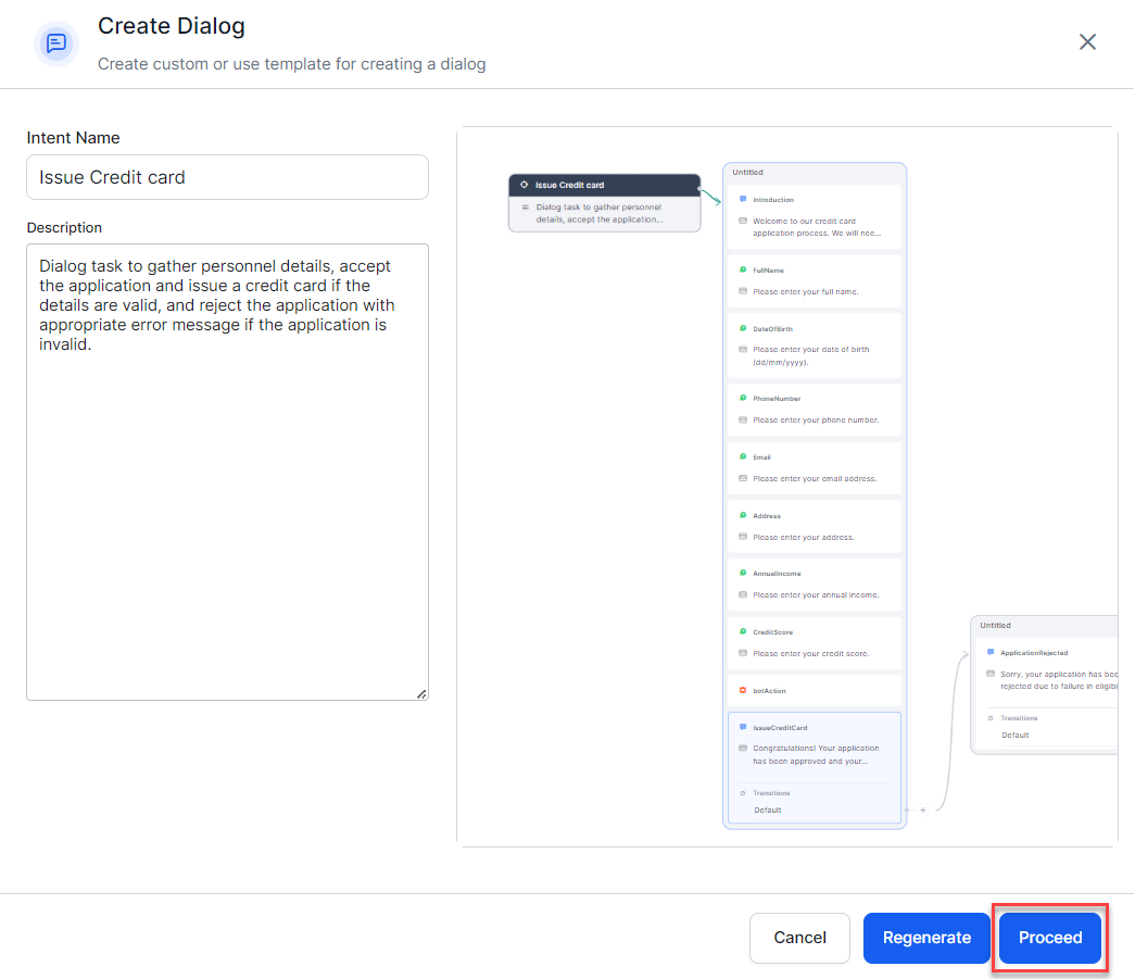
Provide Intent Name (mandatory) and a meaningful Description that states the purpose of the Dialog Task, and click Generate.
Note
Non utf 8 characters are not supported for intent display name.
-
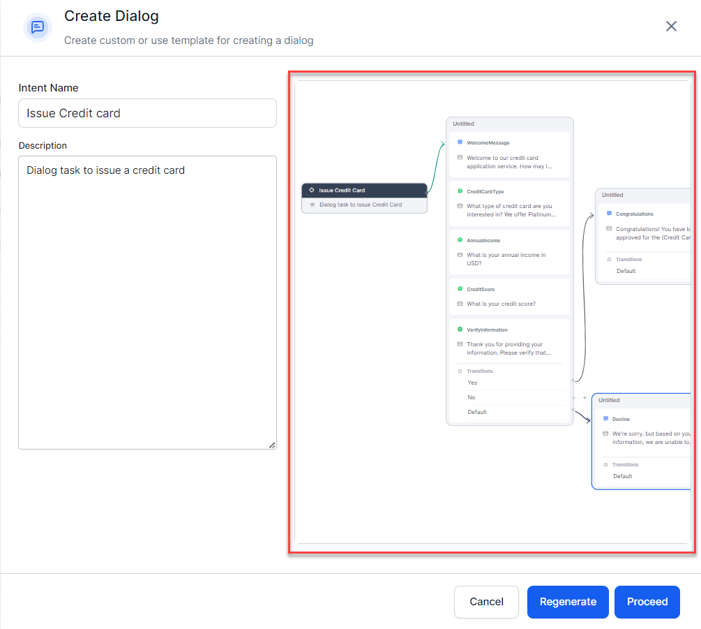
You can see a Preview of the AI generated dialog flow.
-
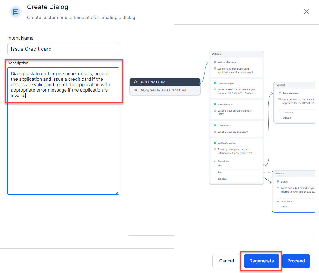
You can regenerate the dialog by changing the description and clicking Regenerate.
Note
Providing a relevant description is recommended. If no description is provided, a dialog will be generated, but only with the error prompt.
-
Click Proceed when you are satisfied with the preview.
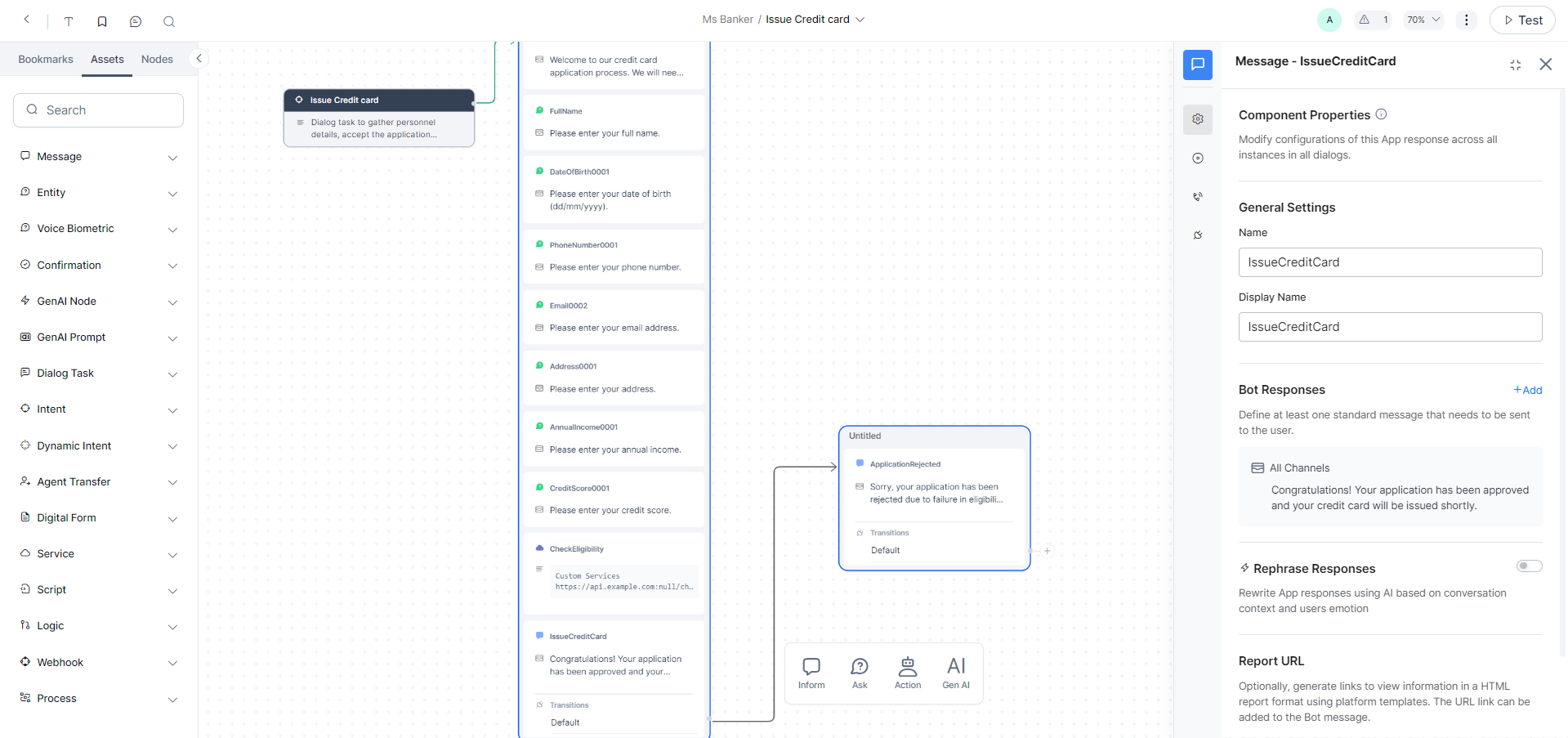
The nodes and the flow for the Business Logic are automatically built for your conversation. The Platform auto-defines the Entities, Prompts, Error Prompts, Bot Action nodes, Service Tasks, Request Definition, and other parameters. You can customize the flow per your requirements by editing the generated nodes and adding your own. You can configure the generated Dialog Tasks just like any other dialog task.
Auto-Generate Dialog Tasks using Pre Built Templates
This option provides you ready-made templates targeting major industry verticals, covering generic use cases related to the industry, and having pre-established integration, and lets you choose a suitable dialog template. You can update the description and generate use cases based on the purpose. This option accelerates development by providing a starting point for common scenarios, ensuring consistency and efficiency.
Note
You can avail this feature only if the integration is configured in your VA. You must go through the installation journey to access the integrations and templates.
-
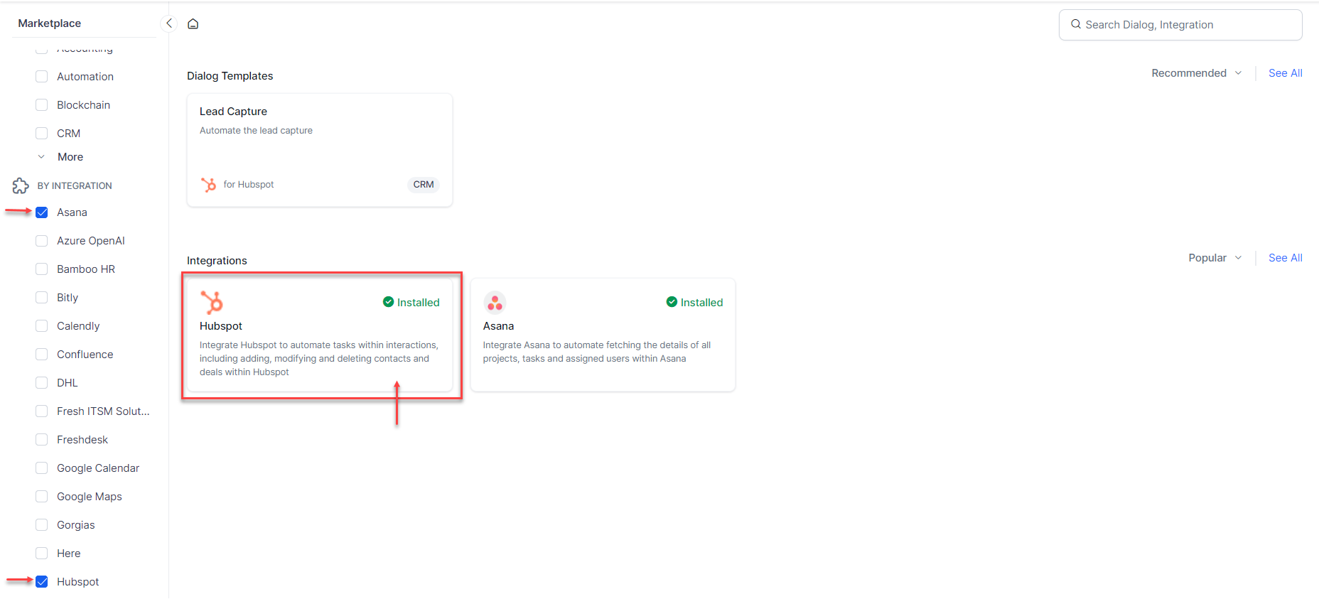
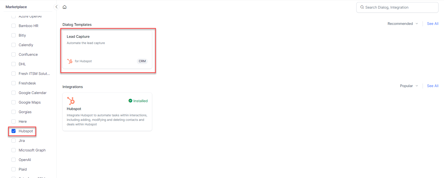
Click the Marketplace option. The Marketplace page opens with lists of Categories and Integrations. You can see a list of the most popular integrations and recommended templates.
-
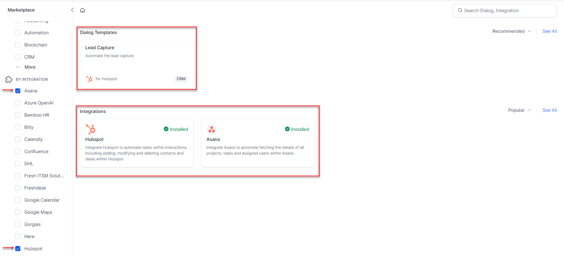
Select the required categories or integrations. The corresponding integrations and available dialog templates appear. The integrations configured in your VA are labeled as Installed.
-
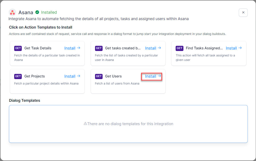
Dialog Action Templates contain the required nodes to make API calls to perform particular actions. You would notice that every Action Template has an API method mentioned in the brick. To create a dialog using the available Dialog Action Templates of an integration:
-
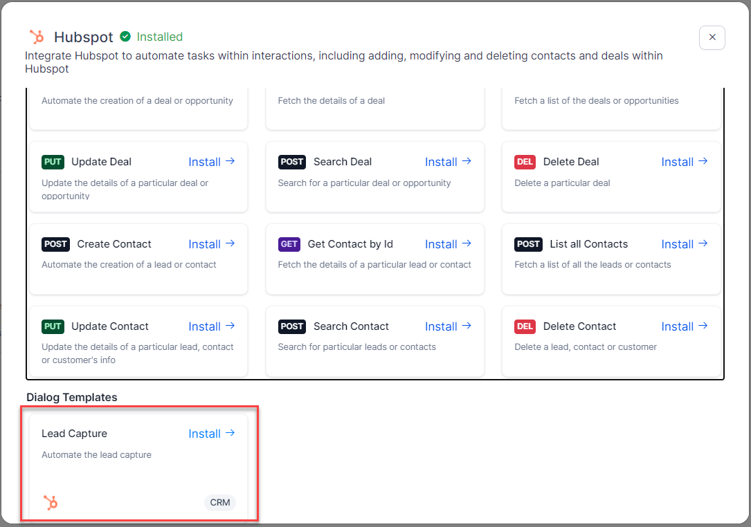
Click the suitable integration. You will get a popup window containing the available Action Templates for the selected integration.
-
Install the required action template(s) by clicking the corresponding Install →.
-
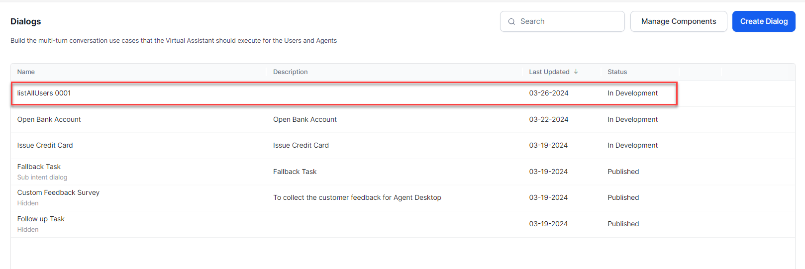
You will see the dialog task(s) added to the list of dialogs.
-
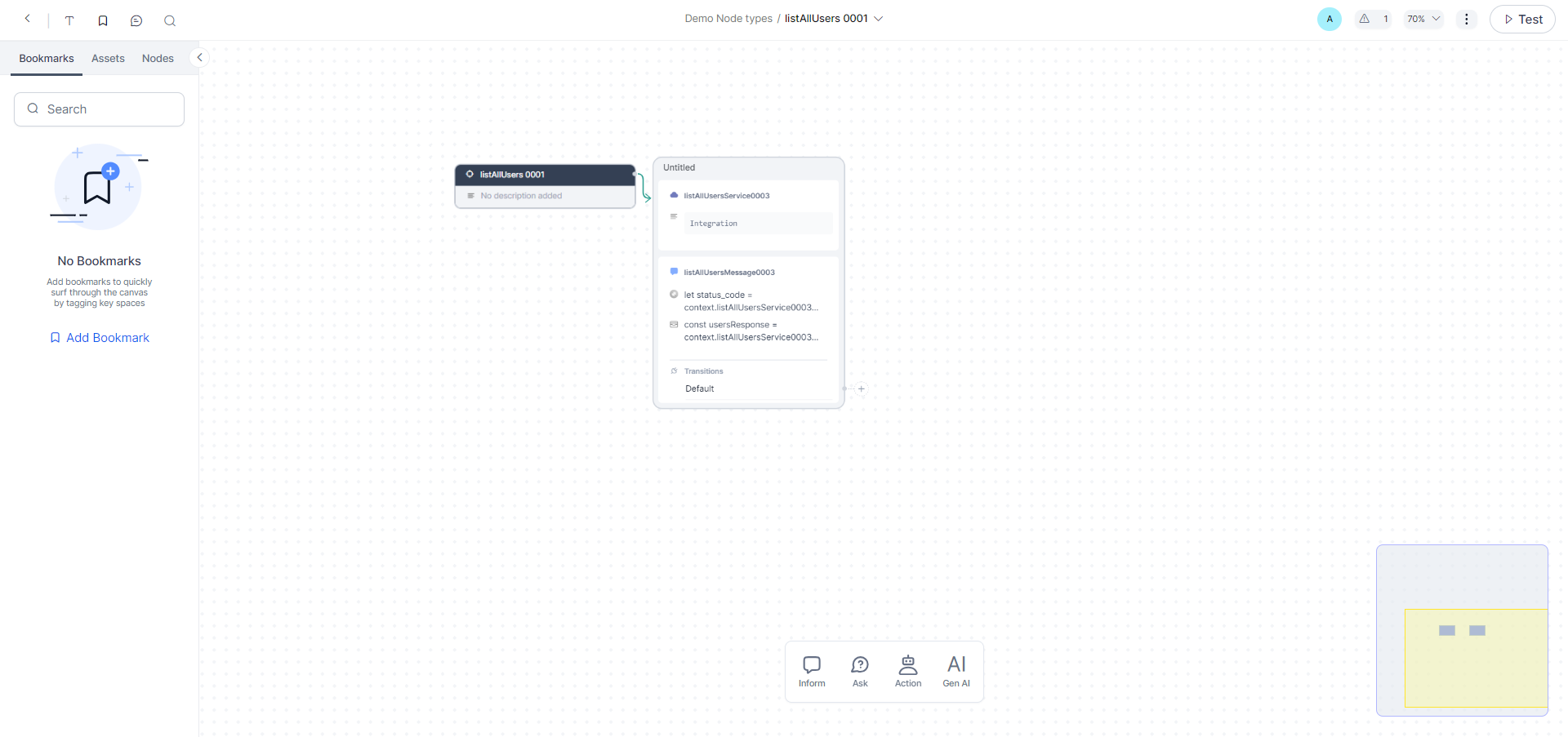
You can edit and customize the dialog design as per your requirements by opening it in the dialog builder.
-
-
Dialog Templates are pre-created templates of dialog tasks to perform a particular task. To create a dialog using Dialog Template (if available):
Note
Dialog templates are not available for every integration.
-
Click the required Dialog Template.
You can also select the required Dialog Template by clicking on an integration and exploring the options.
-
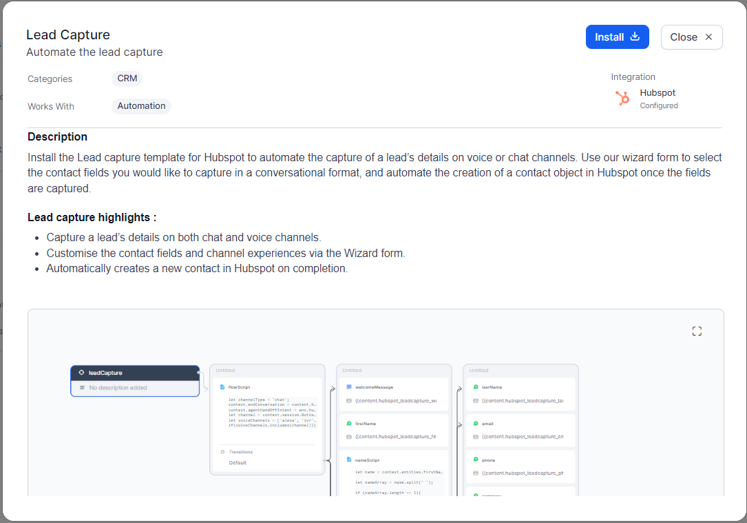
Click the tile containing the required Dialog Template to see the description, highlights, and preview of the dialog in a popup window.
-
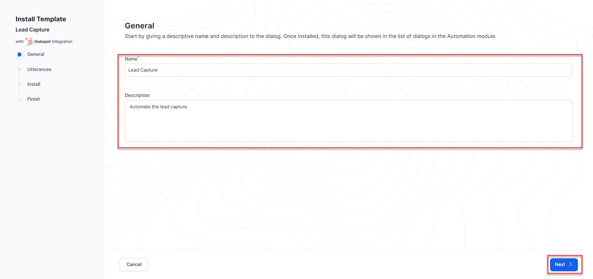
Click Install on the popup. You can modify the name and description of the dialog on the next screen. Make the required edits and click Next.
-
The next few screens help you with the below setup:
- Utterances to identify this intent
- Channel experience
- Other setup points pertaining to the intent. For example, information points to be captured for Lead Capture intent.
-
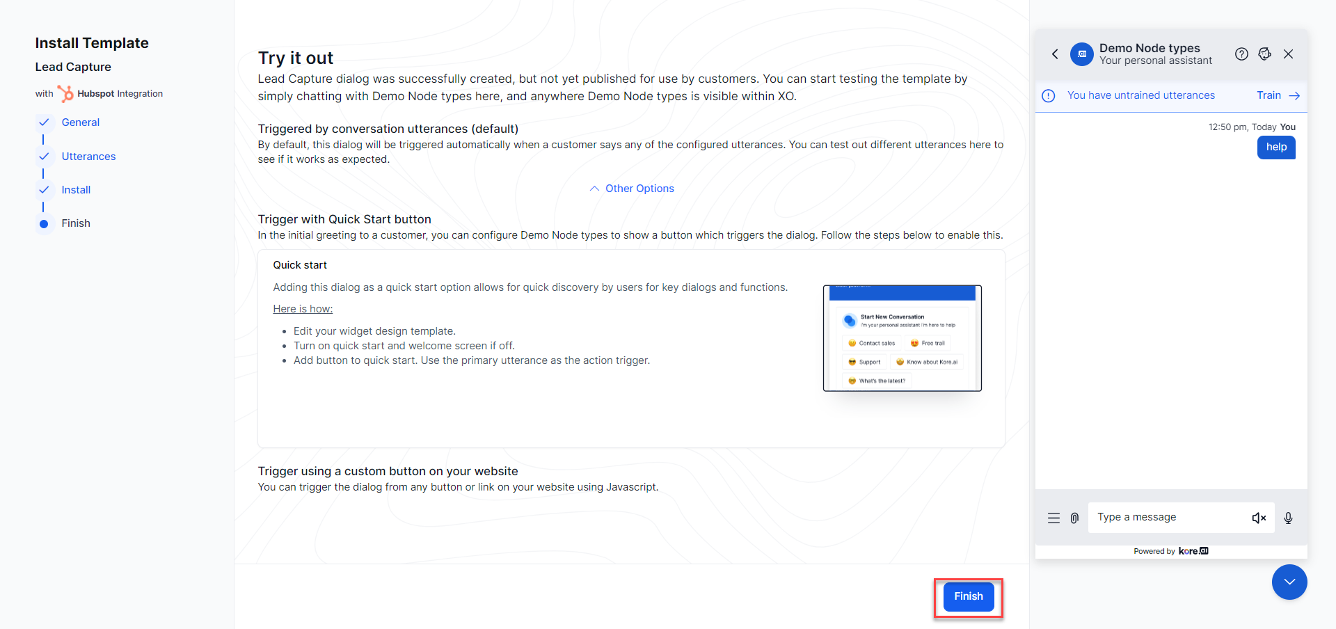
The template is installed after you finish the setup. Click Finish.
-
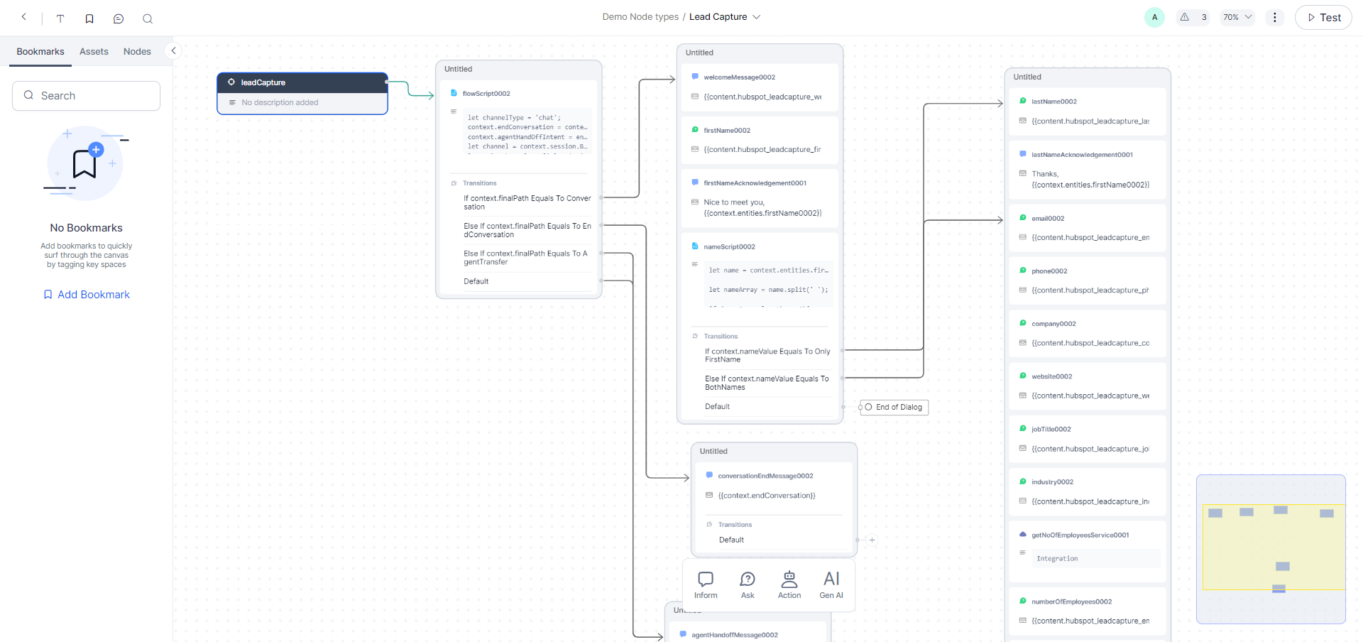
The dialog task is created and opens in the Dialog Builder. You can make required changes like any other dialog by adding, removing and configuring nodes as per need.
Click here to know about Nodes & Connections
Dialog Task Builder Overview
Before moving on, here is an overview of the Dialog Task Builder. For details on navigating dialog tasks, please see Navigating the Dialog Task Builder.
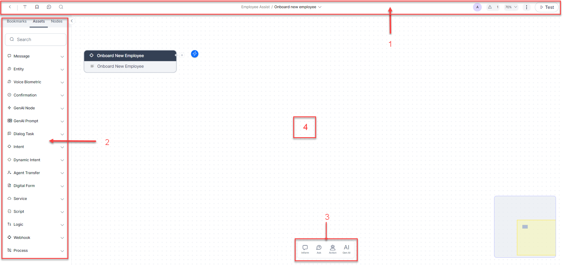
The Dialog Builder interface consists of:
The Tool Set
The Dialog Design process occurs in the Dialog Builder. This comes with its specific top menu - the Tool Set.
For the convenience of comprehension and demonstration, let’s visualize the Tool Set into three parts:
Features on the Left Side of the Tool set
- Exit the Dialog Task Builder (
 ) and return to the Dialog Tasks List.
 -
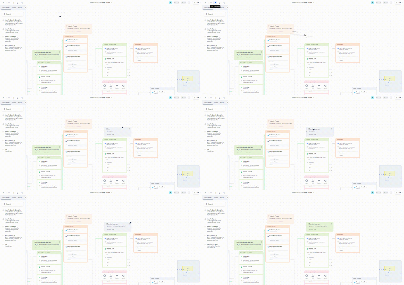
Add Bookmarks (
 ) - You can bookmark frequently visited or crucial content in the canvas with relevant information. The added bookmarks can be seen in the Bookmarks tab of the Index Panel. They help you navigate to the bookmarked content without having to search or browse extensively.
 -
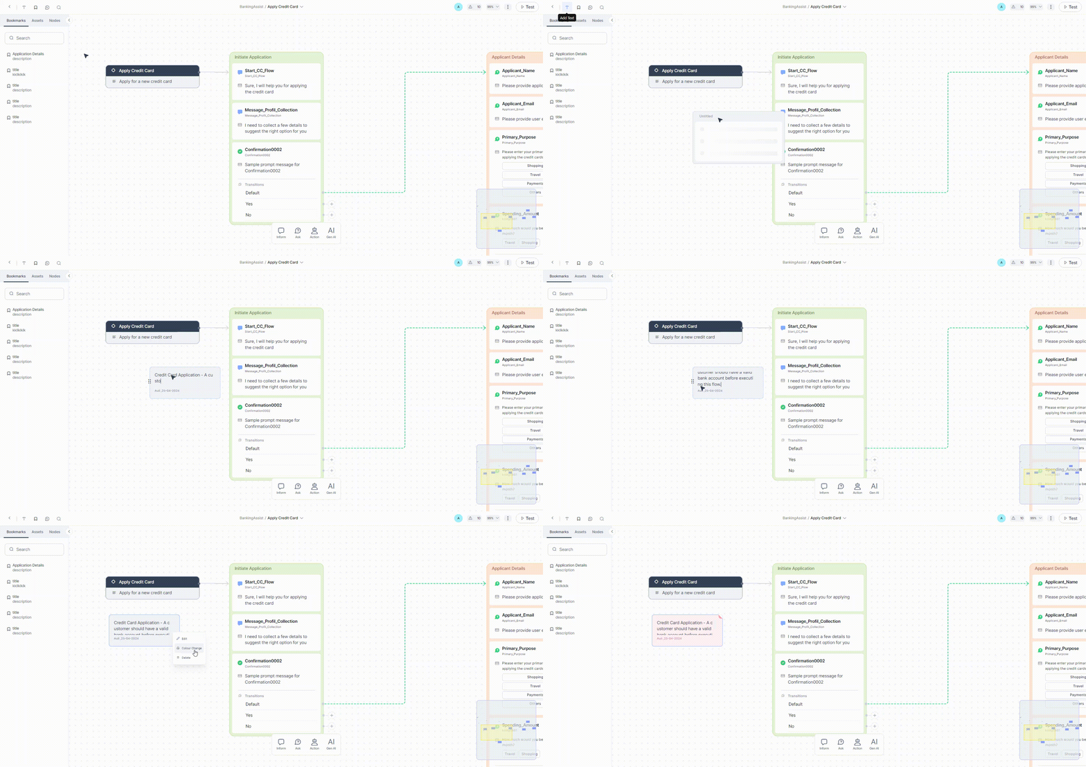
Add Note (
 ) - You can add a note anywhere on the canvas to record the logic being developed in a sequence or group of sequences or other relevant nodes about the logic building for future reference.
 -
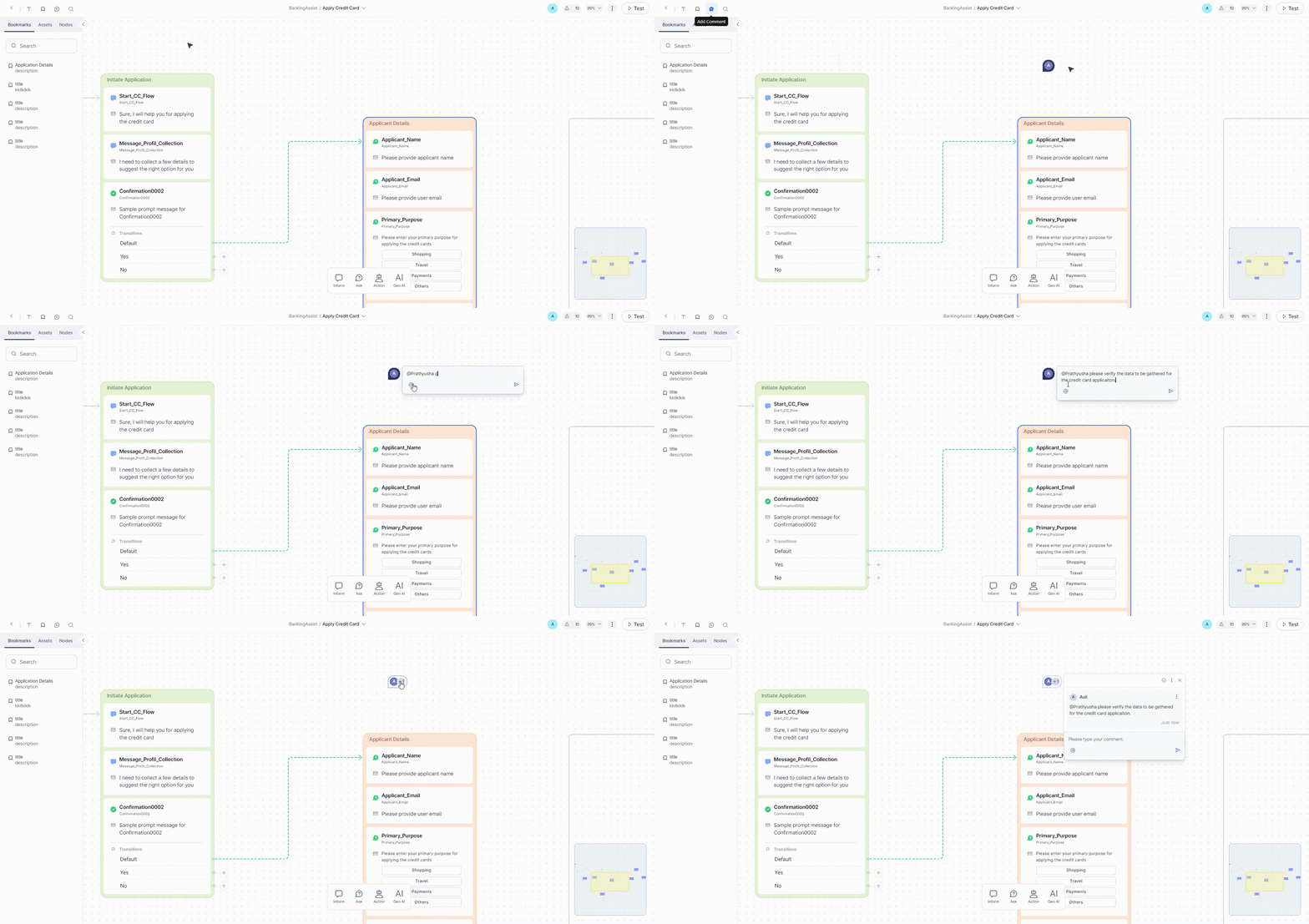
Add Comment (
 ) - You can tag other users in a comment to enhance communication through feedback, suggestions, and discussions on specific elements of the design or if you need another user to pitch in and help you with the conversation design with their developmental or functional expertise.
 -
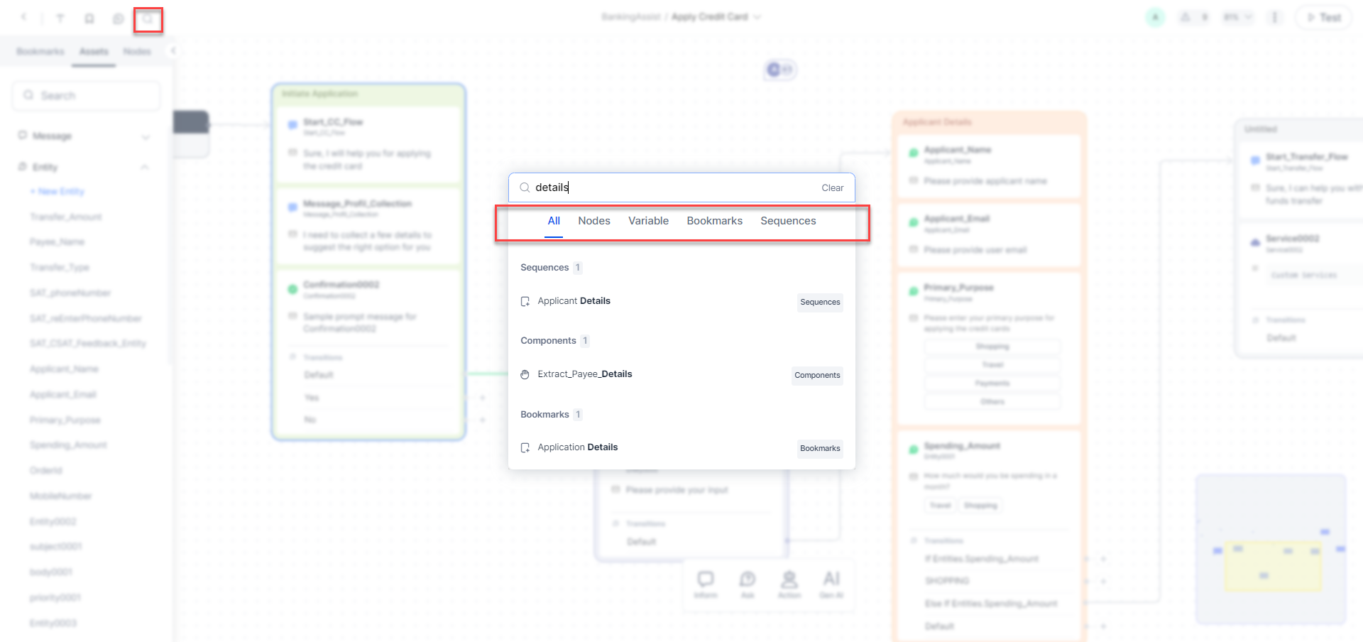
Find (
 ) - You can search for nodes, variables, Bookmarks and sequences at Dialog level. Clicking this icon opens a window where you can perform a universal search. You will get a list of all the nodes, variables, sequences and bookmarks grouped by type that contain the search string. Additionally, individual tabs are present for each type wherein all items of those types are listed.
Features in the Middle of the Tool set
-
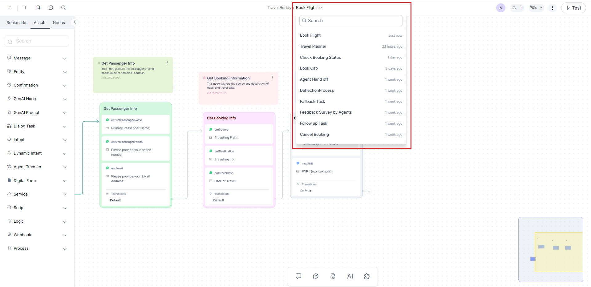
Switch between Dialog Tasks (
 ) – The Task Switcher allows you to change to a different task within your selected app easily. This option is located at the top of your canvas
Features on the Right Side of the Tool set
- Test (
 ) - You can chat with the app in real time to test recognition, performance, and flow as if it were a live session.
 -
View Warnings (
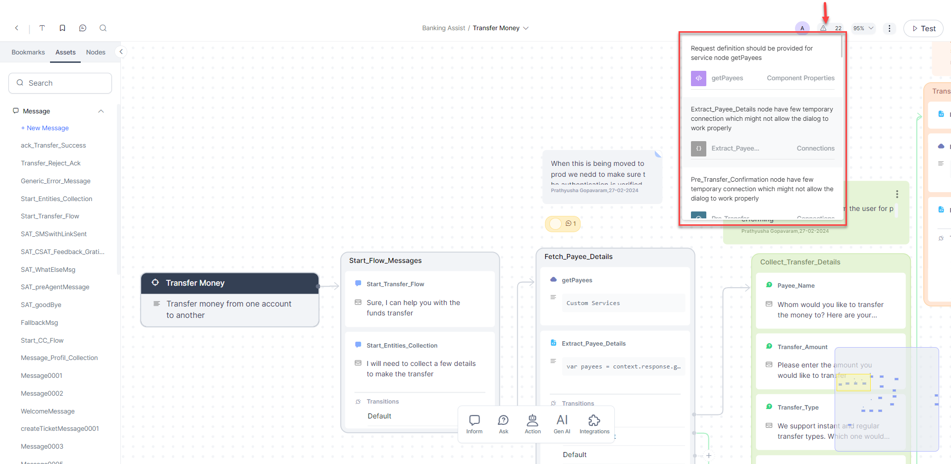
 ) - In the top navigation area, you will see a real-time set of errors and warnings that might have occurred as you define your dialog task. The information icon is located at the top right of the Dialog Builder. Click the information icon to display any errors or warnings, as shown in the following illustration.
 -
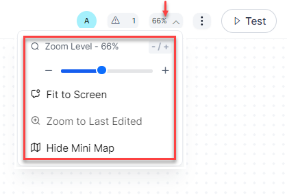
Display Options (
 ) - Use Display Options to utilize screen real estate better.
Display Options are used to:
- Fit to Screen – Resizes Dialog Builder components and connections to fit within the display screen resolution for a single, non-scrolling page.
- Zoom Level – is used to set the zoom level as needed.
- Zoom to Last Edited – This takes you to the zoom level you have used to edit the dialog.
- Hide/Show Mini Map – To show or hide the mini-map of the dialog.
-
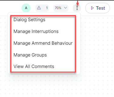
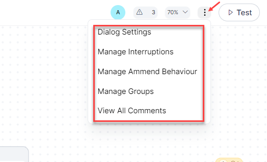
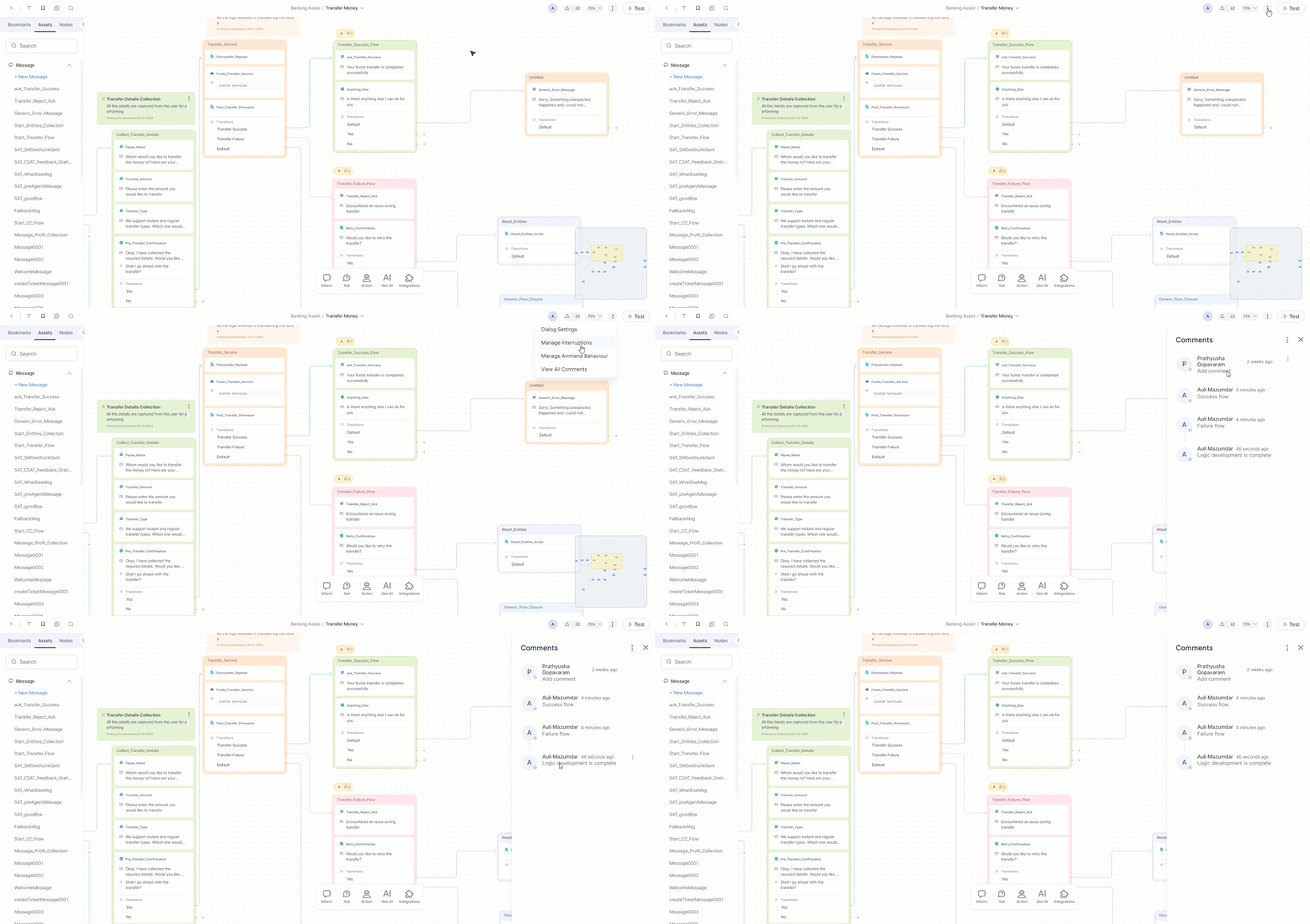
More options, where you can access Dialog Settings, Manage Interruptions, Manage Ammend behavior and View Comments. Learn more.
-
Bot Owners - You can see bubbles containing the names of all the users of the current dialog, such as Bot Owner, Bot Developer, Conversation Designer, etc. The first letter of the bot owner’s name appears in a colored bubble.
The Index Panel
The Index panel consists of tabs listing features that help enhance collaboration and organization while using the dialog builder:
You can add, edit, move or delete notes, comments, or bookmarks as needed. However, note that once deleted, they cannot be restored.
Bookmark Tab
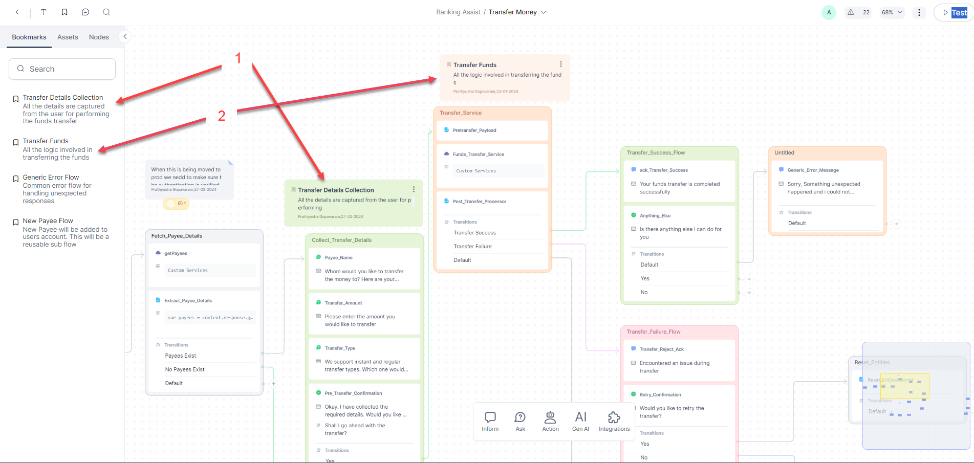
The Bookmarks tab allows you to organize and reference important information. You can bookmark frequently visited or crucial content in the canvas with relevant information. This helps you navigate to the bookmarked content without having to search or browse extensively.
The Bookmark tab provides a structured and organized way to manage bookmarks and contributes to a user-friendly interface, making it easier to navigate and interact with the bookmarked dialogs.
You can also search for bookmarks.
Assets Tab
The Assets tab contains all the node types as expandable lists. Upon expanding them, you can see an option to add a new node of that type to the canvas, as well as all the nodes created for the current app, irrespective of whether they are added to any dialog.
All the created nodes you see in this tab are reusable. You can drag and drop them or add them using the "+" (Connector) before, after, or between existing sequences.
You can also search for nodes.
Nodes Tab
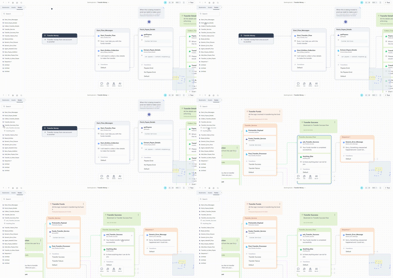
On this tab, you can see a list of all the sequences present in the Current Dialog. Upon clicking the sequence name, you see all the nodes in that sequence - the nodes that are added to the canvas for the current dialog.
You can also search for nodes and sequences, which will show you the nodes/sequences in the current dialog that match the search text.
The Nodes Panel
The Nodes panel is a streamlined, user-friendly categorization provided at the bottom of the canvas. Click a group to see the node types within it, and drag and drop the nodes to add them to the dialog. The nodes added from this panel will get added as reusable assets to the Assets tab of the Index panel.
Node type groups in the panel:
- Inform - Contains the nodes that can be used to provide information to the user. For example, Message node.
- Ask - Contains the nodes that can be used to get input from the user. For example, Confirmation or Entity node.
- Action - Contains nodes that can be used for any action that the app is expected to perform without interaction with the user. For example, Script, Service, Process, or Agent Transfer node.
- GenAI - Contains nodes that can be used to leverage the full potential of LLMs and Generative AI models to quickly build conversations that involve complex flows and also provide human-like experiences. For example, Agen Node and Prompt Node.
The Canvas
The Canvas is where you can integrate your conversation scenarios with your business logic.
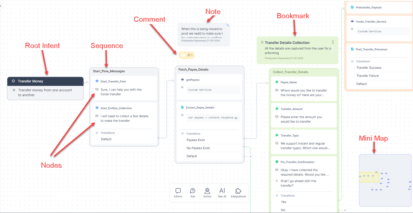
The canvas contains the following elements or components:
The Root Intent
This is the first component of any conversation, and whenever you create a new Dialog Task, it is automatically placed on your canvas.
The display name and description of the root intent are the same as the Dialog's. The Root Intent is an independent node and is not part of any sequence.
Like any other dialog, you can configure the component, NLP, and Connection properties of Root Intent. Key points about configuring the connection properties:
- Only one default connection is available for the Root Intent.
- You can connect a Root Intent to any node present on the canvas, not necessarily the first node of a sequence.
- Creating If-Else connection paths is not possible for the Root Intent.
Sequences
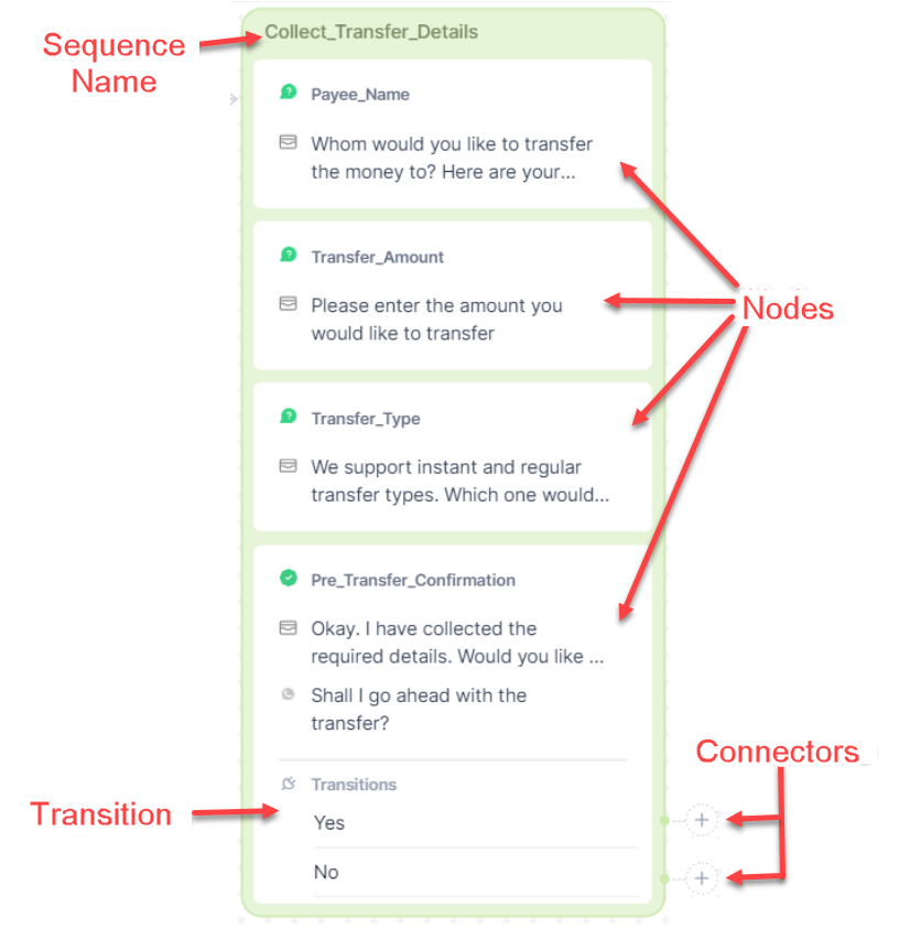
These are placeholders for creating groups of nodes. Each sequence has one or more nodes added in logical sequences.
A sequence gets automatically created when you add a node to the canvas. By default it is named Sequence [x] where x depends on the number of unnamed sequences already present on the canvas. Once a sequence gets created, you can either add more nodes to that sequence, or, you can add nodes outside any existing sequence, in which case a new sequence will get created.
To add a node to an existing sequence, drag the node on the sequence. You will see placeholders labeled Drop here appearing between nodes. You can drop the node on any of these placeholders; the node will get added on that spot in the sequence.
The task being designed in a dialog can be broken down into several sub-tasks. For example, if you are developing a dialog to send money from one account to another, you may break the tasks into subtasks like gathering the account owner's details, gathering the recipient account's details, transferring the money, success scenario, failure scenario, etc. You can have a sequence for each sub-task.
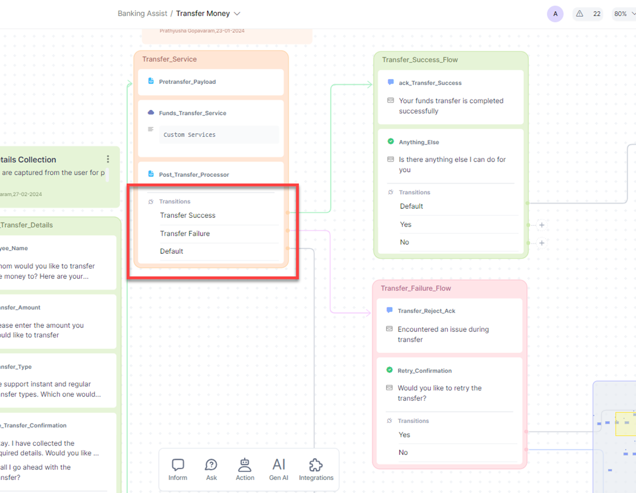
Each sequence contains one or more nodes placed in a logical sequence and a Transition section at the end, through which you can either continue the flow of dialog to the next sequence or split the flow into two or more paths based on conditions.
You can set connections between two sequences; Drag the connector  from the source sequence to the required destination sequence. Please note that by default, the connection will be from the last node of the source sequence to the topmost node on the destination sequence.
Connections can be set or changed on the canvas by dragging the transition arrow or through the Connections settings on the Component Properties panel.
You can also add a sequence between two existing sequences. Below are the steps to do that:
- If you add the new node directly to the canvas, a new sequence will be created containing the newly added node.
- Set the connection between the source sequence and the new sequence.
- Set the connection between the new sequence and the Destination sequence.
To delete a sequence, right-click it and select Delete from the menu.
Warning
The deleted sequences cannot be restored.
Nodes
Nodes are the different points at which components of your conversation intersect. Each kind of node has a set of distinct features and can be used to fulfill a specific purpose, like displaying a text message, providing the user a digital form to provide data, gathering a specific piece of data from the user, accessing data files, etc.
For details, please see Node Types.
You can add nodes inside or outside sequences. You can also drag and drop nodes or add them using the connector next to a sequence. Adding a node using a connector will automatically create a new sequence containing the new node and Transition. Read more.
To delete a node, right-click it and select Delete from the menu.
Warning
Deleted nodes cannot be restored on the canvas. However, they will still be available in the Assets tab of the Index panel.
Notes, Comments and Bookmarks
You can use Notes, Comments, and Bookmarks to easily record and collaborate between app users.
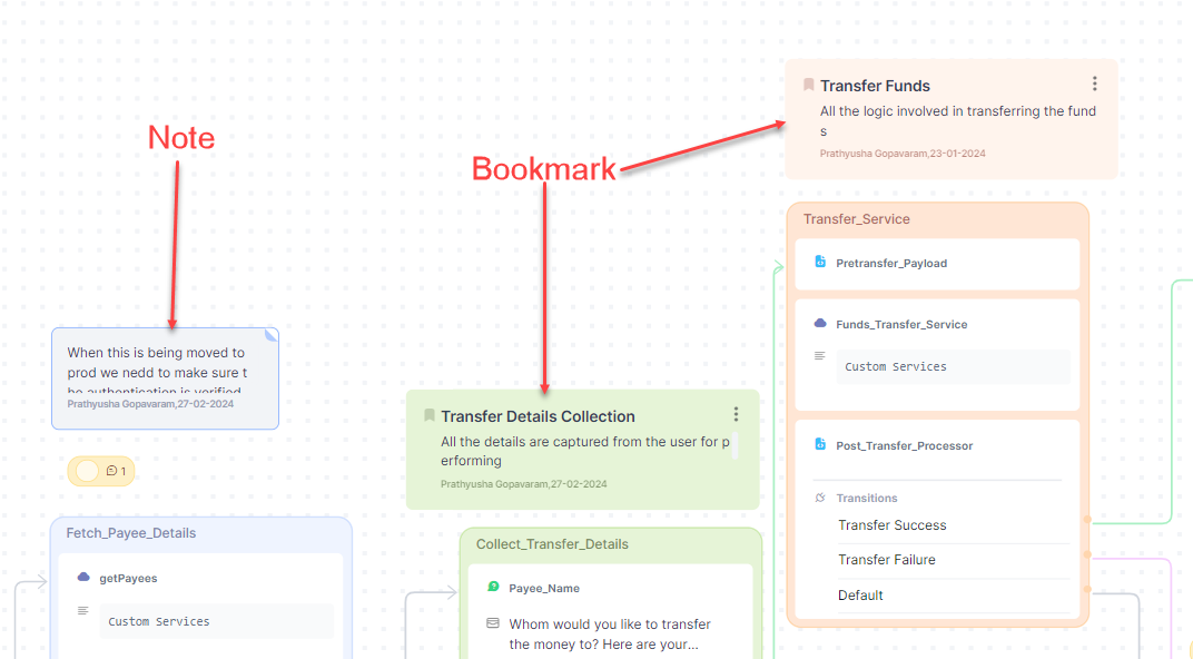
You can place Notes on strategic points on the canvas and write down the dialog's introduction, a list of subtasks, and the purpose of each subtask.
Using Bookmarks, you can create navigation points in a dialog with a complex structure so that you can quickly navigate to the bookmarked points without having to manually search the entire design. You can mention the specific point of the dialog flow in the bookmarks as an easy reference for other users.
Comments are effective in creating a collaborative environment. Often, in the course of development, at some point, you may need help and input from other bot users. For example, you need them to pitch in with their knowledge about the business logic or functional expertise or need clarifications in order to proceed. In such situations, you can place a comment wherein you can tag the respective user and mention your need.
Below action can be performed:
- Add new comment: You can add a comment by selecting the comments icon available in the header and placing the comment anywhere on the canvas. You can also right click on canvas to add comments. A text area opens where you can type in the comment.
- View comment: You can see a user icon and reply count where the comment has been posted. Mouse hover on the icon displays the preview of the first comment. Clicking on the comment icon opens the comments panel with the selected comment’s thread.
- Respond to a comment: You can respond to the comment from the individual comments thread.
- Resolve Comment: You can resolve the comment by clicking the
 icon once discussion in the thread is closed. The Resolve option is available in the View Comments panel too.
 - Delete comment/reply: You can delete the comment or a reply. Note that you can delete a comment or reply only if it is posted by you. Also, deleting the main comment will delete all the responses too.
- Edit comment/reply: You can edit the comment or a reply. Note that you can edit comments or replies only if they are posted by you.
-
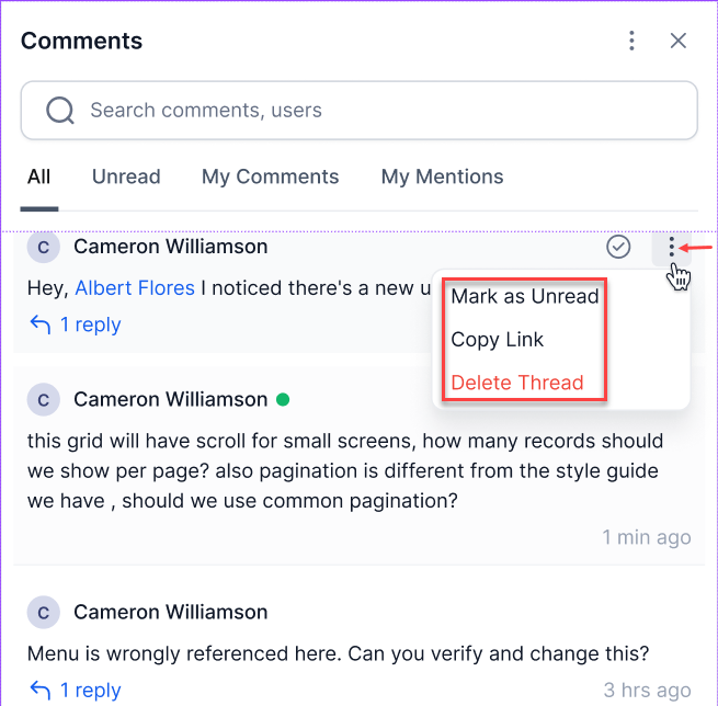
Other Options (At thread level)
- Mark as Unread - You can mark a comment as Read
- Copy link - Clicking on this option,you can copy the link of the comment. When you access the link, you are panned to the relevant comment
- Delete Thread - You can delete the entire thread if the main comment is posted by you
-
Mention and Notification: You mention others in comments using @ followed by their name, triggering notifications to ensure that the mentioned team members are aware of the discussion.
-
Other Features:
-
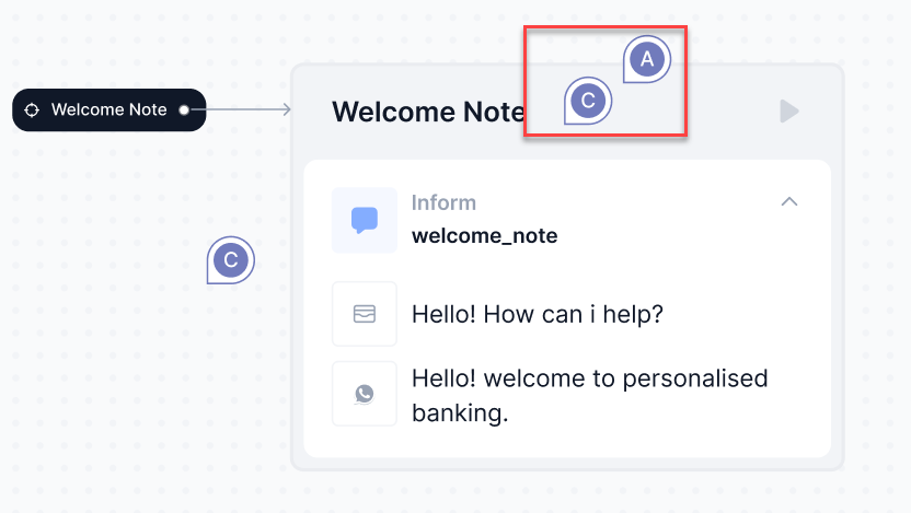
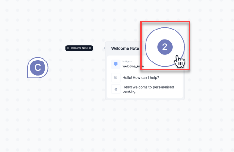
Zoom Out Preview - When canvas is zoomed out, the nearby comment icons are clubbed and displayed with the count.
Zoom In view
Zoom Out view
-
Timestamp - Time stamp will be displayed in the comment thread as well as the comments panel. It will be shown as “relative time indicators” and the complete timestamp will be displayed on hover
-
-
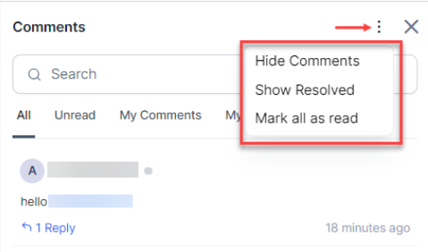
Options in the Comments Panel
Mini map
It is a miniature representation of the visual appearance of the dialog design.
Collaboration Tool
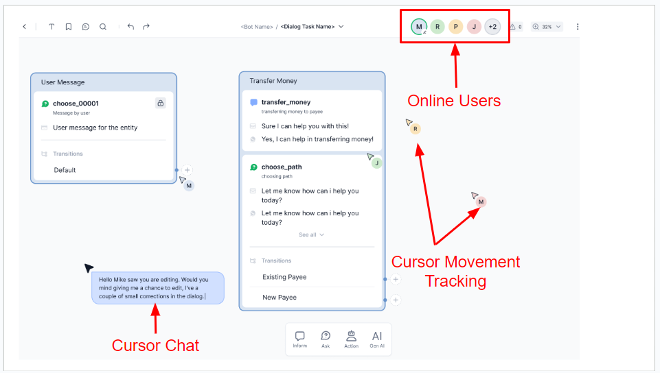
Real-time collaboration in the Dialog Builder allows team members to work together, seeing each other's actions and communicating instantly. This fosters better coordination, speeds up the dialog creation process, and improves overall quality through better coordination.
Real-time collaboration features:
- Live presence awareness: As an app developer enters the dialog builder, the cursor display and the avatars in the header reveal the presence of other active team members.
- Color-coded cursors: Each team member's cursor is assigned a distinctive color that matches the header's avatar icon. This allows users to be easily identified as their cursors move fluidly through the canvas.
- Instant cursor chat: The team communicates seamlessly, leveraging cursor chat, enabling real-time commenting features. To initiate a cursor chat, use Cmd+/ on Mac or Ctrl+/ on Windows, or right-click on the dialog builder and select Cursor Chat.
- Collaborative viewing: While one user edits the dialog, other users are allowed to view it. Cursor display ensures that each team member can see where others are working. The first user to open the app is granted edit rights, while others join as viewers.
- Dialog Access Claim: When the user currently editing exits the dialog, a notification alerts other users to claim the edit access. The first user to click and claim this access can edit the dialog.
Add node to dialog
There are two ways to add a node:
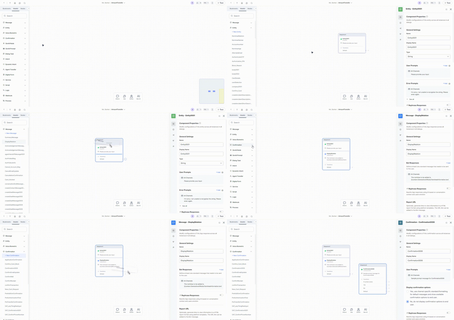
- Drag and drop nodes from the panel onto the dialog builder, see below.
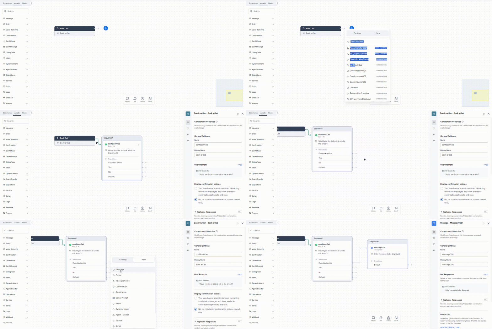
- You can also use the options on the Dialog Builder Canvas using Connector; see below.
Use Drag and Drop
You can add nodes within the dialog task by dragging them from the Index panel on the left or the Node panel at the bottom to the designated place on the canvas. You can drop the node within an existing sequence or outside the existing sequences; in this case, a new sequence will be created automatically, containing the newly added node.
You can also add a node directly on the canvas, creating a new sequence. You can then drag and drop the node to an existing sequence, if required.
Use the Dialog Canvas
Click the  button in the Transition node of the sequence after which you want to add another node. You will see a list of all the nodes created in the current app, along with the node type and an option to create and add a new node, and you can select any of these to add.
Add If-Else Connections
You can add conditions to the sequence by adding an If-Else connection in the Transition section of the sequence. This is where you can set the execution path based on the condition.
To do this, hover over the Transitions section and click Add New. Learn more.
You can also set connections through the Connection Properties.
Node Properties
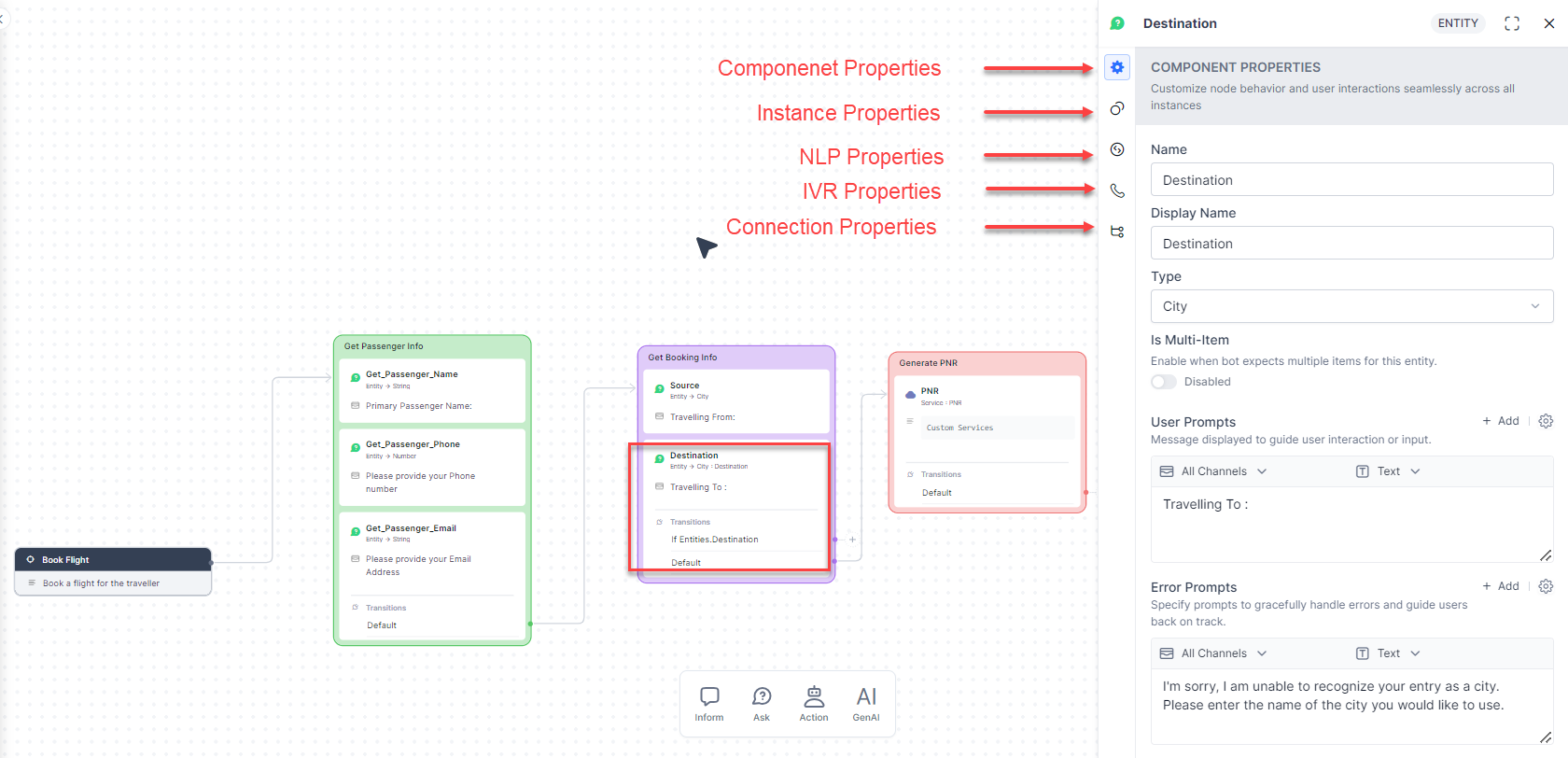
Clicking on a node will open its Properties panel, which includes specific features depending on the type of node you are working with. Please consult the documentation on Node Types to learn more about what is included in each. So, noting that some nodes may not come with some features, here is a general overview of what is available within this panel:
- Component Properties such as name, type, and component-specific properties.
- Instance Properties can be customized for the selected node for the current dialog.
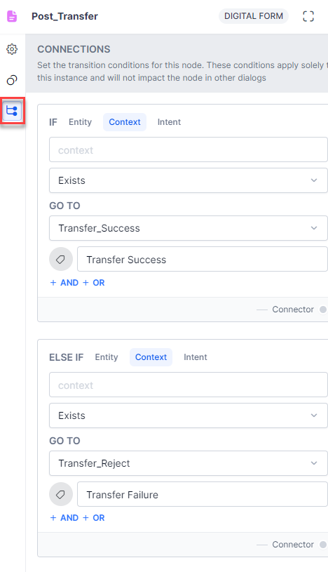
- Connection Properties can be used for configuring transition conditions. (Only available for the bottommost node in a sequence)
- NLP Properties for intent and entity recognition.
- Voice Call Properties for IVR channels (available for certain nodes only after IVR integration).
Visual Appearance of Flow Design
The dialog builder lets you create visually appealing dialog designs by offering design settings for components.
Bookmarks and Notes
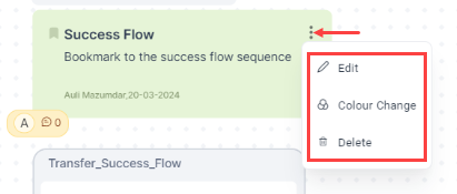
The platform provides the following options for customizing notes and bookmarks:
- Edit: To edit the contents.
- Delete: To delete the bookmark or the note from the canvas
- Color Change: To change the color of the bookmark or note. You can use custom colours to improve visibility and collaboration.
You can see these options by right-clicking the note and clicking the 3-dot menu icon on the bookmark.
Sequences
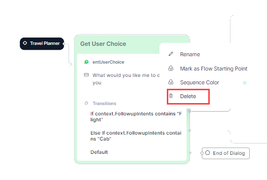
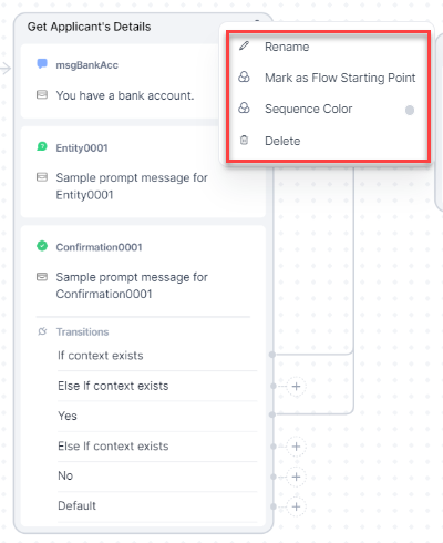
You can see the following visual customization options for a sequence by right-clicking it:
- Rename: You can rename a sequence based on your preference and logic. By default, the name is Untitled; you can name and rename it as many times as you need.
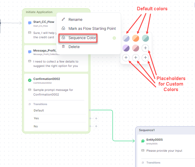
- Mark as Flow Starting Point: Using this option, you can mark a sequence as the starting point of the dialog flow. When you do so, the connector arrow from the root intent points to the first node of this sequence.
-
Sequence Color: You can change the color scheme (Border and Fill colors) of a sequence. The platform provides six default color schemes to choose from. This can be useful in case you need to visually indicate a split of flow, positive and negative flows, etc.
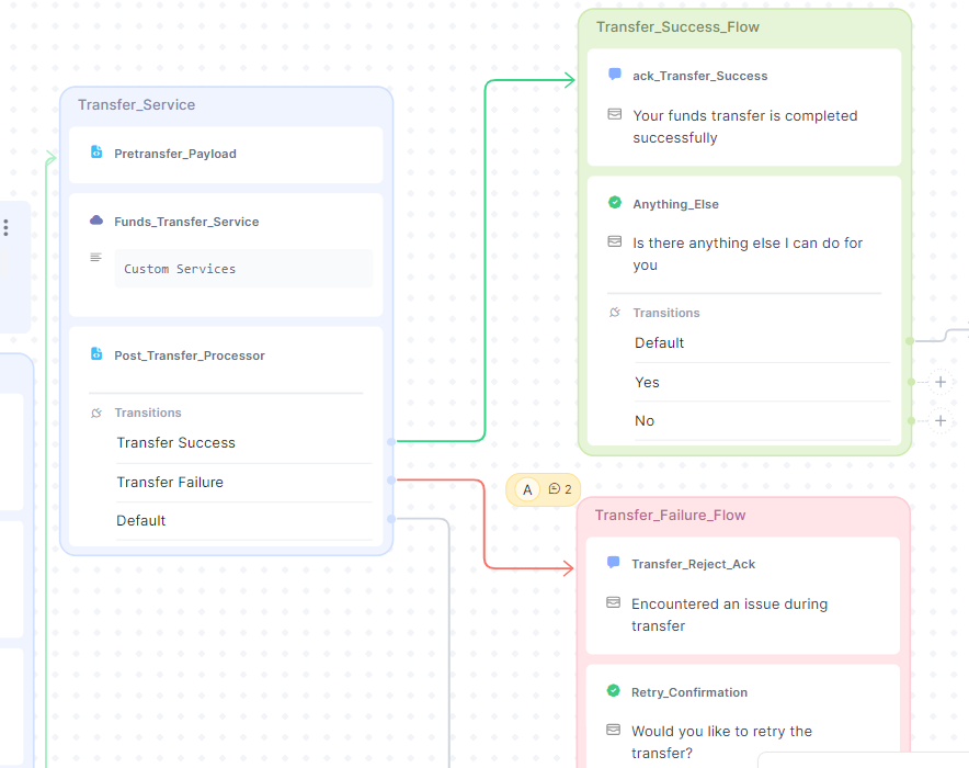
For example, in the image below, green and red colors have been used for sequences that contain the positive and negative flows, respectively.
You cannot change the default color schemes, however, you can add your own custom colors or edit the custom colors available on the palette. The border color is auto-populated based on the color you select.
Custom colors are saved at Dialog level.
-
Delete: This option allows you to delete the sequence. Note that deleted sequences cannot be restored; however, the nodes that were added to the sequence will still be available for use in the Assets tab of the Index panel.
Refer here for details on grouping of nodes in a sequence
Connector Arrows
The platform provides customization options for Connector arrows, which can enhance their visual appeal and facilitate comprehension of the flow. When you click on an arrow, you can see a panel containing these options.
Below are the options:
- Info: When you click this icon, you can see the Source sequence (ORIGIN) and Destination sequence (CURRENT) in the arrow.
- Style: By clicking this icon, you can see the styles available for the connectors.
- Thickness: You can set the thickness of the connector arrows through this option.
- Color: You can pick a color for the connector arrow through this option.
- Delete: You can delete a connector arrow. Note that this will not impact other connectors or sequences; only the connection properties of the node from where the connector originated will be reset.
The ‘More Options’ Menu
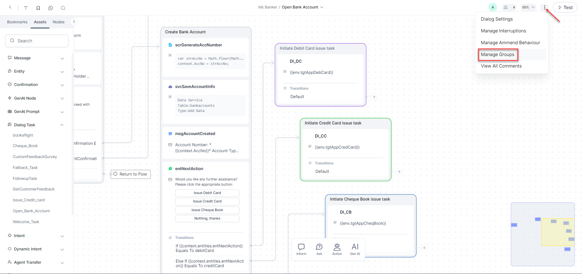
The More Options menu at the top right of the Dialog Builder shows shortcuts to dialog settings, manage interruptions, amend behavior, manage groups, and view all comments.
Dialog Settings
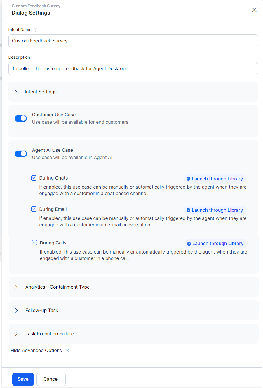
The Dialog Settings panel allows you to modify the dialog task's basic settings and set the visibility of a dialog to create a hidden dialog task that is available for use but not shown as a task. You can access Dialog Settings using the More Options menu.
Add or modify the following settings for your dialog:
- Name – The name of your dialog task, usually the main user intent. For example, Book Ticket.
- Description – An optional description of your dialog task displayed in the XO Platform.
-
Intent Settings:
- Sub intent only dialog – The task is invoked only as a sub-task when another task is in progress. It is not presented as a task when the user requests help.
- Hide from help – The task is not presented as a task when the user requests help. Users can invoke this task anytime while talking to the assistant.
This option is selected automatically when the Sub intent only dialog option is selected. You can manually deselect it.
-
Customer Use Cases – Select if this dialog task is available for end users (customers).
-
Agent AI Use Cases - Select if this dialog task is available for agents.
- Enable or disable the following options in this section:
- During Chats: If enabled, agents can manually or automatically trigger this use case when they are engaged with a customer in a chat channel.
- During Calls: If enabled, agents can manually or automatically trigger this use case when they are engaged with a customer in a phone call.
- During E-Mails: If enabled, agents can manually or automatically trigger this use case when they are engaged with a customer in an email conversation.
- Launch through Library:
- Enabled: The dialog task is listed under all available dialog tasks in the Search tab of the widget.
- Disabled: The dialog task doesn’t appear on the list, but remains searchable via the “Ask a question” search bar in the Search tab of the Agent AI widget, allowing agents to browse and find this use case to trigger it.
- Launch through Library:
- Enable or disable the following options in this section:
-
Analytics - Containment Type(Any one option can be selected): * Abundance as Self Service: Users can abandon the conversation while executing the dialog. * Abundance as Drop Off: Conversations can be abandoned by users or due to any failure during dialog execution.
- Follow-up Task – The follow-up task array contains all the intents detected from user utterances from this dialog. You can either: * Handle the follow-up tasks as part of node connections (default setting) or * Let the user select the follow-up task.
- Task Execution Failure – Define the assistant’s behavior when there is an error in task execution. It can be set as either: * Same as the Bot Level behavior. * Specific to this task – initiate a task, run a script, or show a message.
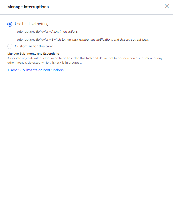
Manage Interruptions
The Manage Interruptions options allow you to select if and how a user can switch to another task and exit strategies. It can be set up at the VA, task, and node levels to ensure the configurations are layered to suit your various business requirements. You can also add conditional exceptions between tasks with the ability to pass contextual data between them.
Click here to learn more.
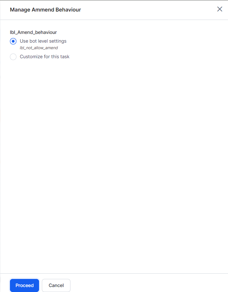
Manage Ammend Behavior
Using Amend Entity, you can allow the users to amend entity values and control post-amendment dialog behavior.
Click here to learn more.
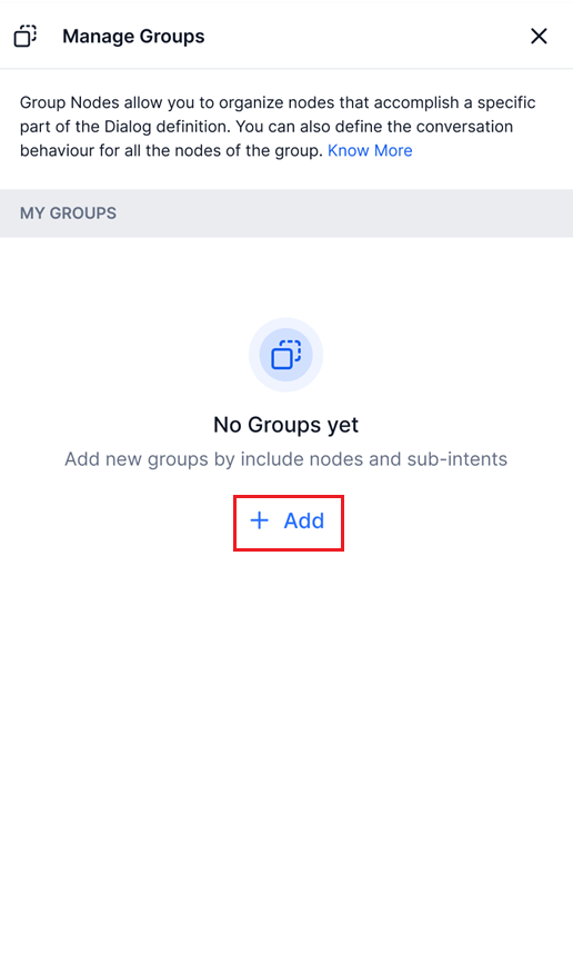
Manage Groups
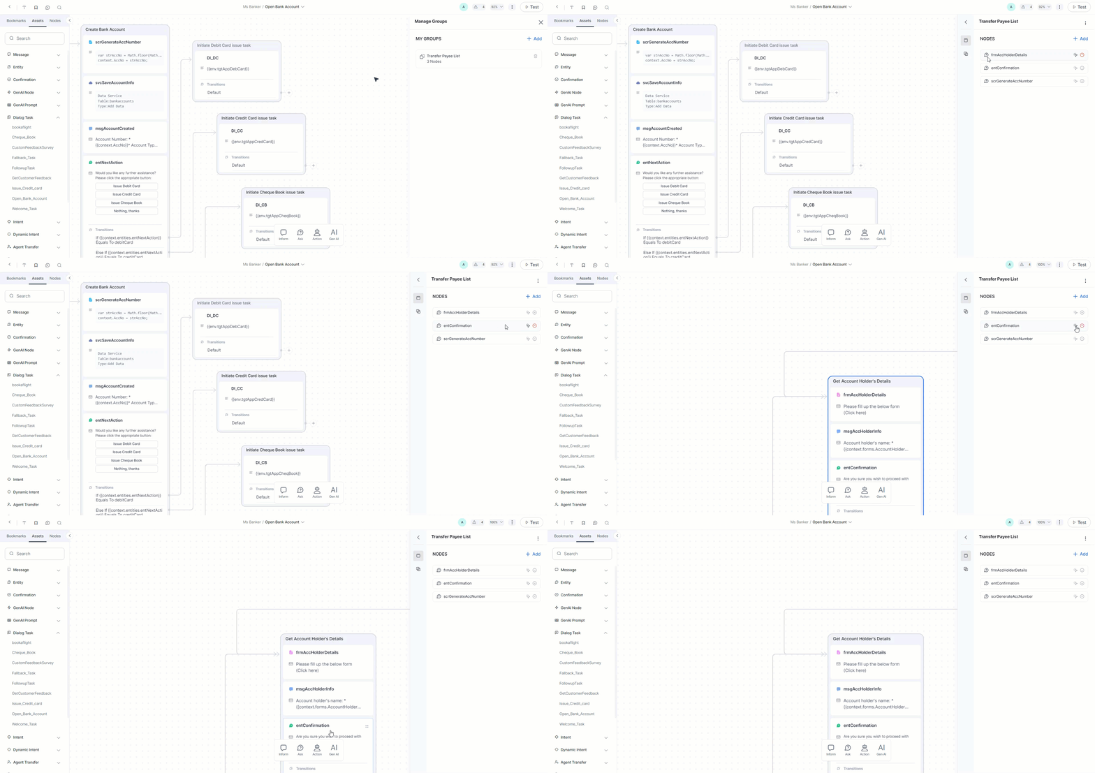
Using this option, you can create and manage Node Groups.
Click here to learn more.
Node Groups
Node groups are primarily used for defining a group of nodes.
Advantages of grouping Nodes in a sequence
-
Grouping nodes allows for automatic back-to-back transitions between consecutive nodes.
-
Complex conversation flows can be broken down into logical groups, each responsible for a specific function, making the design easier to manage and understand.
-
Inputs and outputs can be handled at the group level, allowing users to focus on group interfaces without needing to manage every node.
-
Groups help maintain a clean and structured flow, which is useful in large or multi-functional bots.
-
Node groups support better handling of follow-ups, digressions, and amending entity values.
Create the Node Group
To create node groups, follow the below steps:
-
On the Dialog Builder, navigate to More Options > Manage Groups
-
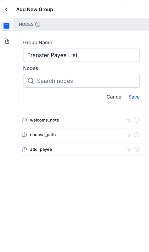
Click +Add.
-
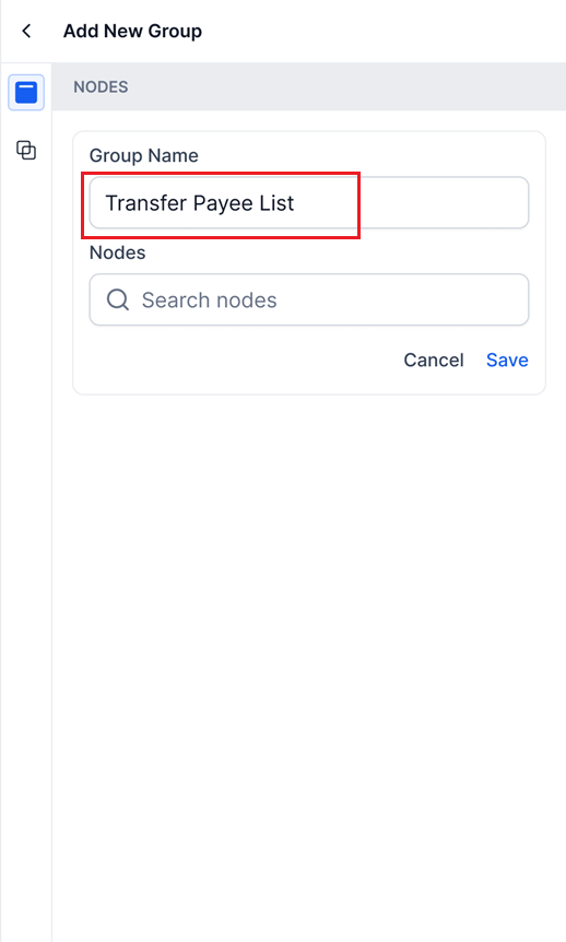
Provide a group name.
-
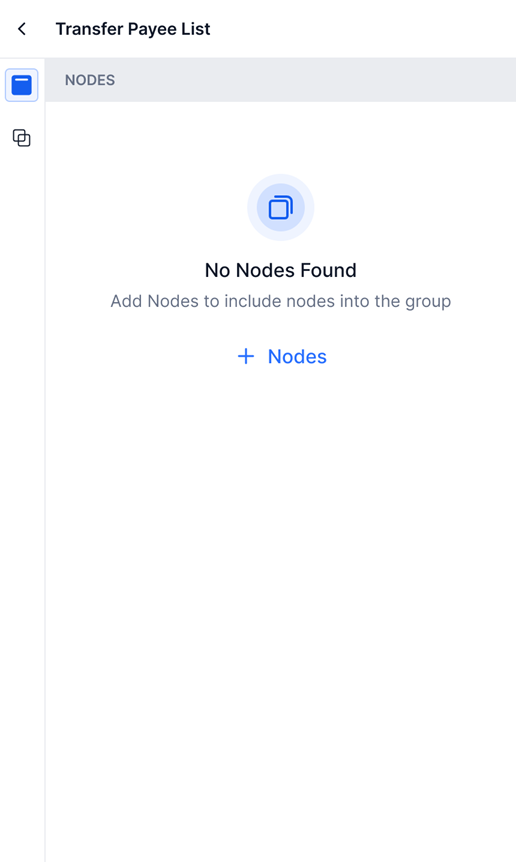
You can either create an empty group by clicking Save,
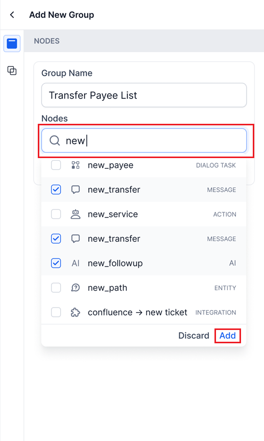
Or you can also add one or more nodes to the group right at the time of group creation. Perform a search for node names and click Add.
You can manage groups by editing the group, and adding and removing nodes.
Edit the Node Group
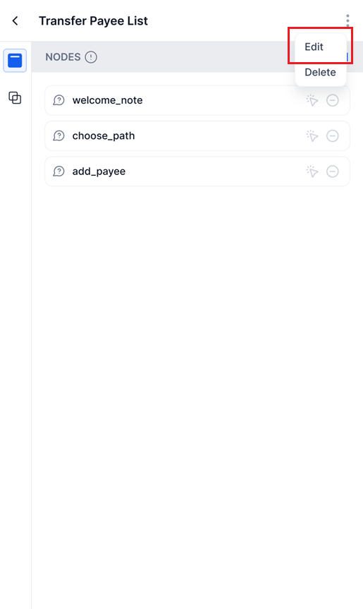
On Right-clicking on a group name, you get a menu containing Edit and Delete.
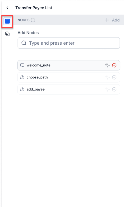
On clicking Edit, you can edit the name of the node group, as well as add or remove nodes. And finally, save the changes.
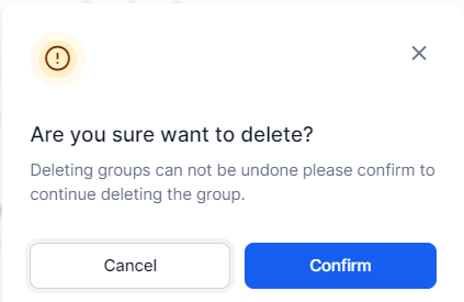
On clicking Delete, you get a popup warning; the group will be deleted if you click Confirm.
Warning
You cannot undo the deletion.
Add node to a group
Follow the below steps to add a node to an existing group:
-
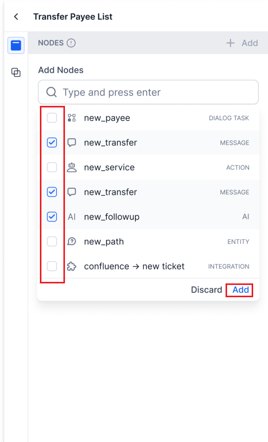
In the Manage Group panel, click the group name to which you want to add the node and then the Nodes icon. The list of nodes within the group appears with a search field.
-
Out of the nodes that appear as search results, you can select one or more nodes by checking the corresponding check boxes and then click Add to add them to the group.
Highlight Nodes
You can locate a node that is added to a group on the canvas. Click on the arrowhead icon ( ) corresponding to a node, and the sequence containing that node will be highlighted.
Delete node
You can hover over a node to get the Delete option. Once deleted, the node will no longer be a part of the group; however, you can add it again.
Subintent
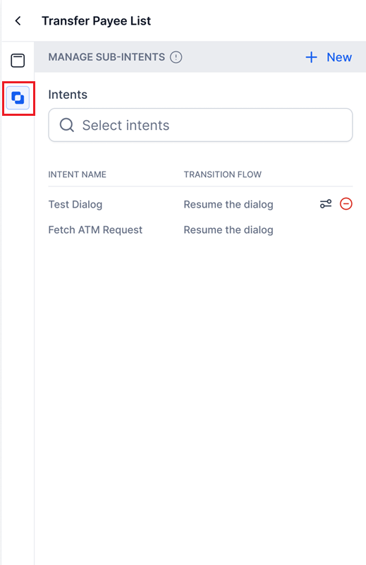
If you are using the group to set up a Subintent, you can do so by navigating to the required node group and clicking the Intents button. For additional information, please see Grouping Nodes as Subintents.
View All Comments
Through this option, you can view all the comments added to the current dialog.
