Insights provides analytics and monitoring for your AI agent program. It brings together executive dashboards, evaluation pages, voice channel diagnostics, and a configurable pipeline framework in a single section, giving teams visibility into agent quality, customer sentiment, operational efficiency, and cost performance.
| Insight | Purpose |
|---|
| Dashboard | Executive overview with KPIs, trend charts, outcome distribution, ROI metrics, and a filterable conversation list |
| Analytics | Event volume, LLM performance, cost tracking, and session/trace exploration with granular time ranges |
| Billing and Usage | Billing-unit consumption reporting with time-range controls for cost governance |
| Agent Performance | Per-agent quality scorecards with side-by-side comparison, status flagging, and quality trends |
| Quality Monitor | Aggregated quality health across five evaluation dimensions with trend analysis and issue flagging |
| Customer Insights | Intent distribution, sentiment trajectory, frustration detection, and resolution tracking |
| Feedback | End-user ratings and verbatim comments captured from chat sessions, with multi-filter controls |
| Voice Analytics | Call quality (MOS), ASR accuracy, end-to-end latency, barge-in, and DTMF fallback metrics |
| Agent Transfer | Efficiency, queue performance, and human-agent metrics for escalated conversations |
| Pipelines | Built-in and custom analytics pipelines with a visual node-based editor for custom evaluation logic |
Before You Begin
Confirm the following before working with Insights pages:
- You must have at least Viewer-level access to the project.
- Agent Performance, Quality Monitor, and Customer Insights require analytics pipelines enabled in Settings. Without pipelines, these pages display a placeholder prompting you to enable them.
- Voice Analytics requires at least one voice channel deployment to generate data. Without a voice deployment, the page is empty.
- Dashboard KPI cards, such as Quality Score and Avg Sentiment, display a dash (–) until pipelines evaluate sufficient conversation data.
Accessing Insights
Navigation: Project → Sidebar → Insights
The Insights sidebar lists all available pages. Click any page name to navigate directly.
Dashboard
The Dashboard page provides a pre-built executive overview of your AI agent program. It aggregates key performance indicators, trend visualizations, outcome breakdowns, and a conversation-level drill-down into a single view, giving stakeholders immediate visibility into agent performance without any configuration. Use it as the starting point for daily operational checks or to prepare data for leadership reviews.
Navigation: Project → Insights → Dashboard
Date range selector: A toggle in the top-right corner lets you select 7d, 30d (default), or 90d. Changing the range refreshes all KPI cards, charts, and conversation data on the page.
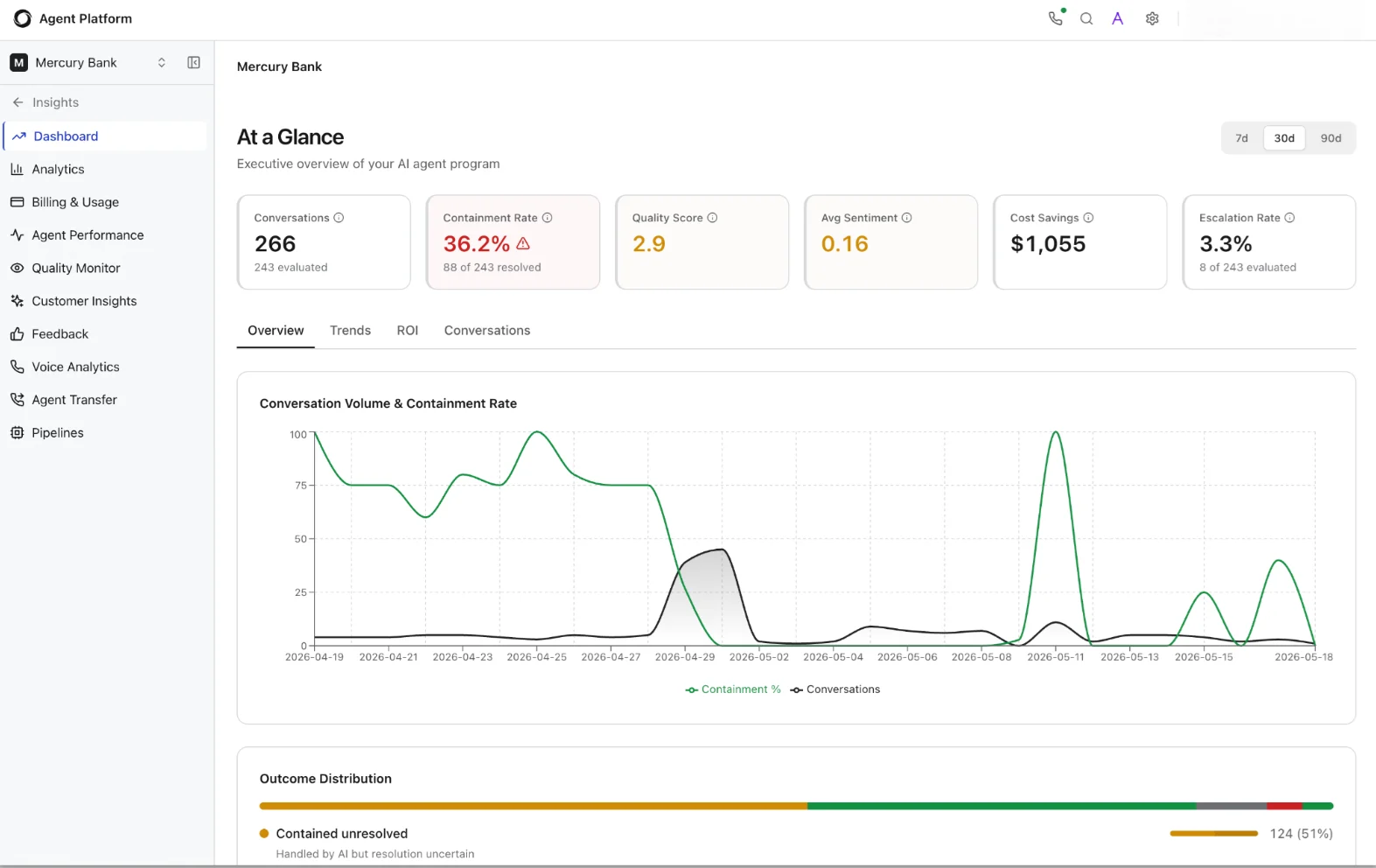 KPI Metric Cards
Six metric cards appear at the top of the page. Each card displays a primary value and, where applicable, a sub-label with supporting context. Warning icons appear on cards where the metric falls below expected thresholds.
KPI Metric Cards
Six metric cards appear at the top of the page. Each card displays a primary value and, where applicable, a sub-label with supporting context. Warning icons appear on cards where the metric falls below expected thresholds.
| Metric | Description |
|---|
| Conversations | Total conversation count in the selected period. The sub-label shows how many conversations pipelines evaluated. |
| Containment Rate | Percentage of sessions the agent resolved without human escalation. A warning icon appears when the rate drops below the platform-configured threshold. The sub-label shows the resolved count versus the total evaluated. |
| Quality Score | Aggregated quality score across all evaluated conversations, derived from pipeline evaluations. Displays a dash (–) if no quality pipeline has processed data yet. |
| Avg Sentiment | Average sentiment score across all conversations in the period. Displays a dash (–) if the sentiment pipeline has not yet run or if the platform lacks sufficient data. |
| Cost Savings | Estimated cost savings compared to human-handled conversations. A positive value indicates cost-efficiency; a negative value indicates the program has not yet reached cost parity with human support. |
| Escalation Rate | Percentage of sessions escalated to a human agent. The sub-label shows the escalated count versus the total evaluated. |
| Tab | What it shows |
|---|
| Overview | A Conversation Volume & Containment Rate trend chart plotting daily conversation count and containment percentage over the selected period. Below the chart, an Outcome Distribution horizontal bar breaks down conversations into three categories: Resolved (green), Contained-unresolved (amber: the AI handled the conversation but resolution remains uncertain), and Escalated (red). Each segment shows its count and percentage. |
| Trends | Longitudinal trend lines for all core KPIs, conversations, containment, quality, sentiment, cost savings, and escalation, over the selected period. Use this tab to identify sustained improvements or regressions across multiple metrics simultaneously. |
| ROI | Return-on-investment metrics comparing agent costs to human-handled baselines. Includes cost-per-conversation, total savings, and efficiency ratios. |
| Conversations | A filterable, sortable list of individual conversations with columns for status, outcome, agent name, duration, and key metrics. Click any row to open the full conversation detail. |
Analytics
The Analytics page monitors event volume, LLM performance, token consumption, and cost in near real time. Unlike the Dashboard, it offers granular time controls down to 30-minute windows—useful for investigating production incidents, tracking the impact of model changes, or auditing LLM spend during peak traffic.
Navigation: Project → Insights → Analytics
Time range controls
Analytics supports the most granular time ranges in the Insights section: 30m, 1h, 3h, 6h, 12h, 24h, 2d, 7d, 30d, or a Custom range where you specify exact start and end timestamps. This granularity is especially useful for correlating agent errors or latency spikes with specific deployment events.
 Overview Tab
Six metric cards summarize the selected period at a glance:
Overview Tab
Six metric cards summarize the selected period at a glance:
| Metric | Description |
|---|
| Sessions | Total sessions in the selected period. A session represents a single end-to-end interaction between a user and the agent system. |
| Messages | Total messages across all sessions, including both user messages and agent responses. |
| LLM Calls | Total LLM API calls agents made during the period. Includes calls to all configured models (for example, routing, generation, evaluation). |
| Errors | Total errors during agent execution, including LLM failures, timeout errors, and tool invocation errors. |
| Tokens | Total LLM tokens (input + output) across all calls. |
| Cost | Estimated cost based on token usage and per-model pricing. Use this to track spend against budgets or compare cost-efficiency across model configurations. |
| Tab | Purpose |
|---|
| LLM Performance | Model-level metrics including per-call latency distributions, average tokens per call, error rates by model, and throughput. Use this tab to benchmark model performance and identify candidates for optimization or replacement. |
| Sessions Explorer | Browse and filter individual sessions with full conversation details, trace counts, token usage, and duration. Each session row expands into a detailed view with turn-by-turn replay, token breakdown, and model information. |
| Traces Explorer | Search and inspect individual trace events across sessions. Filter by event type, agent name, or error status to isolate specific execution paths for debugging. |
| Query | Run custom analytics queries against project event data using a query interface. Useful for ad-hoc investigations that don’t fit pre-built views. |
| Section | Details |
|---|
| Session header | Session ID, agent name, trace status badge (for example, “history / partial”), total traces, total tokens, and session cost in a summary bar at the top. |
| Conversation pane | Full turn-by-turn dialog replay showing user messages and agent responses. Each agent’s turn displays the responding agent’s name and response latency. Multi-agent sessions show hand-offs between agents. |
| Session Overview tab | Agent name, session ID, message count, trace event count, connection state (Connected / Disconnected), and timestamps (Started, Finished). |
| Token Breakdown | Tokens In, Tokens Out, Total Tokens, LLM Calls count, and total Cost in a grid of metric cards. |
| Models Used | Lists each LLM model the session invoked, with its model identifier and version string. |
| Trace tabs | Tabbed navigation across: Overview, Traces, Errors, Data, Conversation, Performance, IR (Intermediate Representation), and a Traces download option. |
| Timeout Diagnostics | Browser idle timeout and Access Token TTL values for the session, useful for diagnosing disconnections. |
Billing and Usage
The Billing and Usage page provides a consolidated view of your project’s billing-unit consumption, enabling finance and operations teams to monitor spend, forecast costs, and ensure the project stays within allocated budgets. The platform calculates billing data from materialized processing batches, so there may be a short delay before the most recent usage appears.
Navigation: Project → Insights → Billing and Usage
Use the time range selector to view usage for the last 7 days, 30 days, or 90 days. The page displays aggregated billing-unit counts, breakdowns by resource type (LLM calls, token consumption, pipeline executions), and trend lines showing usage over the selected period.
The Agent Performance page lets you monitor and compare the quality of every agent in your project across all evaluation dimensions. It surfaces which agents are performing well, which need attention, and how quality trends over time—useful for multi-agent architectures where different agents handle different conversation types.
Navigation: Project → Insights → Agent Performance
Date range selector: Use the toggle in the top-right corner to select 7d, 30d, or 90d. A Compare button next to the date selector opens a side-by-side agent comparison view.
 Agent Health Summary
A banner at the top of the page displays the total number of agents, total conversations evaluated, and a status breakdown showing how many agents the system flags as Critical (red) versus Healthy (green). This gives you an instant read on overall agent health before diving into individual scores.
KPI Metric Cards
Five metric cards show aggregated scores across all agents:
Agent Health Summary
A banner at the top of the page displays the total number of agents, total conversations evaluated, and a status breakdown showing how many agents the system flags as Critical (red) versus Healthy (green). This gives you an instant read on overall agent health before diving into individual scores.
KPI Metric Cards
Five metric cards show aggregated scores across all agents:
| Metric | Description | Scale |
|---|
| Quality | Aggregated quality score across all evaluated conversations. A warning triangle appears if the score falls below the threshold. | 0–5 (avg score) |
| Hallucination Rate | Percentage of agent responses the system flags for unsupported claims, self-contradictions, or factual inaccuracies. | 0–100% (lower is better) |
| Knowledge Gaps | Count of conversations where the agent lacked sufficient knowledge base coverage to answer the query. | Count (lower is better) |
| Safety Score | Guardrail pass rate, the percentage of responses passing all configured safety guardrails. | 0–100% (higher is better) |
| Context Score | Average score for how well agents preserved relevant conversational context across multi-turn interactions. | 0–5 (avg score) |
| Column | Description |
|---|
| Agent | Agent name. |
| Status | Health status: Critical (red badge) or Healthy (green badge), based on aggregate scores. |
| Conversations | Number of conversations the agent handled in the selected period. |
| Quality | Agent’s individual quality score (0–5). |
| Hallucination | Agent’s hallucination rate (%). |
| Knowledge Gaps | Count of knowledge gap detections for this agent. |
| Safety | Agent’s guardrail pass rate (%). |
| Context | Agent’s context preservation score (0–5). |
This page requires analytics pipelines. Enable pipelines in Settings to start tracking agent quality, hallucination rates, knowledge gaps, and more. Without active pipelines, the page displays a placeholder.
Quality Monitor
The Quality Monitor page provides a centralized health check across all evaluation dimensions. Use it to assess how quality is trending and which dimensions need attention. It aggregates outputs from multiple pipelines into a unified scoring view with trend analysis, dimension-level drill-downs, and issue flagging.
Navigation: Project → Insights → Quality Monitor
Date range selector: Use the toggle to select 7d, 30d, or 90d.
 Quality Health Summary
A banner at the top displays the total number of evaluated conversations, the aggregated quality score, and color-coded counts of dimension statuses: Critical (red), Warning (amber), and Healthy (green).
Evaluation Dimension Cards
Five dimension cards appear below the summary banner. Each card shows the dimension name, its current score or percentage, a mini sparkline showing the trend over the selected period, a count of flagged items, and a status icon (warning triangle for dimensions below threshold).
Quality Health Summary
A banner at the top displays the total number of evaluated conversations, the aggregated quality score, and color-coded counts of dimension statuses: Critical (red), Warning (amber), and Healthy (green).
Evaluation Dimension Cards
Five dimension cards appear below the summary banner. Each card shows the dimension name, its current score or percentage, a mini sparkline showing the trend over the selected period, a count of flagged items, and a status icon (warning triangle for dimensions below threshold).
| Dimension | Description | Scale | Target |
|---|
| Overall Quality | Aggregated quality score across all evaluated dimensions. | 0–100% | Higher is better |
| Faithfulness Score | Percentage of responses the system verifies as factually grounded and free of hallucinated content. Flags responses containing unsupported claims, self-contradictions, or fabricated information. | 0–100% | Higher is better |
| Knowledge Coverage | Percentage of queries where the knowledge base provides sufficient coverage to support the agent’s response. Gaps indicate topics that need additional knowledge base content. | 0–100% | Higher is better |
| Safety Score | Percentage of responses passing all configured guardrail safety checks. The system flags violations for review. | 0–100% | Higher is better |
| Context Preservation | Percentage of responses correctly maintaining conversational context across multi-turn sessions. Flagged items indicate where the agent lost or incorrectly applied context. | 0–100% | Higher is better |
Customer Insights
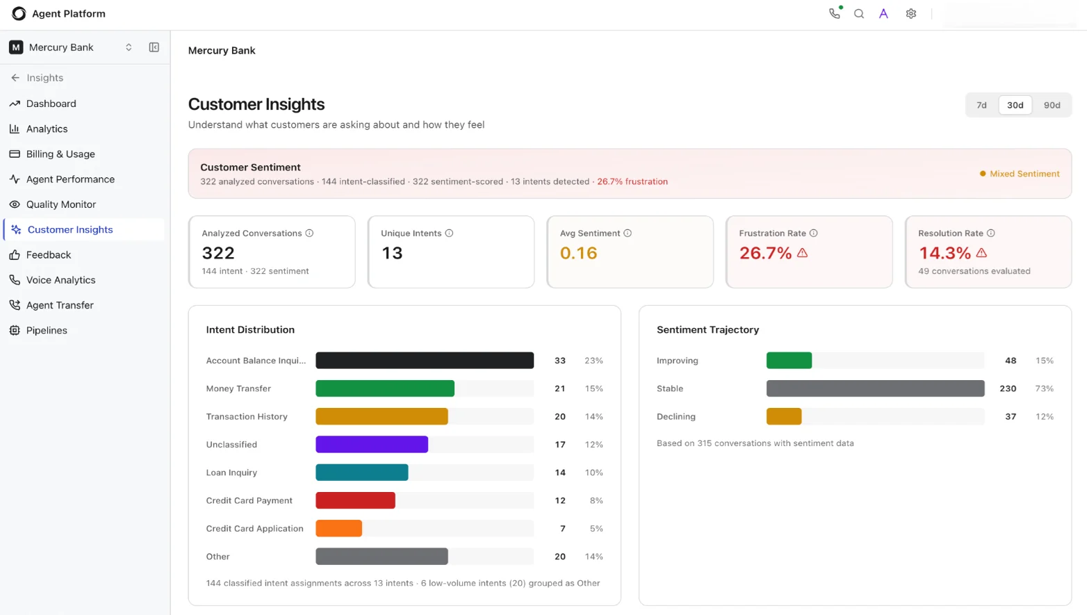
The Customer Insights page helps you understand what customers are asking about and how they feel about the experience. It combines intent classification, sentiment scoring, frustration detection, and resolution tracking into a single view to help you identify emerging topics, detect dissatisfaction early, and measure whether the agent resolves the intents it encounters.
Navigation: Project → Insights → Customer Insights
Date range selector: Use the toggle to select 7d, 30d, or 90d.
 Customer Sentiment Summary
A banner at the top displays a contextual summary of the analyzed data, for example: “322 analyzed conversations · 144 intent-classified · 322 sentiment-scored · 13 intents detected · 26.7% frustration.” A sentiment indicator (for example, “Mixed Sentiment”) provides a quick qualitative read.
KPI Metric Cards
Customer Sentiment Summary
A banner at the top displays a contextual summary of the analyzed data, for example: “322 analyzed conversations · 144 intent-classified · 322 sentiment-scored · 13 intents detected · 26.7% frustration.” A sentiment indicator (for example, “Mixed Sentiment”) provides a quick qualitative read.
KPI Metric Cards
| Metric | Description |
|---|
| Analyzed Conversations | Total conversations that pipelines analyzed in the selected period. The sub-label shows the breakdown. |
| Unique Intents | Number of distinct intents the system identified across all analyzed conversations. |
| Avg Sentiment | Average sentiment score across all conversations. A score near 0 indicates neutral sentiment; positive values indicate positive sentiment. |
| Frustration Rate | Percentage of conversations where the system detected user frustration signals (repeated questions, negative language, escalation requests). A warning triangle appears when the rate exceeds the configured threshold. |
| Resolution Rate | Percentage of conversations reaching successful resolution. A warning triangle appears when the rate drops below the threshold. The sub-label shows the count of resolved conversations the system evaluated. |
| Direction | Description |
|---|
| Improving | Conversations where sentiment trended positively over the course of the interaction. |
| Stable | Conversations where sentiment remained consistent throughout. |
| Declining | Conversations where sentiment deteriorated—candidates for investigation. |
Feedback
The Feedback page surfaces end-user feedback captured directly from chat sessions. It gives you access to raw ratings and verbatim comments so you can identify satisfaction patterns, detect underperforming agents or channels, and prioritize improvements based on what users say.
Navigation: Project → Insights → Feedback
Date range selector: Use the toggle to select Today, 7d, or 30d.
Filters
Four filter controls let you narrow feedback results:
| Filter | Description |
|---|
| All ratings | Filter by feedback rating. Use the dropdown to select a specific star rating or view all ratings. |
| Comment: any | Filter by comment presence. Choose whether to show all feedback, only entries with comments, or only entries without comments. Entries with comments are often the most actionable for qualitative analysis. |
| Agent name | Filter by the agent that handled the conversation. Type an agent name to narrow results, useful for isolating feedback for a specific agent after a deployment. |
| Channel | Filter by the channel through which the conversation occurred. Type a channel name to narrow results. |
Voice Analytics
The Voice Analytics page provides a dedicated dashboard for monitoring call quality, speech recognition accuracy, and end-to-end latency across the voice processing pipeline. For voice-enabled agents, use this page to ensure audio quality, recognition accuracy, and response latency meet caller expectations, and to diagnose degradations before they affect customer satisfaction at scale.
Navigation: Project → Insights → Voice Analytics
Date range selector: Use the toggle to select Today, 7d, or 30d.
 KPI Metric Cards
| Metric | Description |
|---|
| Total Calls | Number of voice calls in the selected period. |
| Avg MOS | Average Mean Opinion Score for call quality on a scale of 1–5. Scores below 3.5 typically indicate noticeable quality issues. |
| ASR Quality | Automatic Speech Recognition quality score (0–100, higher is better). Measures how accurately the ASR engine transcribes the caller’s speech. |
| E2E Latency | End-to-end latency in milliseconds for the voice processing pipeline. Covers the full round-trip from user speech input through ASR transcription, LLM processing, and TTS output back to the caller. |
| Barge-In Rate | Percentage of calls where the caller interrupted the agent mid-response. A rising barge-in rate may indicate that responses are too long or latency is too high, prompting callers to cut in. |
| DTMF Fallback | Percentage of calls falling back to touch-tone (keypad) input, typically when ASR fails to understand the caller. A rising rate may indicate ASR quality issues or unsupported accents/languages. |
| Chart | Description |
|---|
| Network Quality and Call Volume | Dual-axis chart plotting MOS scores and call count trends over the selected period. Use this to correlate call quality dips with volume spikes, quality often degrades during peak traffic if capacity-constrained infrastructure cannot keep up. |
| Speech Recognition Quality (ASR) | ASR quality scores plotted over time. Monitor for sustained degradation, which may indicate noisy caller environments, model drift, or the introduction of new vocabulary that the ASR model does not yet recognize. |
Track E2E Latency trends after model or pipeline changes. Even small latency increases (50–100ms) can affect caller experience and drive up barge-in rates.
Agent Transfer
The Agent Transfer page provides efficiency and performance metrics for conversations that AI agents escalated to human operators. It helps operations teams monitor transfer volumes, queue wait times, and human-agent performance to ensure that escalated conversations receive timely, high-quality support.
Navigation: Project → Insights → Agent Transfer
Date range selector: Use the toggle to select Today, 7d, or 30d.
The page organizes data into three sections:
| Section | What it shows |
|---|
| Efficiency | Transfer efficiency metrics split by channel: Voice, Chat, and overall Transfers. Includes transfer counts, average handling time, and resolution rates for escalated conversations. |
| Queue Performance | Queue-level metrics including average wait time, longest wait time, queue abandonment rate, and handling rates per queue. Use this to identify queues that are understaffed or experiencing unusual demand. |
| Agent Performance | Human agent performance metrics for transferred conversations, including conversations handled, average handle time, resolution rate, and customer satisfaction scores per agent. |
Pipelines
The Pipelines page is where Insights shifts from pre-built dashboards to user-defined analytics. The platform ships with built-in pipelines covering common evaluation needs—from sentiment analysis to anomaly detection—and provides a visual node-based editor for creating custom pipelines that encode your organization’s specific quality criteria. Pipelines are the engine behind Agent Performance, Quality Monitor, and Customer Insights: without active pipelines, those pages have no data to display.
Navigation: Project → Insights → Pipelines
Each pipeline card displays its name, description, enabled/disabled status (green “Enabled” badge or gray “Disabled” badge), trigger count, and last processed timestamp (or “Never processed” if the pipeline hasn’t run yet). Use the search bar at the top to find pipelines by name.
 Tabs
Tabs
| Tab | Purpose |
|---|
| Built-in | Pre-configured pipelines that ship with the platform, ready to enable with a single toggle. |
| Custom | User-defined processing workflows created using the visual pipeline editor. |
| Recent Runs | Pipeline execution history with timestamps, durations, status (success/failure), and links to output data. |
| Data | Pipeline output data available for dashboard integration, export, and downstream consumption. |
Built-in Pipelines
The platform ships with eleven pre-built pipelines covering evaluation, classification, detection, and monitoring needs. Enable each pipeline with a single toggle, no configuration required for the defaults.
| Pipeline | Description |
|---|
| Sentiment Analysis | Per-message sentiment scoring with conversation-level trajectory analysis. Feeds the Sentiment Trajectory chart in Customer Insights. |
| Intent Classification | Classifies conversation intent using LLM analysis with customer-defined taxonomy or auto-discovery. Feeds the Intent Distribution chart in Customer Insights. |
| Quality Evaluation | LLM-as-judge quality evaluation with configurable rubric dimensions. Feeds the Quality Score in Agent Performance and Quality Monitor. |
| Hallucination Detection | Detects unsupported claims, self-contradictions, and factual accuracy issues in agent responses. |
| Knowledge Gap Analysis | Identifies gaps in knowledge base coverage by analyzing retrieval precision and uncovered topics. |
| Guardrail Analysis | Evaluates guardrail effectiveness — detects false positives, false negatives, and bypass attempts. |
| Context Preservation | Evaluates whether agents preserve relevant user and workflow context through the conversation. |
| Friction Detection | Detects user frustration signals — rephrased questions, message escalation, caps, and exclamation patterns. |
| Anomaly Detection | Monitors analytics metrics for statistical anomalies using z-score and SPC (Statistical Process Control) charts. |
| Drift Detection | Monitors analytics metrics for gradual performance drift by comparing baseline and current windows. |
| Evaluation Run | Executes persona × scenario × evaluator matrix evaluation with bias mitigation and trajectory scoring. |
Custom Pipelines
Custom pipelines let you define your own analytics logic using a visual, drag-and-drop node-based editor. Use custom pipelines to build organization-specific evaluation criteria that go beyond the built-in set, for example, regulatory compliance checks, brand voice adherence, or domain-specific accuracy scoring.
How the editor works
The editor presents a visual canvas where you construct a pipeline as a directed graph of connected nodes. A Node Palette on the left side provides draggable node types organized into categories:
| Category | Node types |
|---|
| Data | Read Conversation, Read Message Window, Aggregate, Database Query, Filter, Transform Data, Inspect Output |
| Logic | Sub-Pipeline (reuse an existing pipeline as a step), Wait for Event (pause execution until a named event fires) |
 Pipeline structure
| Component | Description |
|---|
| Trigger | Defines when the pipeline runs. Trigger types include Kafka events, scheduled intervals, in-platform events (for example, conversation completed), or filtered subsets of sessions. |
| Processing nodes | The evaluation and transformation logic applied to each triggered item. Nodes can read conversation data, query databases, aggregate metrics, filter records, transform data shapes, or call LLMs for evaluation. |
| Metrics output | The results the pipeline produces. Metrics take the form of named, typed values (counts, percentages, scores) that appear in the Data tab and that you can wire into dashboards. |
Start with the built-in pipelines to establish baselines, then create custom pipelines for organization-specific quality dimensions. The validate-before-activate workflow catches configuration errors before pipelines go live.

