This page covers two closely related evaluation surfaces: Agent Performance, which scores individual agents across quality dimensions, and Quality Monitor, which tracks system-wide quality health. Both are powered by the same analytics pipelines and evaluate the same five dimensions — quality, faithfulness, knowledge coverage, safety, and context preservation. The typical workflow is to spot a problem in Quality Monitor and then switch to Agent Performance to identify which agent is responsible.

Agent Performance

The Agent Performance page lets you monitor and compare the quality of every agent in your project across all evaluation dimensions. It surfaces which agents are performing well, which need attention, and how quality trends over time — useful for multi-agent architectures where different agents handle different conversation types. Navigation: ProjectInsightsAgent Performance Date range selector: Use the toggle in the top-right corner to select 7d, 30d, or 90d. A Compare button next to the date selector opens a side-by-side agent comparison view. Agent Performance

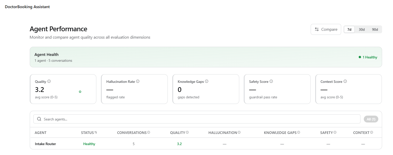
Agent Health Summary

A banner at the top of the page displays the total number of agents, total conversations evaluated, and a status breakdown showing how many agents the system flags as Critical (red) versus Healthy (green). This gives you an instant read on overall agent health before diving into individual scores.

KPI Metric Cards

Five metric cards show aggregated scores across all agents:
MetricDescriptionScale
QualityAggregated quality score across all evaluated conversations. A warning triangle appears if the score falls below the threshold.0–5 (avg score)
Hallucination RatePercentage of agent responses the system flags for unsupported claims, self-contradictions, or factual inaccuracies.0–100% (lower is better)
Knowledge GapsCount of conversations where the agent lacked sufficient knowledge base coverage to answer the query.Count (lower is better)
Safety ScoreGuardrail pass rate, the percentage of responses passing all configured safety guardrails.0–100% (higher is better)
Context ScoreAverage score for how well agents preserved relevant conversational context across multi-turn interactions.0–5 (avg score)

Agent Table

Below the KPI cards, a searchable, sortable table lists every agent with the following columns:
ColumnDescription
AgentAgent name.
StatusHealth status: Critical (red badge) or Healthy (green badge), based on aggregate scores.
ConversationsNumber of conversations the agent handled in the selected period.
QualityAgent’s individual quality score (0–5).
HallucinationAgent’s hallucination rate (%).
Knowledge GapsCount of knowledge gap detections for this agent.
SafetyAgent’s guardrail pass rate (%).
ContextAgent’s context preservation score (0–5).
Use the search bar to filter by agent name. Toggle between Critical and All using the filter pills to focus on agents needing immediate attention.

Quality Trend Chart

A time-series chart at the bottom of the page plots two lines, Avg Quality and Flagged, over the selected period. The shaded area between the lines highlights the quality gap, making regressions visually obvious. Hover over any point to see exact values and dates.
This page requires analytics pipelines. Enable pipelines in Settings to start tracking agent quality, hallucination rates, knowledge gaps, and more. Without active pipelines, the page displays a placeholder.
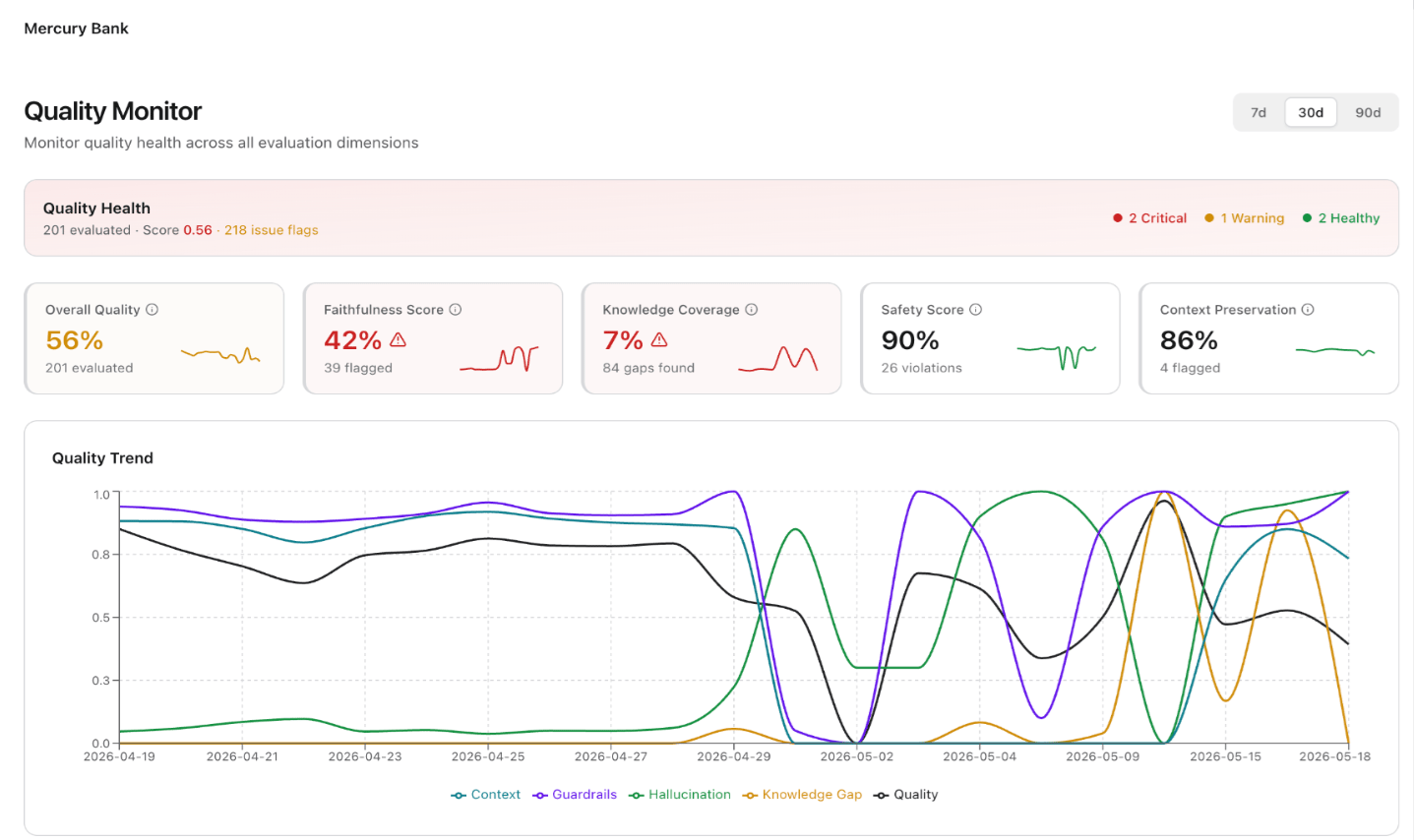
Quality Monitor

The Quality Monitor page provides a centralized health check across all evaluation dimensions. Use it to assess how quality is trending and which dimensions need attention. It aggregates outputs from multiple pipelines into a unified scoring view with trend analysis, dimension-level drill-downs, and issue flagging. Navigation: ProjectInsightsQuality Monitor Date range selector: Use the toggle to select 7d, 30d, or 90d. Quality Monitor

Quality Health Summary

A banner at the top displays the total number of evaluated conversations, the aggregated quality score, and color-coded counts of dimension statuses: Critical (red), Warning (amber), and Healthy (green).

Evaluation Dimension Cards

Five dimension cards appear below the summary banner. Each card shows the dimension name, its current score or percentage, a mini sparkline showing the trend over the selected period, a count of flagged items, and a status icon (warning triangle for dimensions below threshold).
DimensionDescriptionScaleTarget
Overall QualityAggregated quality score across all evaluated dimensions.0–100%Higher is better
Faithfulness ScorePercentage of responses the system verifies as factually grounded and free of hallucinated content. Flags responses containing unsupported claims, self-contradictions, or fabricated information.0–100%Higher is better
Knowledge CoveragePercentage of queries where the knowledge base provides sufficient coverage to support the agent’s response. Gaps indicate topics that need additional knowledge base content.0–100%Higher is better
Safety ScorePercentage of responses passing all configured guardrail safety checks. The system flags violations for review.0–100%Higher is better
Context PreservationPercentage of responses correctly maintaining conversational context across multi-turn sessions. Flagged items indicate where the agent lost or incorrectly applied context.0–100%Higher is better

Quality Trend Chart

A time-series chart plots all five dimensions as separate colored lines (Context, Guardrails, Hallucination, Knowledge Gap, Quality) over the selected period. Use this chart to correlate quality changes across dimensions — for example, a drop in Knowledge Coverage may coincide with a new intent category that the knowledge base doesn’t cover yet.

Dimension Details

Below the trend chart, a Dimension Details section lists individual evaluation results. Each row shows the evaluation name (for example, “Quality Evaluation”), its score, the number of flagged conversations, and a status badge (Warning, Critical, Healthy). Click a row to drill into the specific conversations that contributed to that score.