

Features
- Improved user experience with a single interface for input collection.
- Easy form creation using simple drag and drop actions.
- Vast component library to cater to all your form requirements.
- Provision to define rules for input validations and visibility suiting your use case.
- Automatic dialog task generation from the Form enabling switching between Form or Conversation experience based on the channel of interaction.
General Setup
You can access Digital Forms from Automation AI > Use Cases > Digital Skills.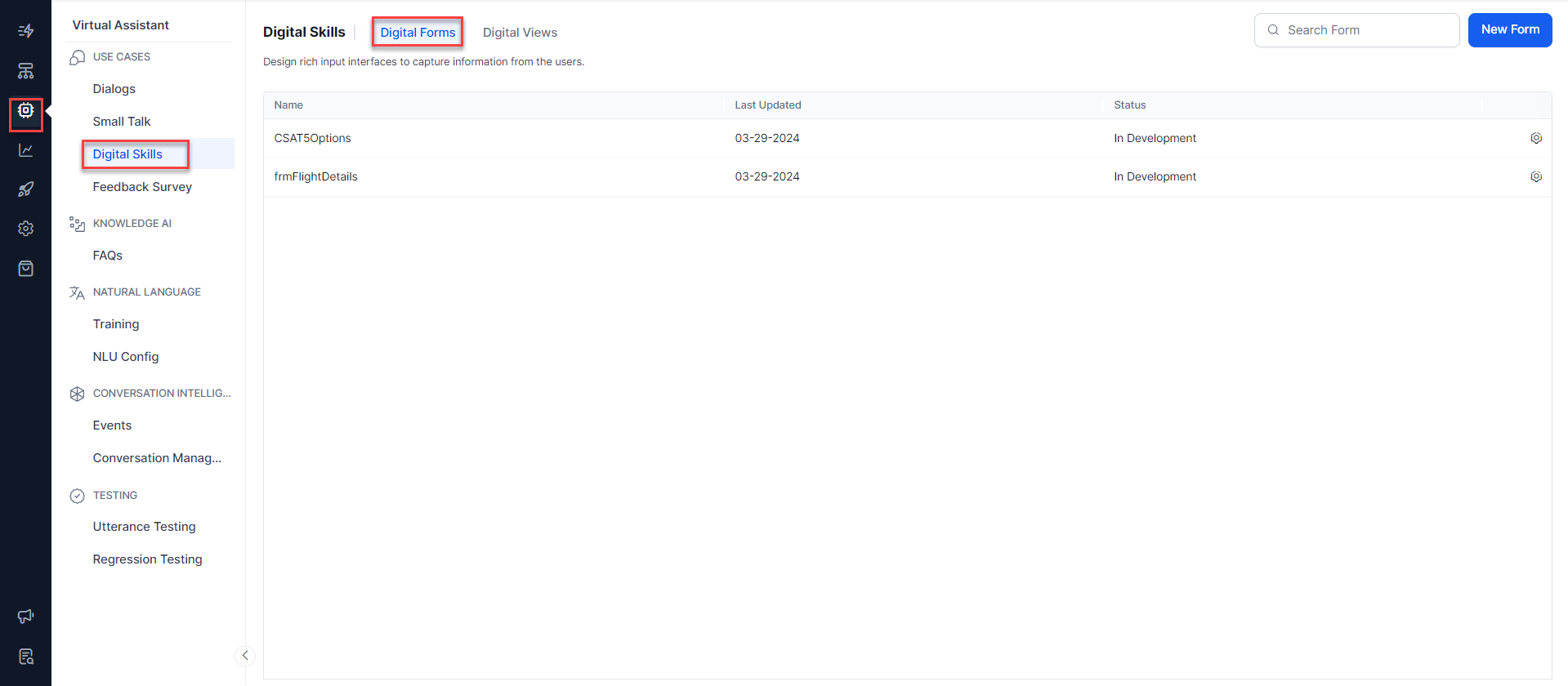
- Form Creation: Define a Digital Form by adding components and configuring their properties.
-
Form Invocation: Forms are invoked from inside a task or process:
- A form is included as a component in the task. The dialog task offers a Form Experience and Conversation Experience based on the channel of interaction.
- A Digital Form is added to a Digital View with a dialog task triggered when a form is submitted from there.
-
Form Submission: When it’s submitted, the component values are validated and any errors are highlighted. Based on the mode of invocation, post successful validation:
- The AI Agent execution proceeds as per dialog flow in case of dialog task invocation.
- The selected task is triggered.
Create a Form
A Digital Form includes a definition and various components to capture user input. To create forms, follow the steps below:- Under Automation AI > Use Cases > Digital Skills, select Digital Forms.
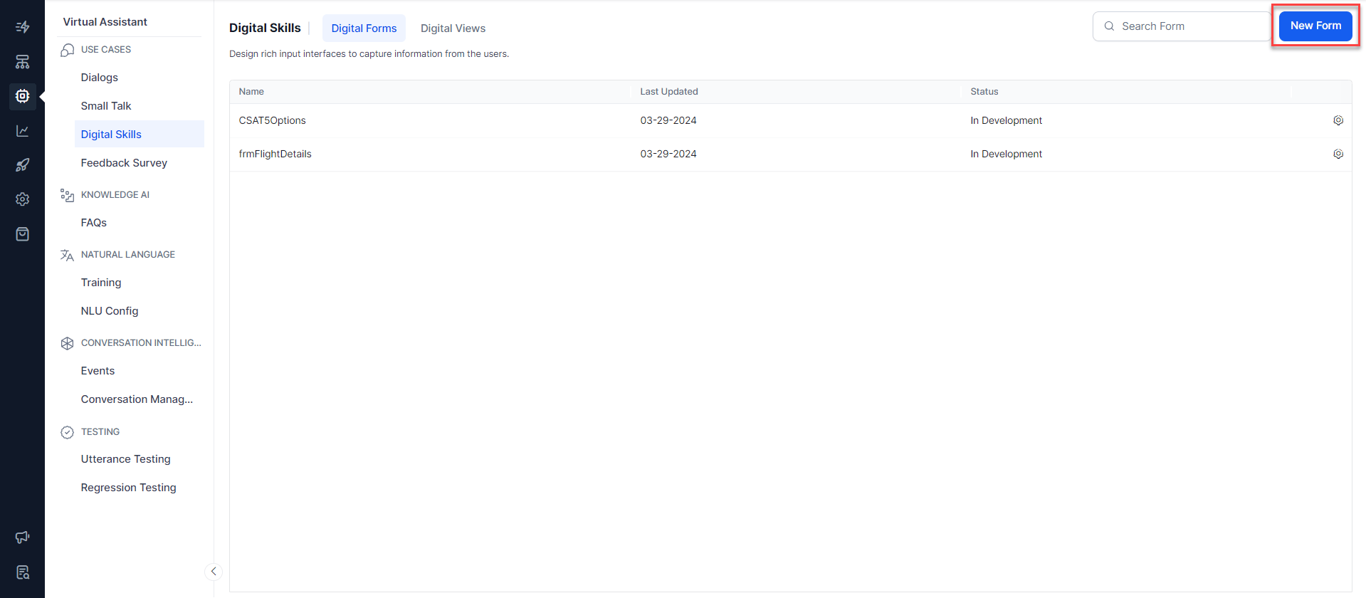
- On the Digital Forms screen, click New Form.
-
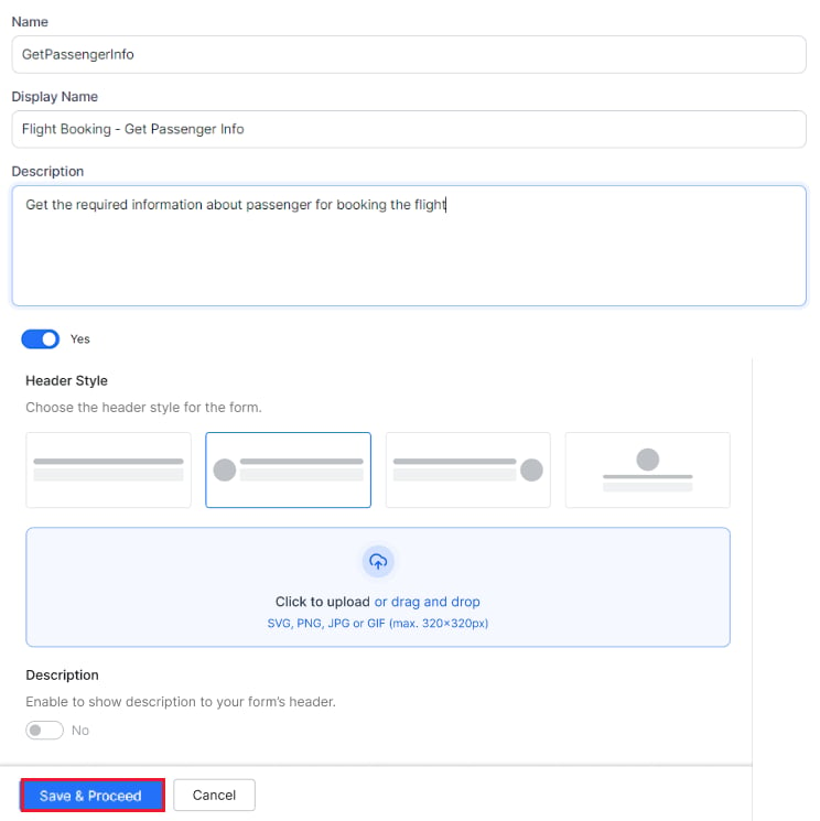
On the New Form page, enter the following:
- Name of the Form.
- Display Name for the Form.
- Description of the Form.
-
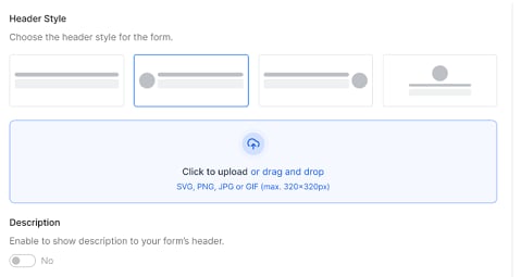
Select form’s Header Style: You can choose a specific header style from the listed illustrations – the circle indicates the position of logo/icon with respect to the title of the form in the header. Click the card to select the style. If it has a logo, you can upload an image file (jpg or png) for the logo.
During the Export of the app, the logo isn’t exported along with Digital Forms. So, when importing this App, you need to separately copy the logo image file and then manually reupload the logo.
-
Turn on the Description toggle if you want to show a description of the form in the header.
-
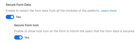
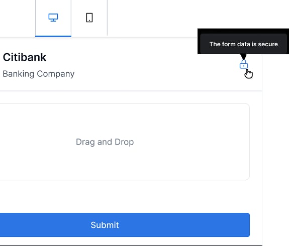
Form Security – Enable Secure Form Data to redact form data from the App Context, Debug Logs, Service Calls, Agent Transfer, and the Bot Kit.

-
Pre-Processor script—The Pre-Processor script in the form settings can be used by the developer to manipulate all the data required for the form that can’t be customized from the UI design view.
For example, in the case of a multilingual AI Agent, the user can customize the form UI & standard responses of the components in the digital form so that they appear based on the selected app language.
Moreover, you can provide dynamic variables to replace the static content in the pre-processor script for use in the form using environment, content, and context variables.
The platform processes and resolves the pre-processor script as the first step in the form node execution. The same can be seen in the debug log. As part of this, the updated definition from the pre-processor script is passed to webUI to render the form.
Example:
Suppose you want to change the standard response of a field of URL type in a digital form based on the app language. You’ve added English, Spanish, German, and Japanese as your app languages.
 Please click here to learn more about the digital form’s pre-processor script.
- This field will be available only while updating the form and not at the creation time.
- Defining a pre-processor script is not mandatory. The default standard responses will always be present.
- This feature is available only for Automation AI.
-
Click Save & Proceed.
Configuration setup using Pre-Processor script
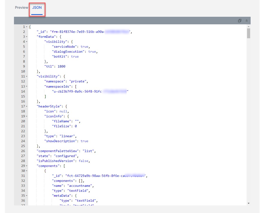
Earlier, our digital forms can be created only in one language and hence multiple forms need to be created to provide the flexibility to render the forms in different languages for multi lingual app. Also the messages and errors were available only in English and can’t be customized. This posed a limitation as it didn’t support all app languages. Additionally, users lacked the ability to customize the forms using the dynamic data from context. The pre-processor script has been introduced to counter the above limitations. You can provide values to the relevant keys based on the app language or any other condition that requires customization of aspects like field labels or standard responses. To get the form definition that’s provided as a response in thekoreUtil.getFormDefinition and keys that need to be customized, refer to the digital form’s JSON view. Navigate to Automation AI > Use Cases > Digital Skills > Digital forms and open the form that you wish to configure. Click Test on the Form Design view, then select the JSON tab.
- Make Language specific customizations
- Populate Dynamic data from external sources (Eg: data file or API)
- Populate Dynamic data using variables
- Pre-fill the form with static or dynamic data (default value using value or context variable)
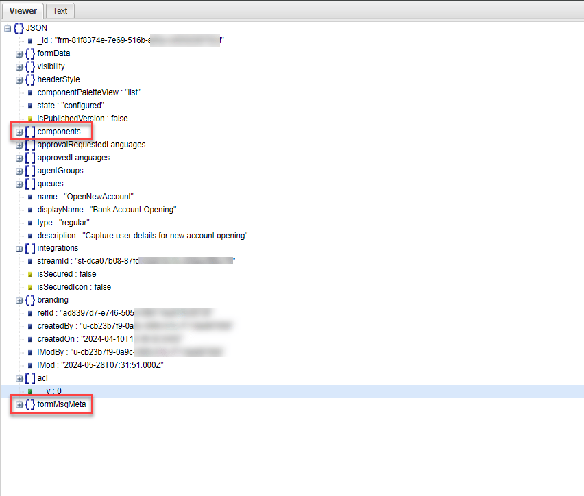
- Components: for field and form level customizations like Form Header, Description, Field Names, Descriptions, Default Text, Validation rules etc.
- formMsgMeta: for customizing Standard Messages and Standard Error Responses
Components
The Components section is a container for all the fields on the form and the keys that can be manipulated in the pre-processor script for customization. Upon expanding the components section, which appears as an array in the JSON viewer, you see an indexed sub-sections that indicates the number of fields in the form. For example, the components section in the below screenshot shows that there are 12 fields in the form.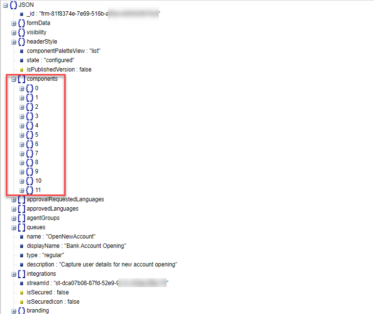
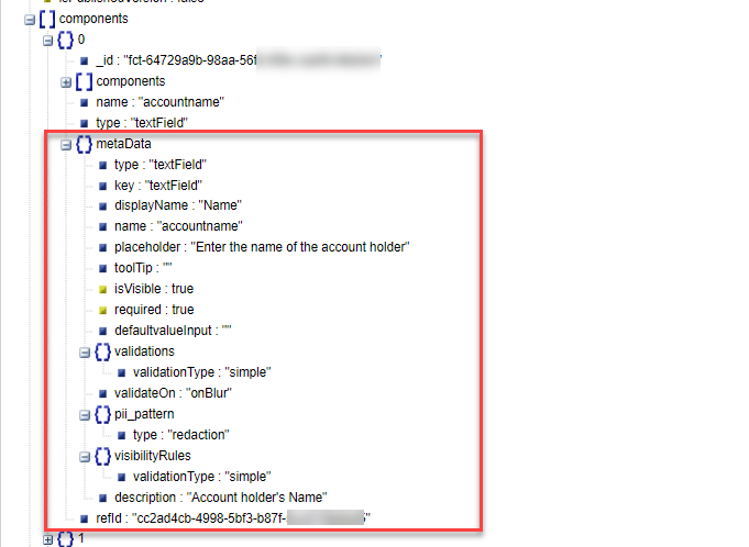
formMsgMeta
The formMsgMeta section contains the keys that contain the Standard Responses and Error Messages. If you want to customize these messages and responses, or customize them based on the AI Agent’s language, you can do so in the pre-processor script by manipulating the values of these keys. These messages and responses can’t be customized from the form design UI. The pre-processor script provides you the required mechanism to create status or dynamic responses based on your requirements. Upon expanding the formMsgMeta section, you can see the keys that you can customize.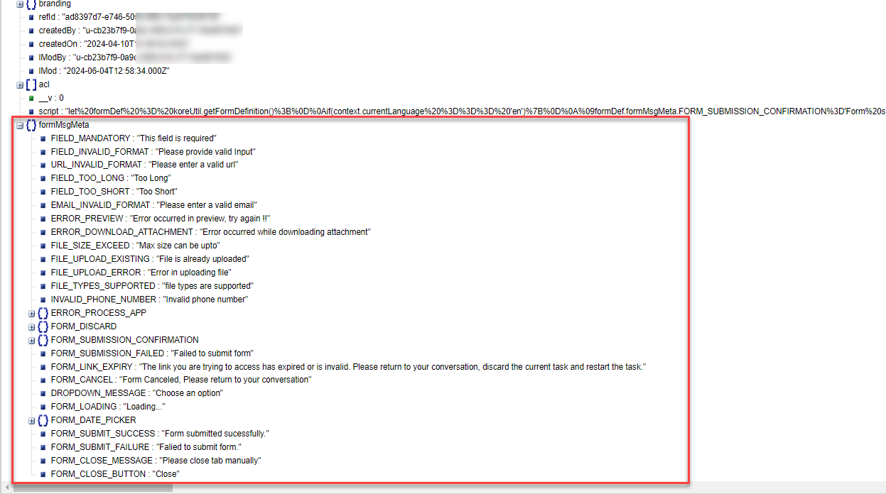
You’ll need to set useFormMsgMeta to yes to ensure that the customized formMsgMeta values are passed on to WebUI for rendering the form. This is an optional key, but not mentioning it’ll make the form display the system default responses and error messages.The syntax to set it is
formDef.formMsgMeta.useFormMsgMeta = 'yes';formDef.formMsgMeta.<<KEY>> = '<<value>>';
The response message customizations are at the form level, that is, a response message of a particular nature will be applicable to all the fields across the form. For example, the customized response message for invalid URL will be the same for all the fields of URL type within the form.
Example: Suppose you want to customize the system response for mandatory fields. The default system response is ‘This field is required’, but you want the response to be ‘This is a mandatory field; please provide a value’. This is how you can do it:
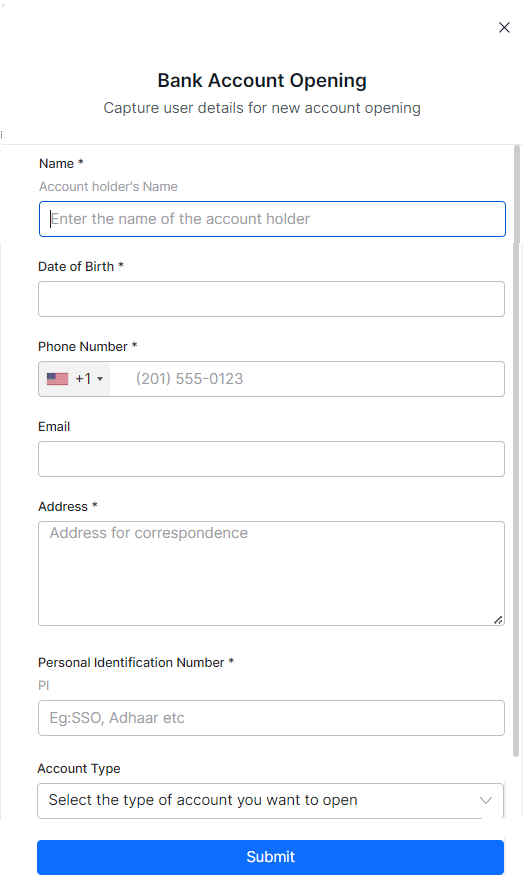
The below use cases explain the steps to make various customizations using the pre-processor script. The digital form to gather data for opening a bank account is being used as an example. Japanese and German languages have been added to the AI Agent.
Use Case 1: Language specific customizations
Components: Suppose you want to customize the display names of the Name and Date of Birth fields based on the selected App language. Since these are the first two fields on the form, their index values are 0 and 1, respectively. Below is the code to customize the display names: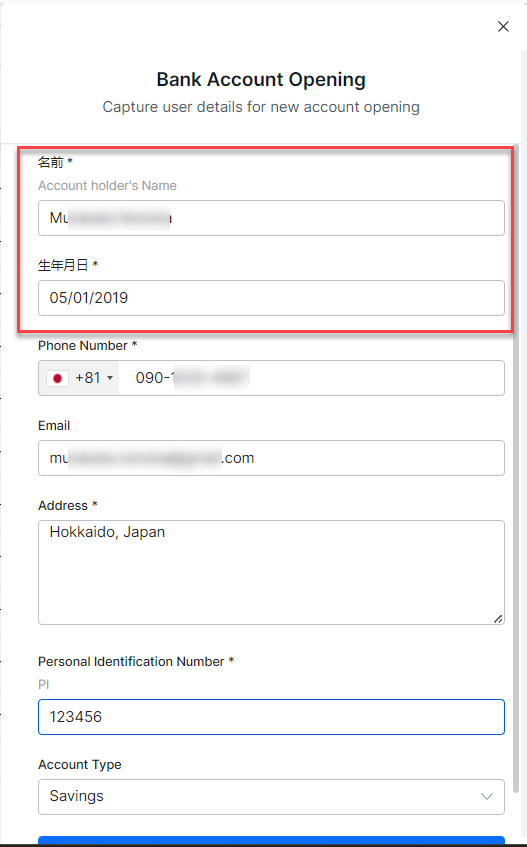
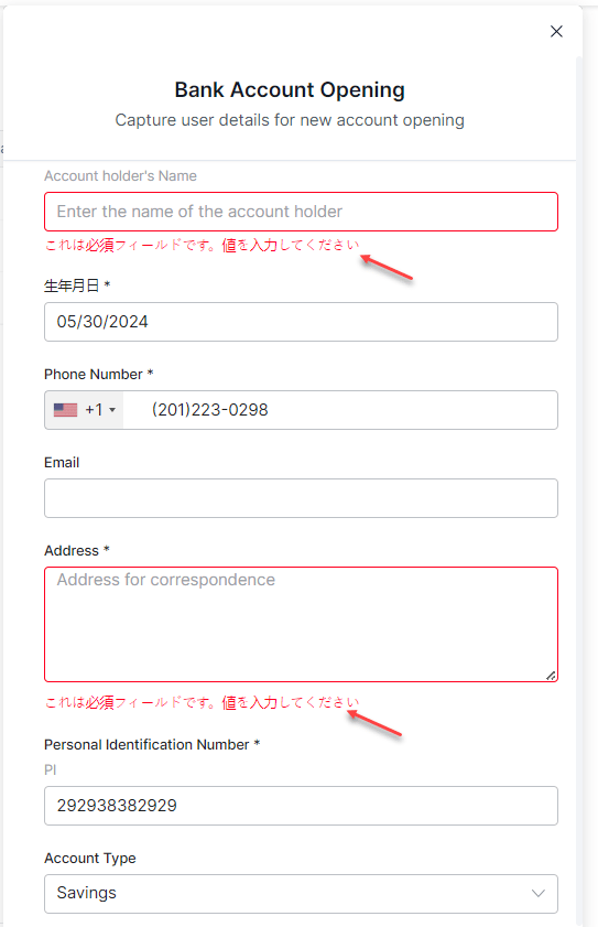
Use case 2: Dynamically generating form text and data using Variables
Component Suppose you want to ask the user’s name and pre-fill it in the form fields and labels. In this example, the user’s name is captured in an entity node, and that name is used to:- Pre-fill the name field
- Personalize the labels of the other fields
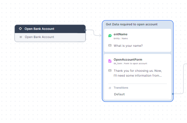
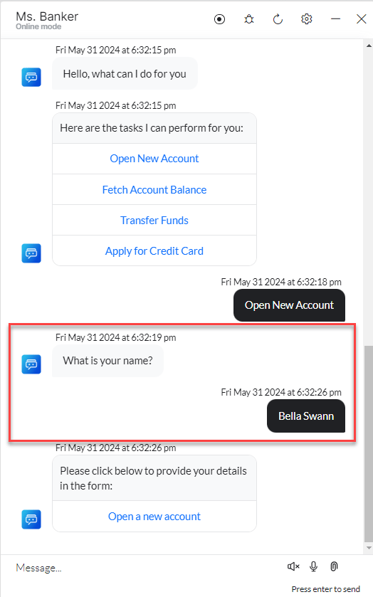
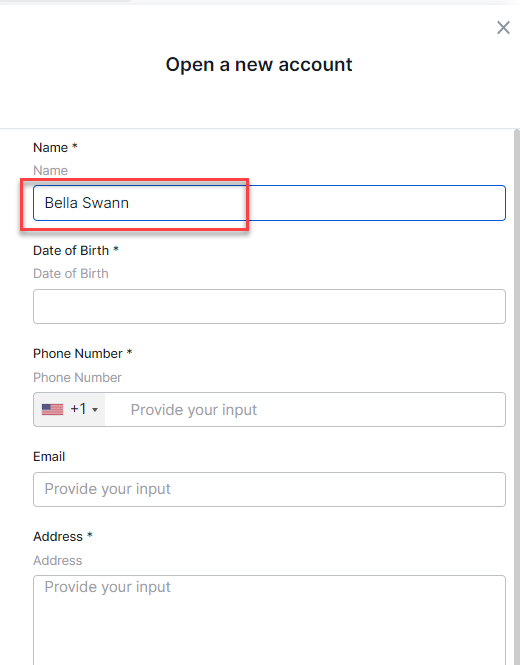
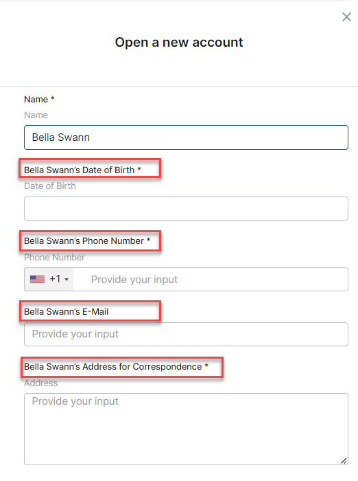
User's Name, this is a mandatory field. Please provide a value**. You can achieve this by adding the below code:
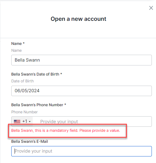
Use Case 3: Dynamically generating form data from external sources
You can use external sources of data, like data tables, data fetched from API etc to dynamically generate form data. The syntax to do that is:Add Components
Once you configure the basic details for your form, the Platform takes you to the form builder, where you can add the components you require. You can drag and drop the components available on the left pane to the canvas and configure their properties to build the form. For details of the available components & their properties see here.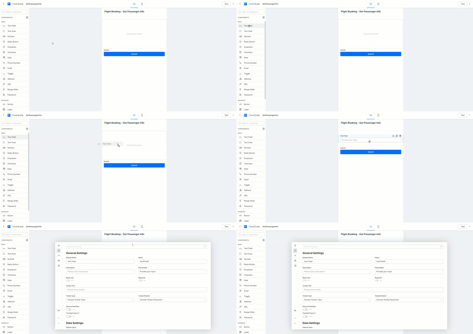
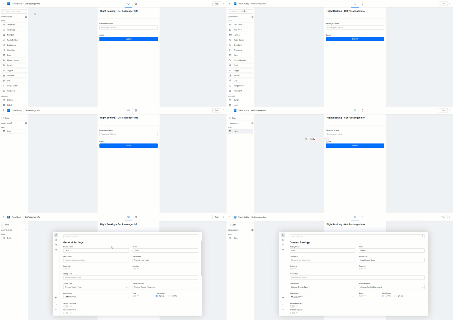
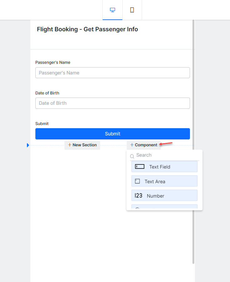
Add Form Sections
If you’re working with a longer and more complex form, you can split it into sections. Hover your cursor in-between form components to reveal an Add Section button. Clicking it’ll add a title and description to your form, which you can use to organize the other fields into sections.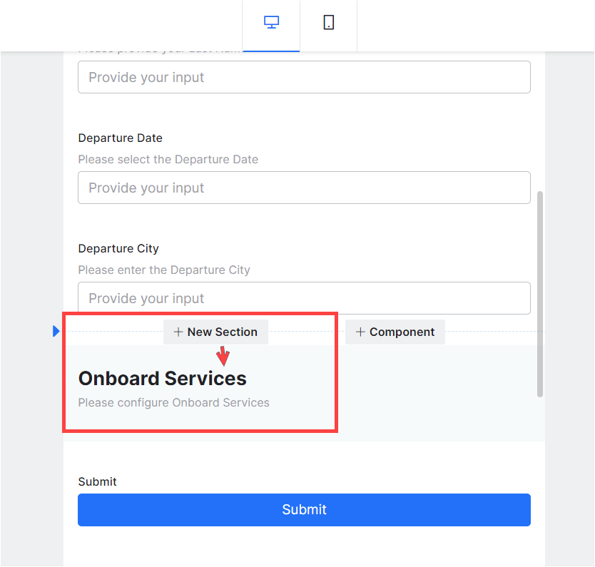
Form Actions
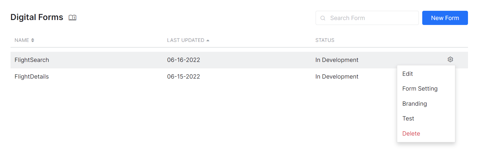
From the Forms Listing page, you can:- Create a New Form, as seen above.
- Edit the Form.
- Use the Branding option to customize a form.
- Test forms.
- Delete forms.
Edit
You can use the Edit option from the form listing to edit the form. The following actions are performed on the Form in edit mode: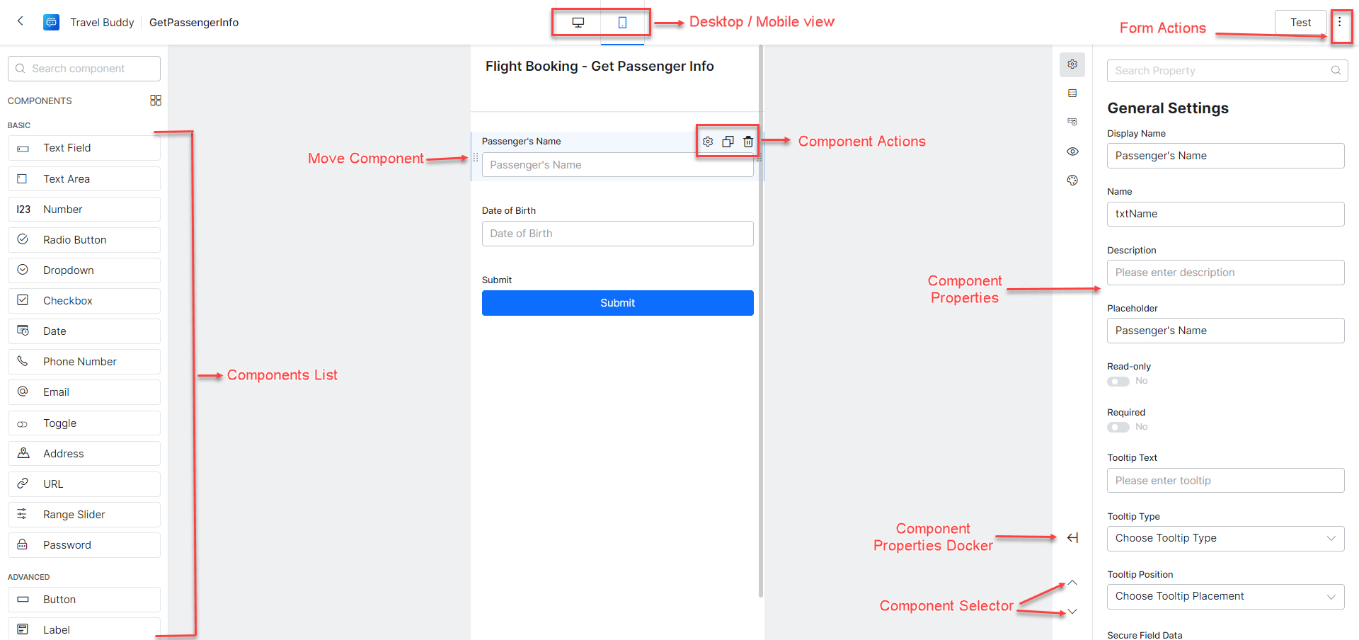
- The Component Listing is used for selecting and adding components to the Form by simple drag and drop action.
- Use the View Toggler to switch between Desktop View and Mobile View.
- Use the Move Component Handle Bar against each of the components to change its location by a simple drag and drop action;
-
Use Form Actions to:
- Test the form to see the preview of the Digital Form in the Platform.
- Delete the Form. Please keep in mind that deleted forms can’t be restored.
- Change the Form Settings such as name, display name, and description.
- Use the Component Actions to access the Settings, Duplicate, and Delete options for each of the form’s components.
-
You can change the components’ properties from the Component Settings popup:
- Use the Component Docker to dock/undock the settings pane to the screen.
- Use the Component Selector to navigate through the components on the Form.
Branding
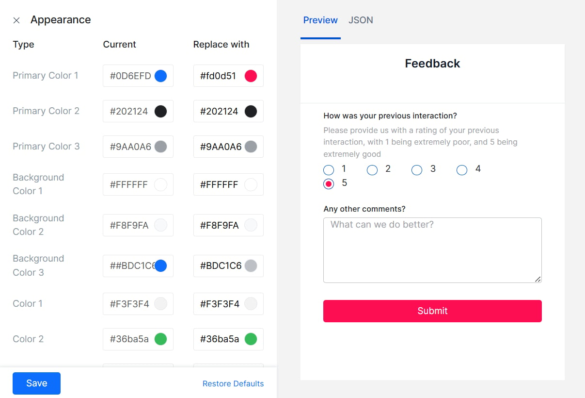
Use the Branding option to change the look and feel of the form to reflect your organization’s standards.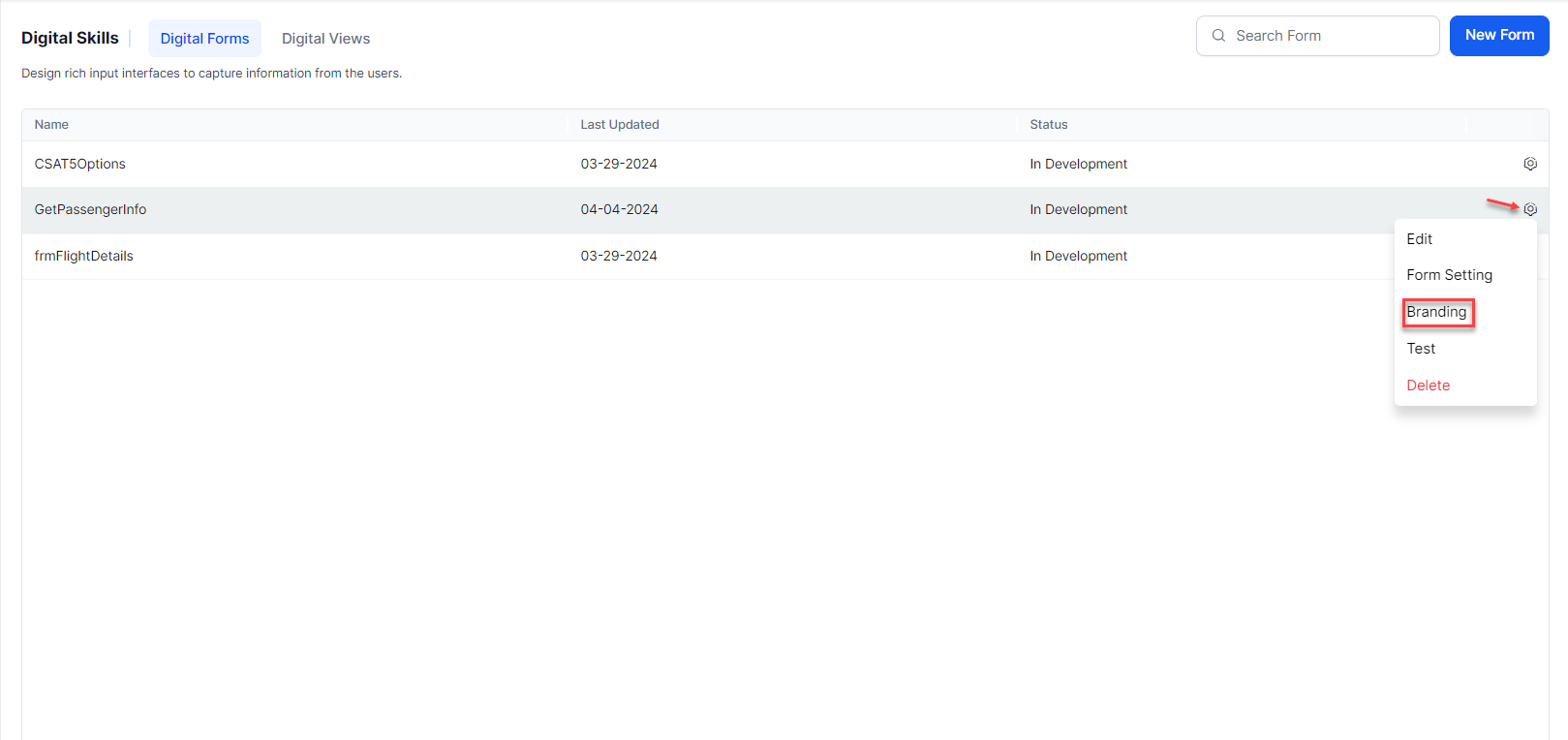
Test
Test the form to see a preview of what it would look like to the end user. You can do this at any point while you work on the form.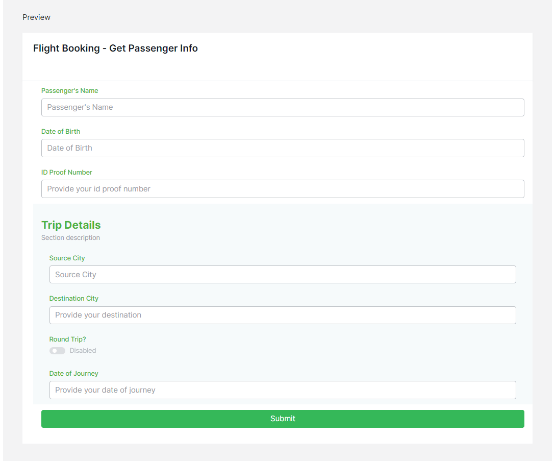
Invoke a Form
A digital form can be invoked as follows:- From a Task: You may include a form as a component in a dialog task for defining the task. The dialog task offers Form Experience and the usual Conversation Experience for filling the form data. You can choose the preference based on the channel of interaction or any other criteria based on your requirements.
- From a UI flow: You can add a Digital Form to a pane and choose a dialog task to trigger when the form is submitted from the pane.
Invocation from Dialog Tasks
Digital Forms are used inside Dialog Tasks for capturing user inputs through a Form Node. To invoke a form from a dialog task, follow the below steps:- Create/open the dialog from where you want to invoke the Digital Form.
- Click the + icon next to the node where you want to add the Form.
- Select the Digital Form option and then the form from the list. You can choose to add a Digital Form directly or use an existing Form Node.
-
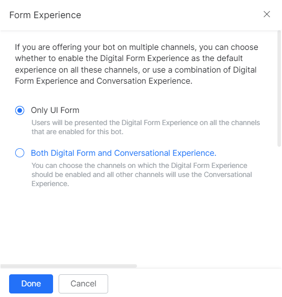
You’re prompted to select the Form Experience, it can be:
-
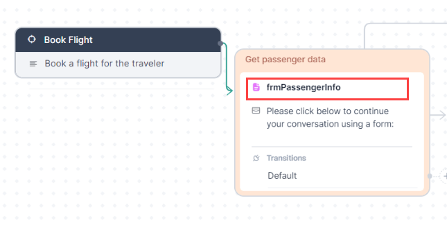
Only Form UI – This creates a Form Node and associates it with the Digital Form selected. This is the default option.
-
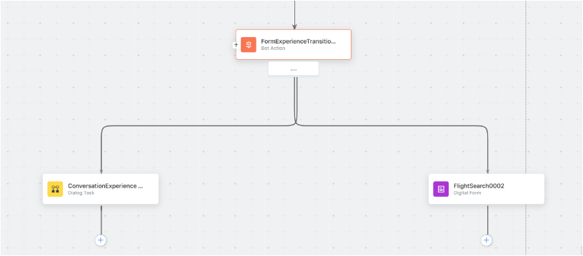
Both Form UI and Conversation Experience (DRAFT) – This further prompts you to choose a channel. When a user is using one of the selected channels they’re presented with a Form UI, the rest of the channel users get a conversation experience.
This option creates:
- A Bot Action Node to determine the transitions to the Form Node and the Sub-dialog Node based on the channels selected.
- A Form Node for the Digital Form, same as was generated for the Only Form UI above.
- A Sub-dialog Node to capture the required entities (as defined in the Digital Form using components) for the conversational experience.
- A Group encompassing the following nodes. This grouping can be renamed and/or deleted. Learn more.
-
Only Form UI – This creates a Form Node and associates it with the Digital Form selected. This is the default option.
-
You can set the Properties for each of the nodes added.
-
The Form Node. Following Component Properties are of special interest:
- Submit Message – Message displayed to the end-user on successful submission of the form.
- Prevent Form Link from Being Appended - Enable to prevent the digital form link from being automatically appended to the message. Disabled by default.
- Web/Mobile SDK Form Behavior – Using this option you can either have the form displayed inline the chat window or open on a full page. Also, you can either go ahead with the default submit prompt or configure the setting to display a custom and more specific message to be shown in chat. Learn more.
- Bot Action Node, in case of the conversation experience flow, can also be configured in the Logic Node as follows:
-
Manage Context Variables is used to create and set values for the context variables. Remember to use the full path of the variable in the key field ie.
context.BotUserSession.<variable_name>
We urge you not to make changes to the connection settings as this affects the AI Agent’s performance. -
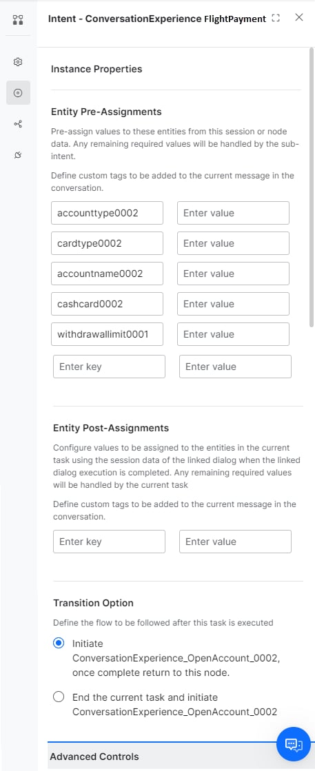
Sub-dialog Node is configured as a normal Dialog Node as follows:
- Use the Entity Post-assignment to capture the user input.
- In case you modify the sub-dialog or the source form, you’re presented with an option to Regenerate Dialog. This ensures that the changes are reflected in the task without having to rebuild the entire task. Be aware that the changes are reflected in all places this sub-dialog is used.
-
The Form Node. Following Component Properties are of special interest:
-
The user input can be accessed as follows:
- Form component values are accessed from the Context Object using
{{context.forms.form_name.component_name}} - In the case of the sub-dialog, the variables used in the post-assignment settings as
{{context.<variable_name>}}
- Form component values are accessed from the Context Object using
- You can continue with the Dialog Task as per your business needs. For example, you can use the Form Component values as input to a Service Node to update the data or use the Script Node to process it further. If you’re using the conversation experience too, remember to connect the auto-generated sub-dialog to the process flow.
Invocation from Panels
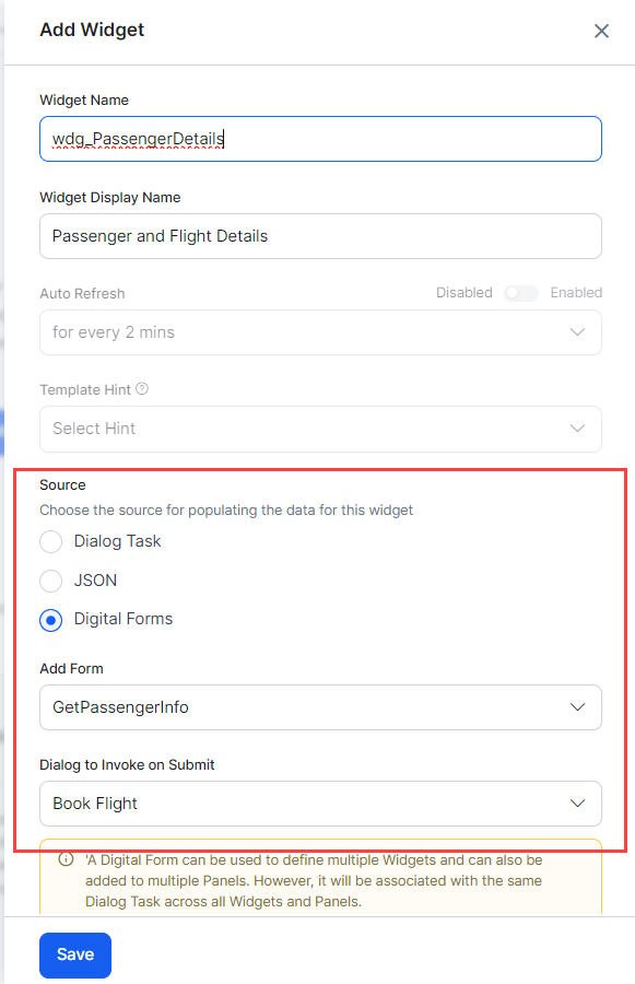
Digital Forms are rendered in Digital Views by configuring Widgets & Panels. Learn more. To invoke a form using Widgets and Panels, follow the below steps:- Create a widget to invoke the Digital Form within Digital Views from Automation AI > Use Cases > Digital Skills.
- Enter the name.
- Select Digital Forms as the Source.
- Add a Form by selecting it from the drop-down list.
- Select the Dialog to Invoke on Submit from the drop-down list.
-
Click Save.
- Add the Widget to an existing panel or create a new panel. You can add a form directly to a panel, it creates a widget by default.
- You can Test the panel.
-
Follow the steps provided here to publish and host the panels.
While a Digital Form is used to define multiple Widgets and also add to multiple panels, it’ll be associated with a single Dialog Task across all Widgets and Panels.
The User Experience
When the end-user initiates the dialog and reaches the node connecting to the Form node, the following events take place. Depending upon the experience selected at design time and the channel of invocation, the flow is the following:Form Experience
A link to the form is presented to the user. Note that for a synchronous WebHook channel, instead of a link the complete form definition is sent here.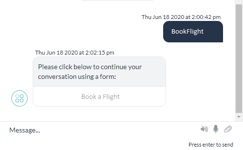
- The link is active only for a certain duration of time, it becomes inactive after that.
- Even within the active period, it can be used only a limited number of times.
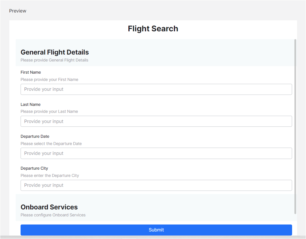
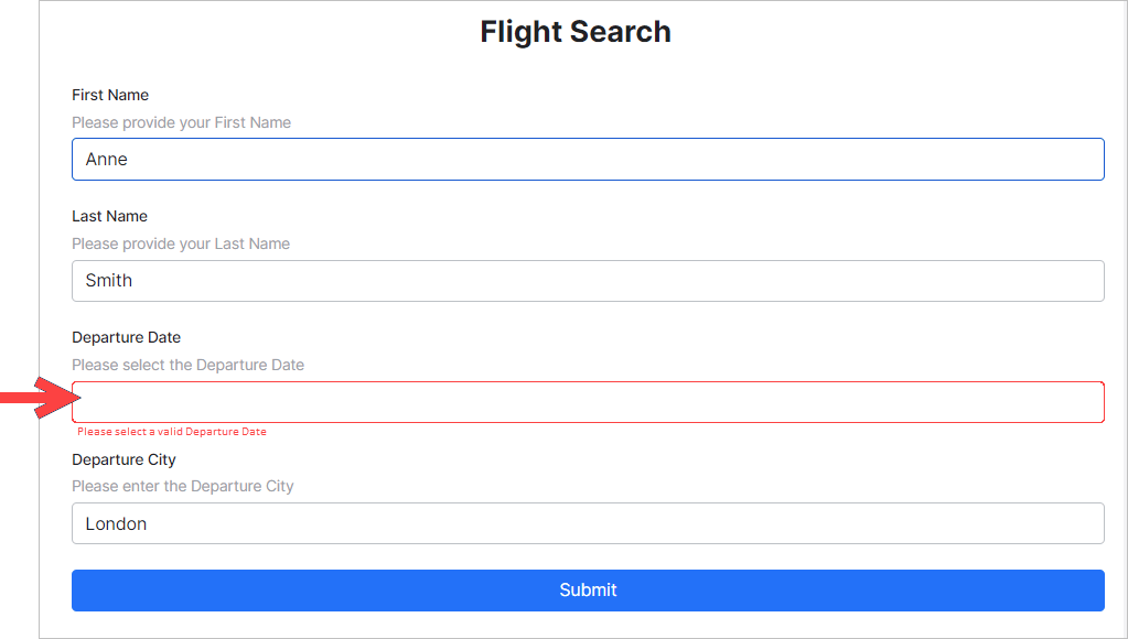
context.forms.<form_name>.<component_name>
Here we’re capturing the user entry and displaying it using a message node.
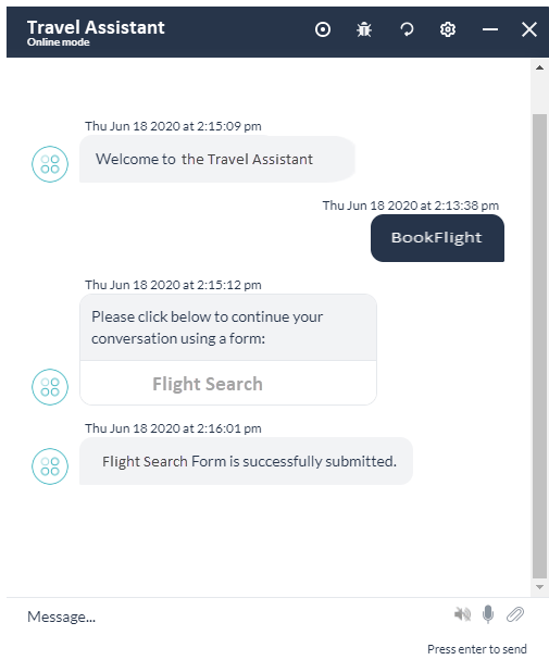
Conversation Experience
From the channel of operation, the end-user is prompted to enter values for every component in the form. The values are available in the sub-dialog context and are captured using Entity Post Assignment as mentioned above. Following is the user experience in Conversation mode: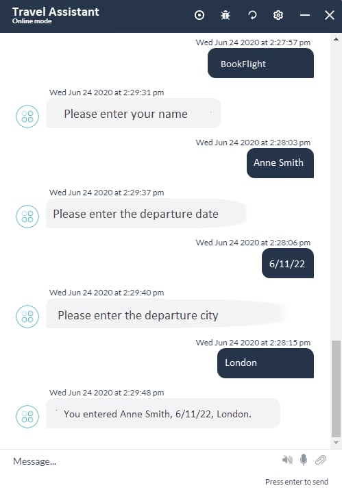
Exceptions
When exceptions are encountered during the dialog execution with a Form Node, they’re handled as follows:Panel Flow
Users can access the form using Panels & Widgets. The experience is the same as for the Process Flow with Form experience. Once the form is validated and submitted, the values are available in the context variable and accessed using the following code:context.forms.<form_name>.<component_name>.
Manage AI Agents with Digital Forms
Publish
The publishing flow for an App with Digital Forms has the following special cases: As with any AI Agent, the Digital Forms exist in the following states:- In-development when a form is created.
- Awaiting approval when a form is submitted to Publish and the request is waiting for the admin to take action.
- Rejected when the Publish request is rejected by the admin.
-
Published In the Platform, the status of a Digital Form remains In Development even after publishing.


 If any edits are done to the Digital Form while it’s In Development, the changes would be reflected in the Published version as soon as you publish the form.
 - Suspended when a published form is suspended by the admin.
Pre-publishing Validations
The following validations are performed before a Publish request is processed: A Dialog Task that contains a Digital Form can be published only if:- The corresponding Digital Form is already published, or
- The corresponding Digital Form is also selected for publishing.
- The corresponding Dialog Task is already published, or
- The corresponding Dialog Task is selected for publishing.
- If the Dialog Task is in a published state, but the Digital Form isn’t in a published state this triggers:
- The Task Failure Event and the corresponding behavior is invoked or
- A relevant Standard Response is displayed and
-
Logged as Failed Task in Analytics.
- Digital Form is in a published state, but the Dialog Task isn’t available then on Form submission, the end-user is presented with the Form’s Error Message.
Import
Digital Forms are included in the full and incremental import of the AI Agent. For Full Import:- As with all other AI Agent components, the full import replaces the entire Digital Forms and form details.
- You can choose to include/exclude the Digital Forms in the import.
- This import fully replaces the Digital Forms that are common to the import file and the AI Agent.
- Additional forms in the file are imported into the AI Agent.
- Additional forms in the AI Agent are retained.
- Post import, any invalid Digital Form integration details are disassociated with the corresponding forms.
Export
The App Export option is available for Digital Forms with a status of In Development or Published.- Digital Forms can be selected/deselected from the App Export page under the Bot Tasks category.
- Choose the option to Include dependent dialogs to export Dialog Tasks that are integrated with the selected Digital Forms to define widgets. Note that this doesn’t include the Sub-dialog Tasks generated using Digital Forms.
-
Complete information for each of the selected forms are available in the export file and this includes:
- Fields
- Field properties
- Form integrations
Form Component Details
Components List
Following is a list of the available components. BASIC-
Text Field – used for single-line input.

-
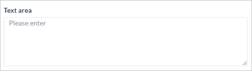
Text Area – used for multi-line entry.
-
Number – used for numerical entries.

-
Radio Button – used as a selection option from a given list.

-
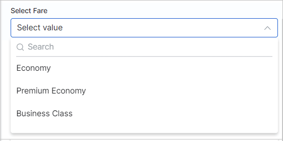
Dropdown – Used as a selection option from a given list; can be multi-select.
-
Checkbox – Used for multi-select option from a given list.

-
Date – Used for date entries, gives a date picker for the user to choose the date.
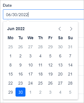
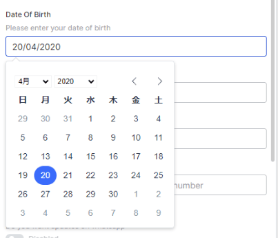
-
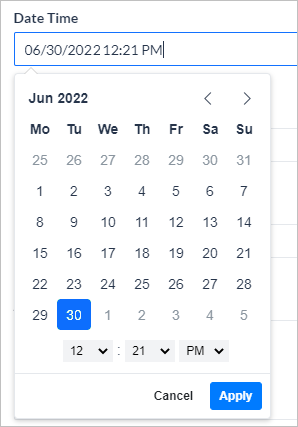
Date & Time – Used for date & time entries. The system displays a date and time picker for the user to choose the date and time.
Use the Date component and set the Time option to yes; choose from 12 or 24-hour format.
-
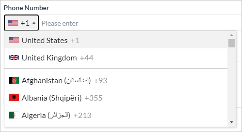
Phone Number – Used for phone number entries, allows the user to choose the country code.
-
Email – Used for email address entries, validates for xxx@uuu.com format.

-
Toggle – Used for switching between two values, ideal for yes/no type of inputs.

-
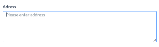
Address – Used for address entries.
-
URL – Used for web URL entries, validates for xxx.com format.

-
Range Slider – Value selection between specified min and max values; can be represented as a percentage.

-
Password - Used to display passwords in their masked form
*****
-
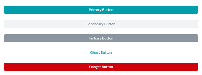
Button – Used as a clickable component to submit reset, or open an external URL the form. Choose from Primary, Secondary, Tertiary, Ghost, or Danger.
-
Label – Used to display a static text box, no action required from the user.

-
Protip – Used to mark important information for the end-user, no user action required.

-
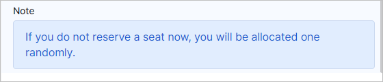
Note - Used to mark information for the end-user, no user action required.
Component Properties
The following are the properties that can be set for each of the components.Not all the properties are valid for all the components, refer to the Property Matrix for the mapping.
Component Mapping Properties
Basic
Advanced
Dialog Node
The following mapping gives the type of entities included in the sub-dialog when it’s auto-generated from a Digital Form.Context Object
The following mapping gives the context object to capture the component value along with a sample context object.
SAMPLE CONTEXT OBJECT
Prefill Form
You can specify data that can be used to pre-populate the form fields. Platform will check for the availability of any form prefill information before launching the form. If any information is available, then the corresponding fields in the form are pre-populated before presenting the form to the user. The values can be static or from a context object. You can specify pre-fill form data using the following context object:context.prefillForms.
You can use the following in Javascript to populate the above-mentioned context object:
Limitations
-
Digital Forms won’t work as expected on the following channels:
- Amazon Alexa
- Cisco Jabber
- Google Assistant
- IVR Voice
- Twilio Voice
- You’re advised to choose the Conversation Experience for these channels.
- Digital Forms created in the parent app aren’t inherited into Smart Apps.
- The Digital Forms functionality isn’t applicable for Dynamic Routing.