
Monitor workflow tool and model performance — track run success rates, average response times, node executions, latency, request volume, scaling, and credit usage. Use workflow tool-specific and model-specific filters for trend analysis, and drill into individual traces for run-level inputs, outputs, and metadata.Documentation Index
Fetch the complete documentation index at: https://koreai.mintlify.app/llms.txt
Use this file to discover all available pages before exploring further.
Tool Analytics Dashboard
The Tool Analytics Dashboard tracks performance of deployed tools and their versions. Use it to monitor run success and failure rates, average response times (ART), and event-based node executions. Navigation: Go to Settings → Monitoring → Analytics → Tool Analytics.Key Metrics
The dashboard displays account-level and workflow tool-specific metrics.Account-Level Metrics
These metrics summarize activity across all workflow tools in your account for the selected period.| Metric | Description |
|---|---|
| Number of tools | Total deployed tools, including all versions managed by all account users. |
| Number of runs | Total successful and failed runs across all deployed tools. |
| Number of times nodes are executed | Event-driven execution counts for all node types. For node-level details, see the Nodes Execution widget. |
Tool-Specific Metrics
These metrics appear in the performance widgets for the selected tool and version.- Tool Runs: Success and failure trends for tool runs.
- Avg. Tool Response Time: ART to requests for the selected tool version.
- Nodes Execution: Event-based execution graph for all node types. Executions are counted up to your account’s rate limit threshold.
Filter Dashboard Data
Global Timeline Filters
Select the time period for all dashboard metrics. The default is 7 days. Custom date selection supports single dates and consecutive date ranges up to one year from the current date.Tool Performance Filters
These filters apply only to tool-specific metrics and work alongside a global timeline selection.- Tool Name: If two tools share the same name, they appear with their deployment timestamps.
- Tool Version: Use this to compare testing versus production performance. By default, all versions are shown.
Performance Widgets
The dashboard has three widgets for tool-specific metrics.Tool Runs
This widget shows successful and failed tool runs as two line graphs for the selected period.- Y-axis: Total Number of Requests (auto-scaled).
- X-axis: Date.
- Successful runs appear in green; failed runs in red.
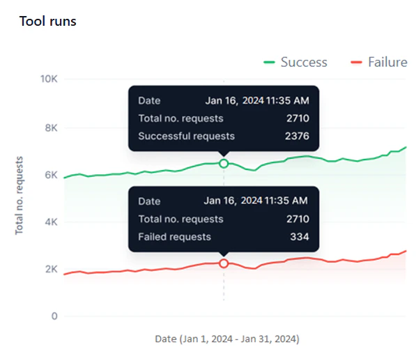
- The widget shows data only for periods the tool was deployed. For example, if a tool was active for 4 days and undeployed for 3 days in a 7-day view, only the 4 active days appear.
- The graph shows curves only when requests are processed. No data points appear for hours or days with no activity.
- Monitor success versus failure rates and identify failure patterns across the same or different dates.
- Identify peak and low performance periods across multiple date ranges.
- Detect sudden spikes in failures or performance drops with the hourly view.
- Compare performance across tool versions.
Avg. Tool Response Time
This widget shows a line graph of the ART for each request the selected tool version handles during the selected period.- Y-axis: Avg. Response Time (auto-scaled).
- X-axis: Date.
- A blue line represents ART values.
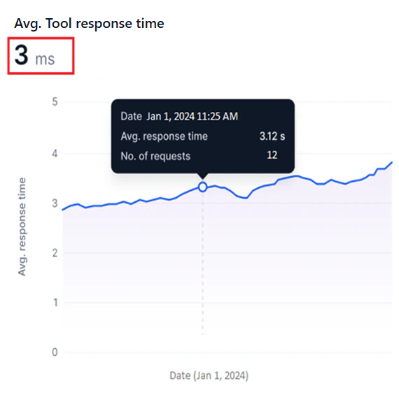
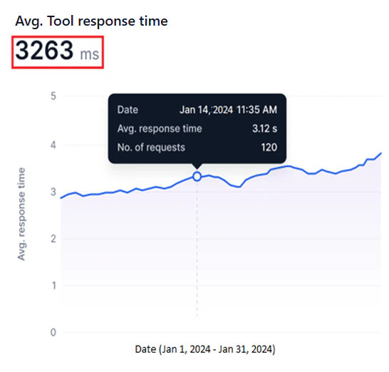
The system calculates the ART for all requests within each hour (hourly ART), combines these for each day (daily ART), then aggregates daily ART values across the selected date range to compute the overall ART.
- Identify bottlenecks by spotting sudden ART spikes that indicate delays or inefficiencies.
- Track optimization progress by monitoring ART trends before and after tool changes.
- Compare ART across tool versions to determine the most responsive option.
Nodes Execution
This widget shows a line graph of nodes executed per event run for the selected tool version and period. For information about node types, see Nodes.- Y-axis: Number of Nodes Executed, fixed to the maximum rate limit for your account.
- X-axis: Date.
- A blue line represents node executions.
- A red line marks the maximum rate limit threshold.
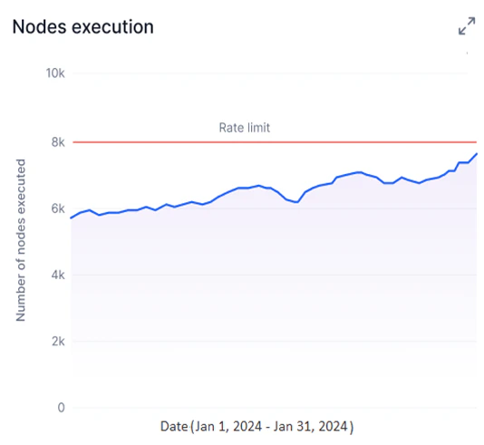
- Identify overused nodes or inefficient tools by visualizing execution trends.
- Stay within subscription thresholds by tracking node executions against your rate limit.
- Detect bottlenecks and resolve tool issues using node execution patterns.
Model Analytics Dashboard
The Model Analytics Dashboard tracks performance for fine-tuned, open-source, and external models in your account. It measures:- Model latency and response times.
- Request success and failure rates.
- Model scaling patterns and usage.
- Credit consumption for deployments and fine-tuning.
Key Metrics
The dashboard displays account-level and model-specific metrics.Account-Level Metrics
These metrics summarize credit usage and model counts across your account for the selected period.| Metric | Description |
|---|---|
| Credits consumed in deployment | Credits deducted from your account for deploying models. |
| Credits consumed in fine-tuning | Credits deducted from your account for fine-tuning models. |
| Number of Deployed Models | Total models deployed in your account. |
| Number of Fine-tuned Models | Total models fine-tuned in your account. |
Model-Specific Metrics
Available metrics vary by model type.| Metric | Fine-tuned and Open-source | External |
|---|---|---|
| Model Latency | Per-request latency for a 24-hour or 7-day period. For longer ranges, average daily latency is shown. See Model Latency. | Same as fine-tuned and open-source. |
| Requests | Success and failure trends, total requests, and average credits per request. See Requests. | Same, but without average credits per request. |
| Model Scaling and Usage | Replica count and hardware configuration during deployment. See Model Scaling and Usage. | Not available. |
| Tokens | Not available. | Input and output token bar chart for the selected period. See Tokens. |
Filter Dashboard Data
Global Timeline Filters
Select the time period for all dashboard metrics. The default is 7 days. Custom date selection supports single dates and consecutive date ranges up to one year from the current date.Model Performance Filters
These filters apply only to model-specific metrics. Available filters depend on the selected model type. If multiple deployments share the same model name, they appear with their deployment timestamps.- Fine-tuned and Open-source models: Select the model name, deployment name, and deployment version. By default, all versions are shown.
- External models: Select the model name and third-party service connection name.
Performance Widgets
To load data in the widgets, select a date or date range, model type tab, and model filters to load data.- Widgets show data only for periods the model was deployed. For example, if a model was active for 4 days and undeployed for 3 days in a 7-day view, only the 4 active days appear.
- The graph shows curves only when requests are processed. No data points appear for hours or days with no activity.
Model Latency
Available for Fine-tuned, Open-source, and External models. This widget shows a line graph of the selected model version’s latency during the selected period.- Y-axis: Latency in milliseconds (auto-scaled).
- X-axis: Date.
- A blue line shows per-request latency for 24-hour or 7-day periods. For longer date ranges, the graph shows average daily latency.
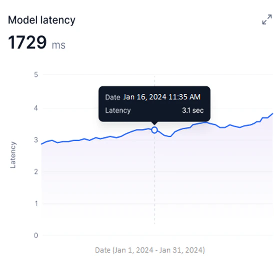
- Identify peak usage and low-efficiency periods by tracking latency over time.
- Detect sudden latency spikes that indicate performance issues.
- Compare deployed model versions to identify the best-performing option.
- Correlate latency trends with credit usage for resource optimization.
Requests
Available for Fine-tuned, Open-source, and External models. This widget shows successful and failed requests as two line graphs for the selected period.- Y-axis: Number of Requests (auto-scaled).
- X-axis: Date.
- Successful requests appear in green; failed requests in red.
- Total Requests: Combined count of successful and failed requests for the selected period.
- Avg. credits per request: Total credits consumed divided by total responses generated.
Avg. credits per request is not shown for external models.
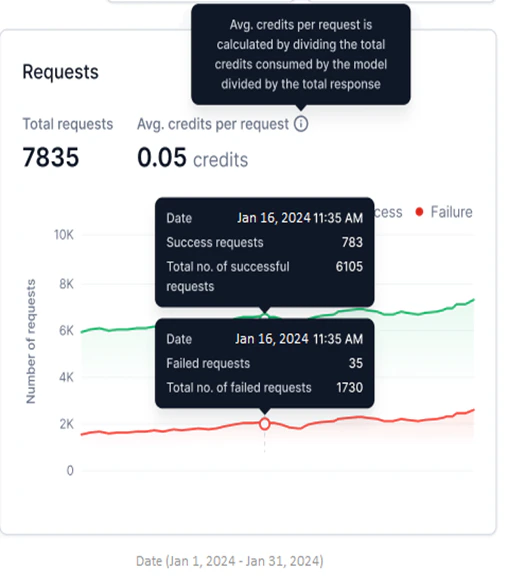
- Monitor success versus failure rates and identify failure patterns.
- Detect sudden spikes in failures using the hourly view.
- Compare request performance across model versions.
Model Scaling and Usage
Available for Fine-tuned and Open-source models only. This widget shows a step graph of the number of replicas with a specific hardware configuration deployed for the selected model version.- Y-axis: Number of Replicas (adjusts based on deployed replicas).
- X-axis: Date.
- Each upward step represents additional replicas being generated; each downward step represents replicas being undeployed.
Multiple Hardware is shown when replicas with more than one hardware configuration are deployed across a date range.
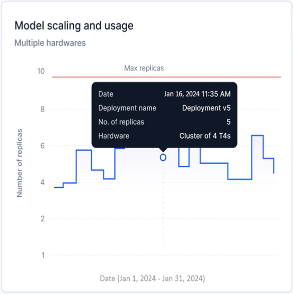
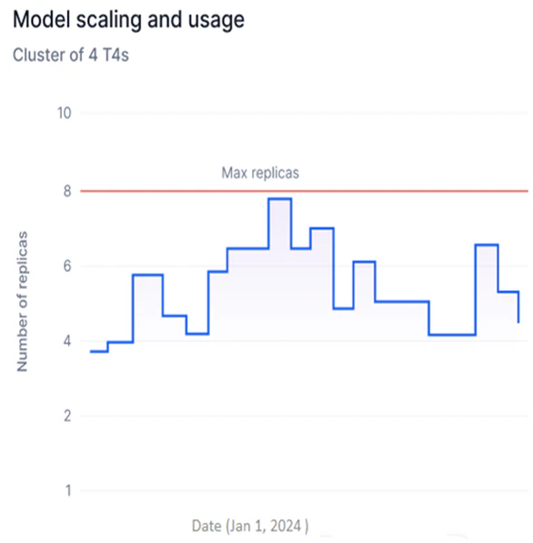
- Track replica deployments over time to identify usage spikes and optimize hardware consumption.
- Spot inefficiencies in replica usage and reduce unnecessary deployment costs.
- Monitor scaling against your account’s replica limits to stay within subscription thresholds.
Tokens
Available for External models only. This widget shows a stacked bar graph of input and output tokens for the selected period.- Y-axis: Number of Tokens (in thousands, K; auto-scaled).
- X-axis: Date.
- Input and output tokens appear in two shades in a stacked bar, showing them as parts of the total tokens used.
- The widget shows the total sum of input and output tokens.
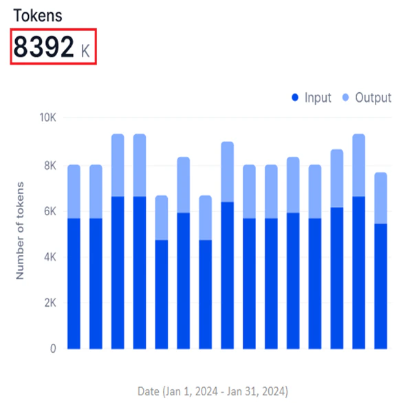
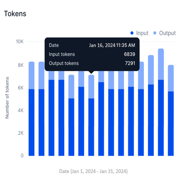
- Assess model efficiency by comparing input versus output token counts.
- Track token-based credit consumption and optimize usage.
- Identify processing bottlenecks and usage patterns over time.